Celebrating Scottish brands through print
Vanguards is a new publication founded by James Roberts and Hugo Ross whilst completing their degrees at Edinburgh College of Art. This quarterly magazine celebrates Scottish brands and products that the pair admire. Check it out below:
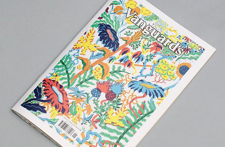


Appreciative of magazines such as The Gentlewoman, The Happy Reader and The California Sunday Magazine, James and Hugo wanted Vanguards to “fight the trendy mag” with its content being the dominant power. It provides featured brands with in-depth pieces on their processes and quality Scottish products alongside a developing critical voice against unsustainable and unethical manufacturing. This first issue of Vanguards is a very exciting move in publishing that invests within a community through intelligent content and design.
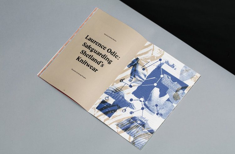


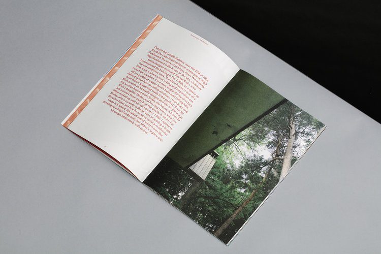
We’ve come across many creative publications over the years (our personal favourite was Zembla, a literary and arts magazine which ran from 2003 to 2005). What’s nice about this one is that there is no reliance on the visual clutter you see in most magazines and the content is allowed to breath. It’s also unafraid to variate the layout which is refreshing to see. The fact it was born out of the celebration of Scotland’s rich and diverse design and manufacturing tradition is even more important in a time when Brexit is still a sore subject within the design community on both sides of the border.
The pair plan to create three more issues based in Scotland with their “bank of stories that couldn’t fit in this issue” which aim to be less celebratory and more a critical piece on the state of Scottish design and manufacturing. We look forward to seeing how this publication will evolve. You can see more on the Vanguard website and on their Instagram account.
Milly's new edge
Sagmeister & Walsh has completed a rebrand and new visual campaign for New York fashion label Milly. The team has applied its rich and vivid art direction to create a campaign that will be produced in print, digitally, and across social platforms. Check it out below:
The fashion label is known for transforming classic silhouettes by merging American sportswear influences with distinctive Parisian atelier techniques. This new campaign aims to shift the brand with an aim to be bold, edgy and colourful. Sagmeister & Walsh’s redesign represents Milly’s evolution in personality, injecting a bolt of energy with the use of bold conceptual photography, while still maintaining the brand’s original look.
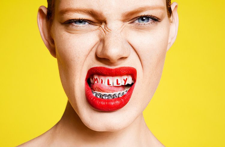


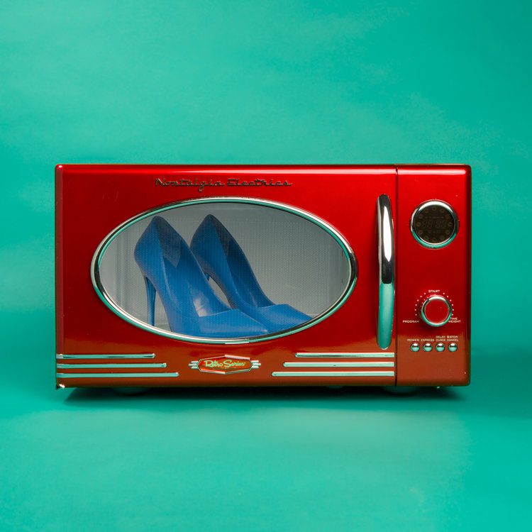
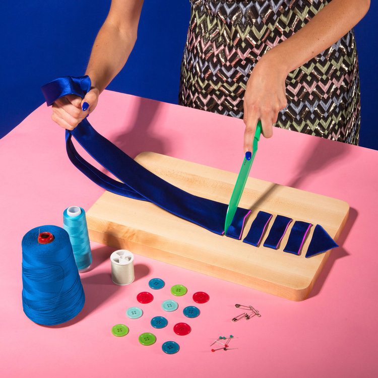
We’re big fans of Sagmeister & Walsh (especially the Appy Fizz campaign that was run in India earlier in the year). Their work is known for being quite bold and irreverent. What I like about this campaign is that takes the existing brand and is playful with it (the logo grows flowers, freezes over in ice and is even painted on a woman’s body). It goes to show for a brand to stay relevant, it needs to move with the times and Milly has (literally) embraced this in its campaign. It will be interesting to see the campaign evolve as it’s rolled out throughout the next year.
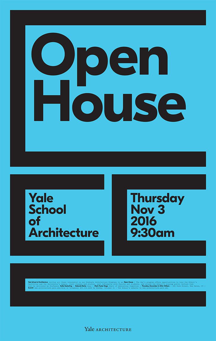
A new direction for Yale School of Architecture
After 18 years of designing posters for the Yale School of Architecture, Pentagram partner Michael Bierut is taking a different tack. Check out the new look below:
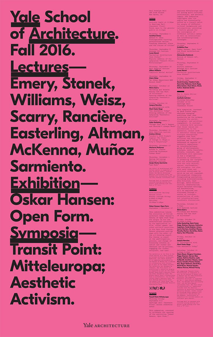
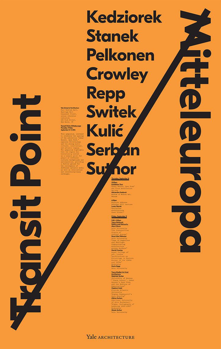

Originally the project aimed to mirror the architectural approach of the previous dean, Robert Stern. For the previous 18 years, this made for a hugely varied series with no consistent typeface where the only constant was that they were black ink on white paper.
Then architect Deborah Berke took over as the school’s first woman dean, and wanted to signal change and a new direction.
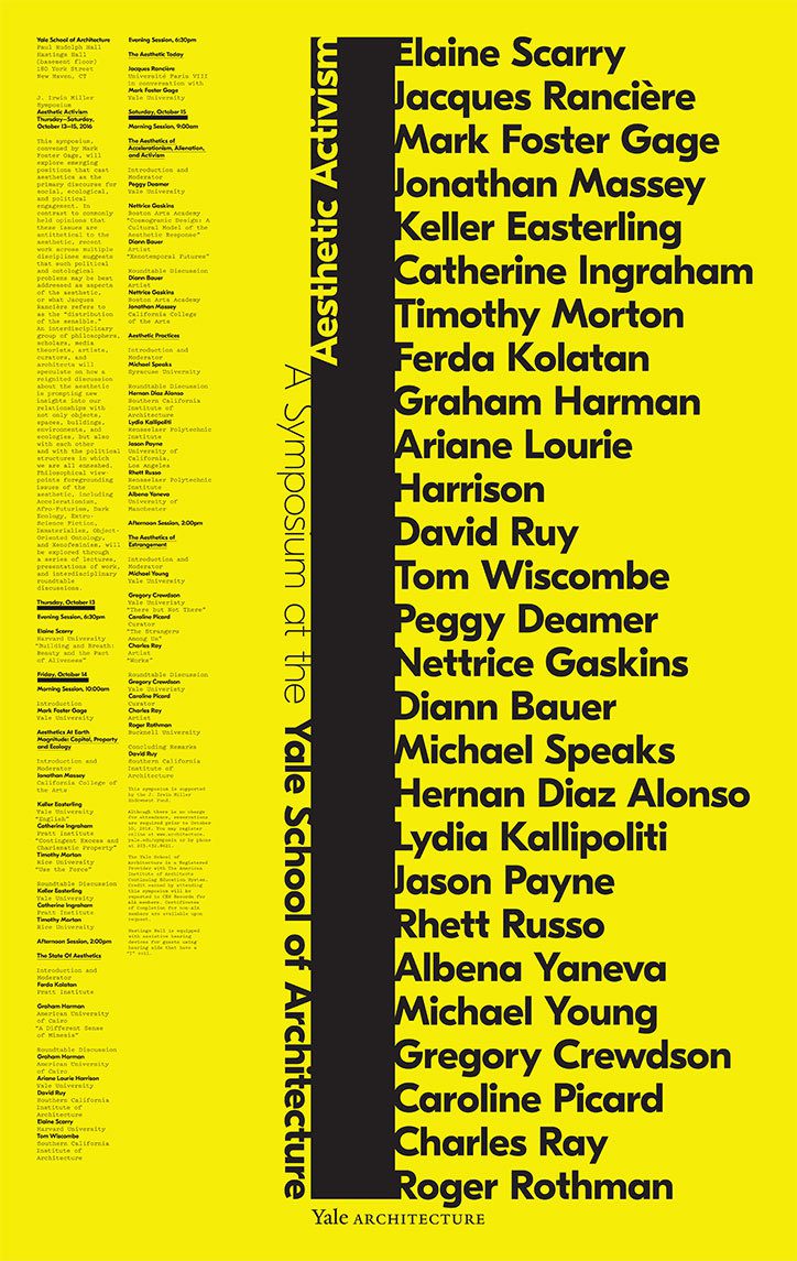
Michael was tasked with conveying this in the posters, and says the introduction of colour was his immediate first thought.
Another big change was that Deborah wanted to focus less on the name of the school, and more about the people involved in the events, so there was more typography. So in collaboration with Laitsz Ho, a designer at Pentagram, they introduced standard fonts for the first time: Eesti from Grilli Type, and Pitch from Klim Type Foundry. As for the logotype, this uses the official Yale typeface by Matthew Carter and is the only design constant.

As a lover of typographic design, the boldness of these new posters pleases me no end. They’re clean and minimalistic and allows the message these poster are conveying to leap out without the need for any additional visual clutter. Most educational institutions would shy away from such an approach with the insistence of inclusion of imagery of their students (or ‘learners’ as they now insist on calling them) so we applaud Yale School of Architecture for ‘breaking from the norm’.
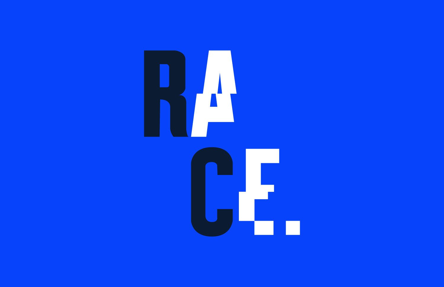
A Charity on a Mission
Established this year, Race Against Dementia is a charity with the mission to raise money to help find a cure to dementia. This charity was kickstarted by famed Formula 1 driver Sir Jackie Stewart, whose wife of 54 years, Helen, has recently been suffering from the brain disease. A new brand identity for Race Against Dementia has been designed by Brand Union. Check it out below:
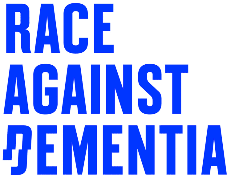
The logo’s condensed structure and rhythm is disrupted by the broken “D” that, in its italic depiction, alludes to racing, and in its disjointed appearance, represents dementia. It’s a surprisingly elegant and powerful combination that really works to convey multiple meanings. The custom font by Colophon Foundry is what gives the identity its strongest voice. It’s amazing what an impact that shift in each letter makes in creating a sense that something is wrong within something that’s so familiar.


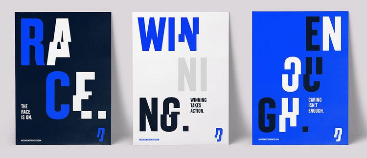

Personally, I think it would have been good to see this identity in use in real world application as it comes off a bit cold on its own. Ok, so the identity relies on archival images of the Stewarts to gives the charity a personal presence and build on the attraction to Formula 1. It also uses a hell of a lot of blue! But at least it has conceptual relevance as that was the color of Jackie Stewart’s car.
I think once the brand has been given time to work, it will become as synonymous with dementia as the Macmillan Green has with cancer. Dementia affected around 850,000 people in the UK last year and that number is rising fast. So a charity that is actively fundraising research to find a cure for this disease is definitely something I will get behind.
EXXXXXXXXTREME!
Officially launched at the Olympics in Rio, TTX (Table Tennis X) is a new version of table tennis initiated by the International Table Tennis Federation (ITTF), the governing body for all international table tennis associations, to attract younger players to the game. Check out the new brand created by Brand Union below:


The simple “T”s in the logo are offset by a wilder “X” that breaks from the baseline and x-height because it’s EXTREME! (TTX is meant to be super exciting with modified rules like sets being only two minutes long). The rise of X-this and X-that for extreme versions of normal sports has been around now for a couple of decades (BMX, FMX, etc) but it’s kind of fun to see it again. And the design of those paddles work really well with the understated single colour logo.
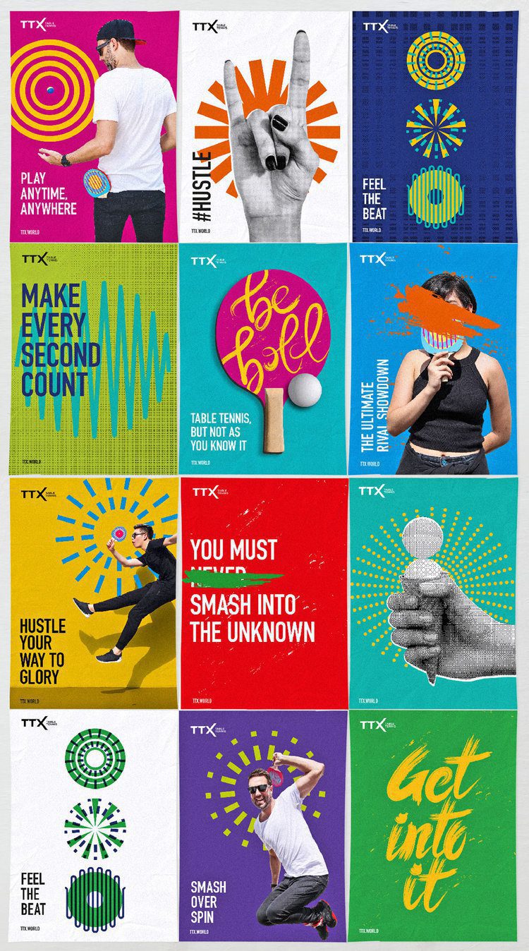

In application, they have gone for a more-is-more approach… and then took it a step further! Looking at it all together, it is a bombardment on the senses. I’m not sure what I should look at first! The halftone patterns? The squiggly lines? The radial motifs, brush lettering or silhouetted humans? Indeed, the only thing that ties it all together is the DIN Condensed typeface. I really liked how simple the brand was to start with but all of that simplicity has been completely lost in the noise. Lets hope as the sport evolves the brand can find its own tone of voice and roll with it.

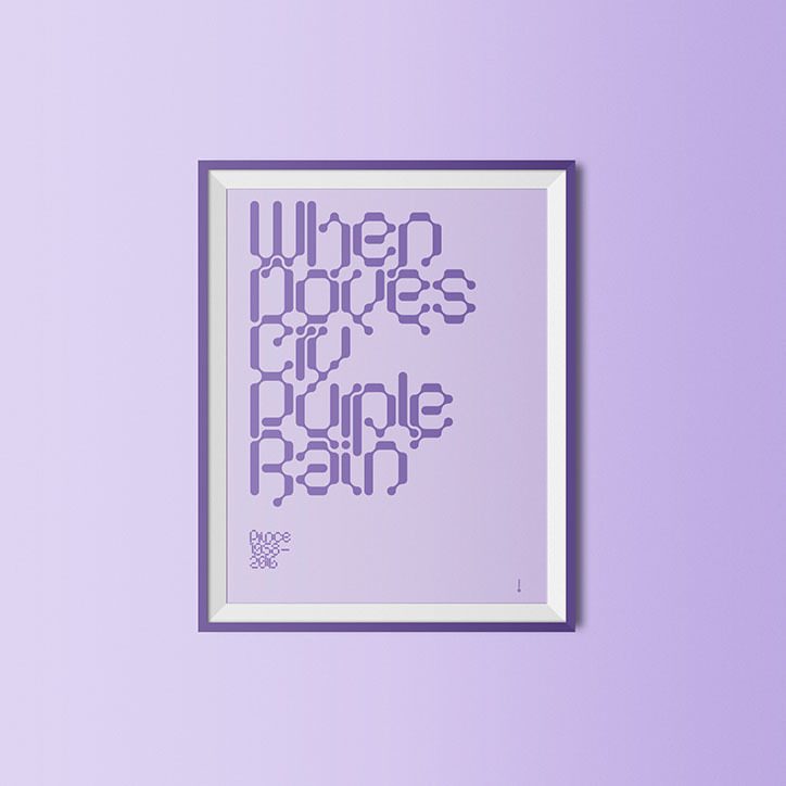
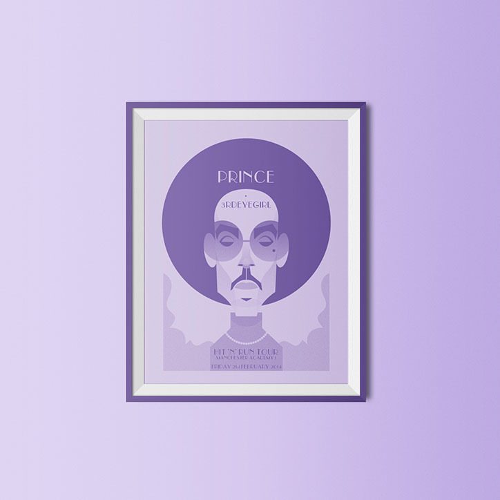
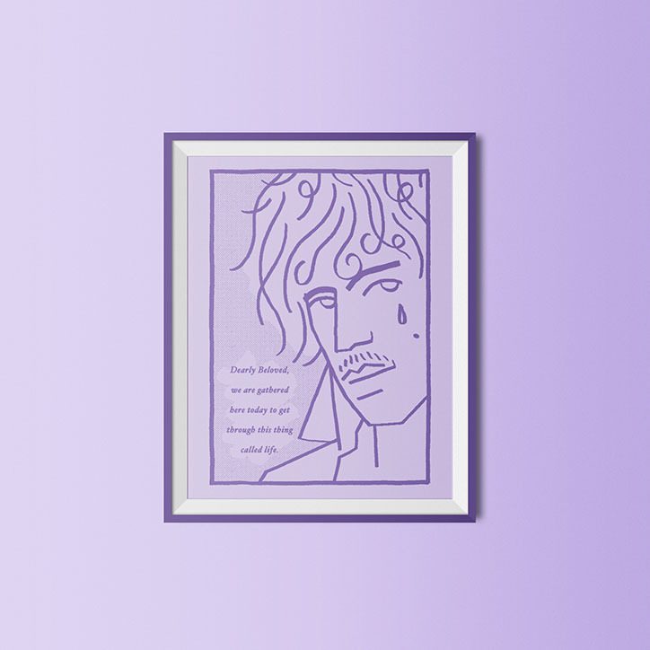
Purple Rain
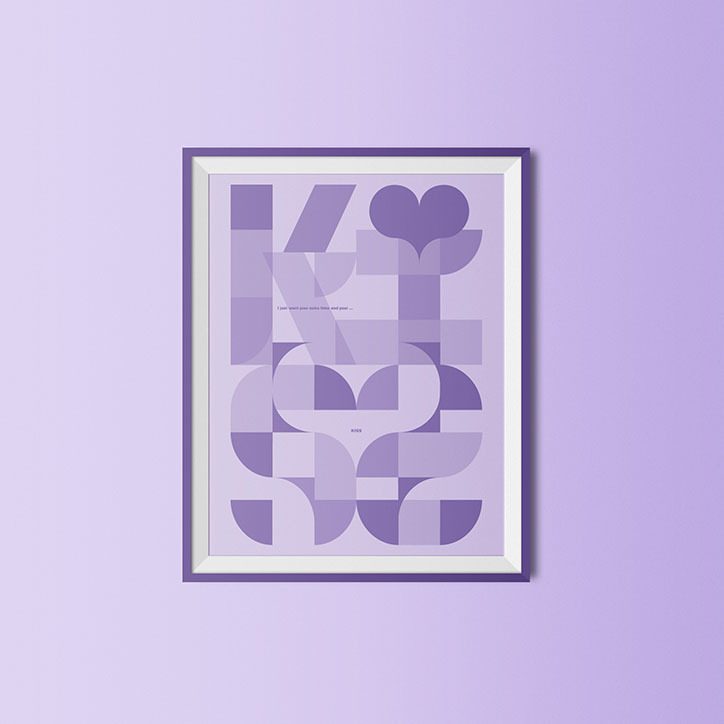
A new exhibition, titled Purple, is bringing together over 30 artists to celebrate the life and work of Prince, the musician who died this year aged 57. The exhibition will run for three weeks from 5 September at Fred Aldous in Manchester. Artworks will be available to buy online with all proceeds going to the local Manchester charity Back On Track which enables disadvantaged adults to make positive changes to their lives.
Check out some of the individual pieces below:

Garbett Studio: Purple
For more info about the exhibition, go to purplemcr.co.uk

British Fencing gets a new slice
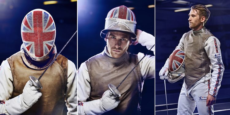
To coincide with Rio, British Fencing introduced a new identity to “reinvent its public perception and broaden its appeal to a wide range of audiences” designed by London-based We Launch. Check it out below:

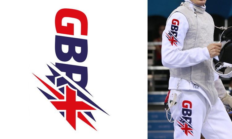
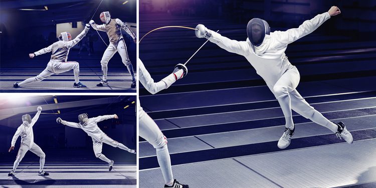
This new logo breaks away from any previous expectations we might have about what fencing logos should look like and introduces a bold, energetic, and dynamic logo that’s more Fast & Furious than Chariots of Fire. In case you’re wondering, the slashes through the wordmark isn’t random or has anything to do with Wolverine’s claws! The three swashes represent the three types of swords – Foil, Épée and Sabre – which unless you know your fencing, you never would have guessed it.
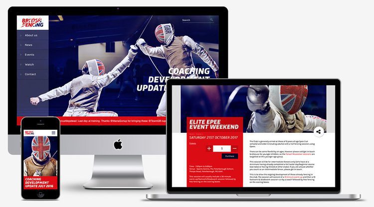
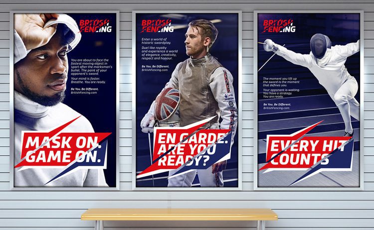
Where the slashes go too far is in the headlines in the application. It looks like a really aggressive speech bubble and, sure, it helps drive the point home, but is it really necessary? It seems like they went through all that effort on the typography and the photography, but then they threw it together on the advertising and used the speech bubble as a ‘quick fix’.
However, I must admit, the version of the logo with the Union Jack is pretty bad-ass!
Back to the Futura
Over the last few years Logitech has been working hard to reinvigorate itself and its products, and now they've launched a new logo design and brand identity to match.
Created by DesignStudio, Logitech's vibrant new logotype – which will appear across their existing products and the new Logi line – is based around geometric shapes and pays homage to classic typefaces. Check out the rollout below:

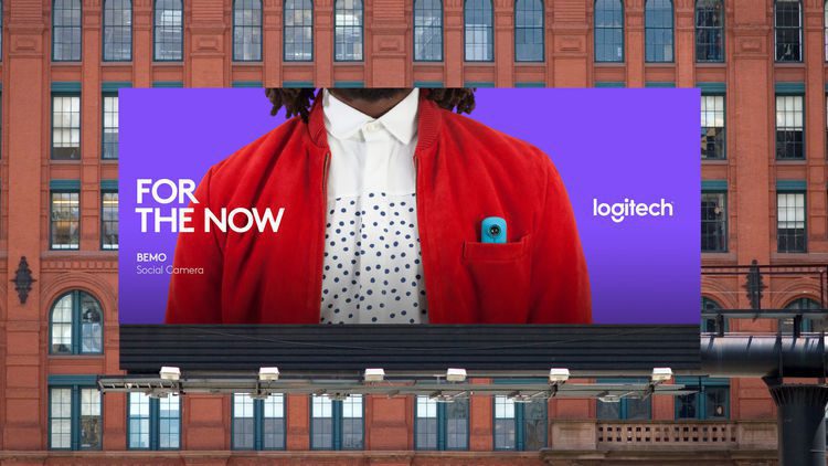


Now maybe you could say we're big fans of DesignStudio as we featured their work on the Premier League rebrand previously. As you can see, the rebrand for Logitech has been given a similar treatment. The striking, high-contrast colour schemes aim to appeal to a younger audience, who were previously unrepresented in the company's branding.
The main feature is the Brown Pro typeface that features prominently. Designed by Aurèle Sack from Lausanne, Switzerland, the birthplace of Logitech, the logo also takes inspiration from Paul Renner’s experimental sketches for his now classic modernist typeface, ‘Futura’. This continues the trend we keep seeing of late. By using bold sans serif typefaces, the brand becomes more flexible and responsive on multiple touch points.
No doubt DesignStudio will continue to evolve the company's image as they work with Logitech on art direction and guidelines. Expect to see the new identity appear in shops and packaging very soon.
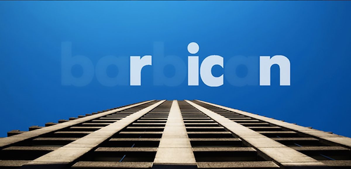
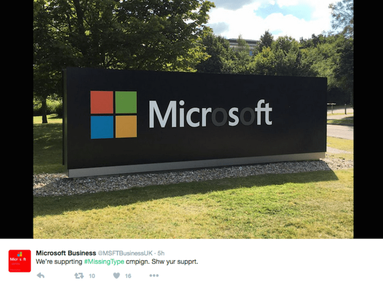
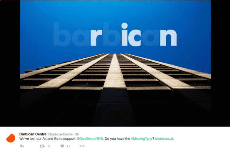
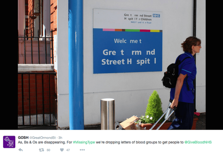
Missing Type
Last year, NHS Blood and Transplant launched Missing Type, a campaign where major brands including Odeon and Waterstones removed the letters A, B and O from their logos to emphasise the absence of donors for those blood types. Check out the film below, created by ad agency WCRS, explaining the campaign in more detail:
This inventive approach garnered a lot of attention so the NHS is running an updated version this year, with new corporate partners including Microsoft, Royal Mail, and Paddy Power. Many of these, as well as institutions such as Great Ormond Street Hospital, are sharing images of their new-look logos on Twitter. Here’s a selection:
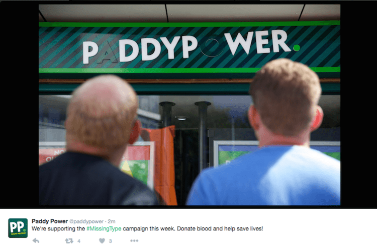
Powerful stuff!
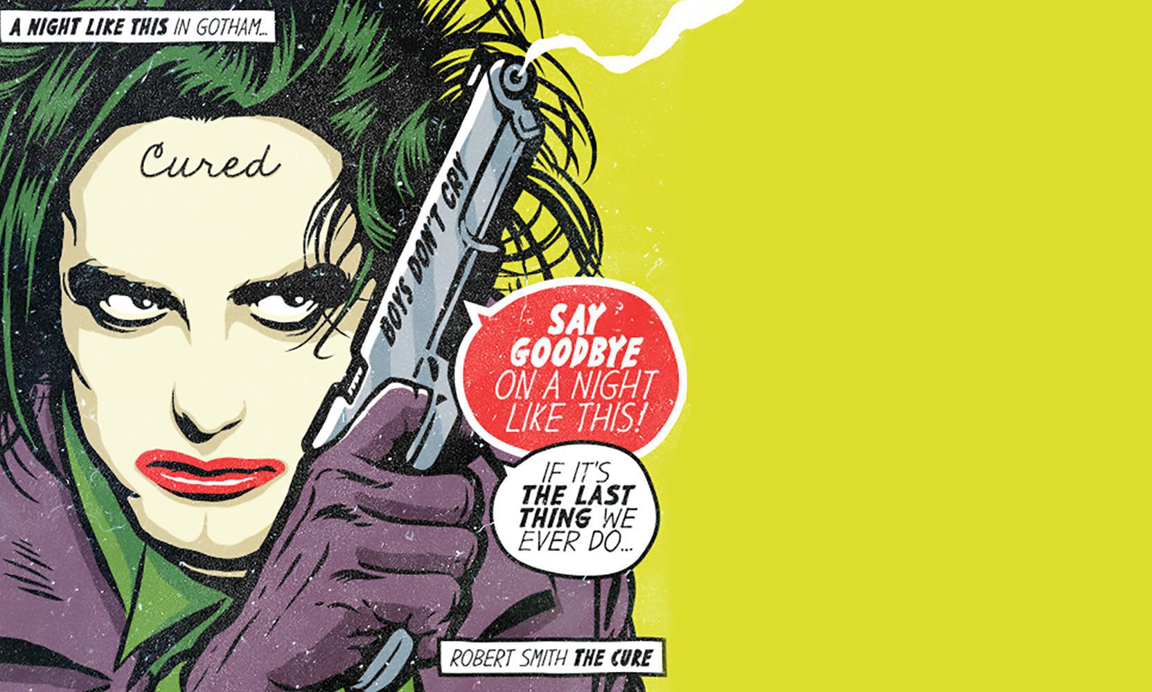
Post-Punk Supervillain Squad
Some of the biggest post-punk music icons become a supervillain squad in this stunning set of posters by Butcher Billy. Check out the video below:
Considering Butcher Billy’s wild streak (having already created pop art prints that blended Charles Bukowski quotes with the distinctive stylings of Roy Lichtenstein), pairing post-punk legendaries with comic book baddies seems like a logical leap. The set of 12 characters sees the likes of Blondie and Robert Smith merge with fictional favourites such as Harley Quinn and The Joker. Check out a selection of these below:


All of these are stunning but my personal favourite (being a fan of The Cure) is Robert Smith as The Joker. The lyrics are a perfect fit with the character and as one who has not seen Suicide Squad yet, this seems more in line with Heath Ledger’s Joker from The Dark Knight or Alan Moore’s graphic novel The Killing joke.
Overall, a great piece which further fuels the 80s revival of late. Long may it continue.