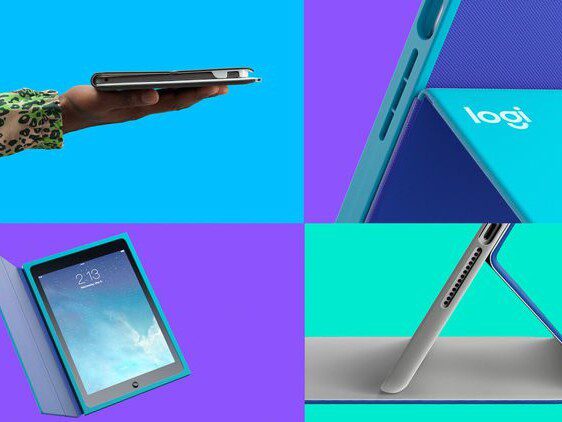
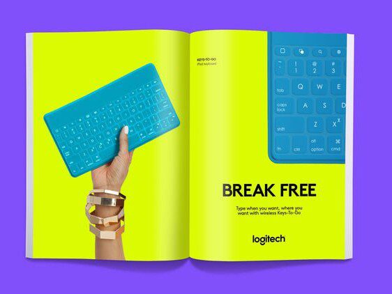
Over the last few years Logitech has been working hard to reinvigorate itself and its products, and now they've launched a new logo design and brand identity to match.


Created by DesignStudio, Logitech's vibrant new logotype – which will appear across their existing products and the new Logi line – is based around geometric shapes and pays homage to classic typefaces. Check out the rollout below:


Now maybe you could say we're big fans of DesignStudio as we featured their work on the Premier League rebrand previously. As you can see, the rebrand for Logitech has been given a similar treatment. The striking, high-contrast colour schemes aim to appeal to a younger audience, who were previously unrepresented in the company's branding.

The main feature is the Brown Pro typeface that features prominently. Designed by Aurèle Sack from Lausanne, Switzerland, the birthplace of Logitech, the logo also takes inspiration from Paul Renner’s experimental sketches for his now classic modernist typeface, ‘Futura’. This continues the trend we keep seeing of late. By using bold sans serif typefaces, the brand becomes more flexible and responsive on multiple touch points.

No doubt DesignStudio will continue to evolve the company's image as they work with Logitech on art direction and guidelines. Expect to see the new identity appear in shops and packaging very soon.