Life in Lockdown: Working from home in a crisis
With the Coronavirus pandemic turning our world upside down, we thought it would be good to get a snapshot of life under lockdown. Our creative director David Huskison gives us an insight into what his new normal looks like.
What a difference a month can make! Words that we never thought we’d have to utter in our lifetime have become the new norm around the dinner table. Words such as “social distancing”, “self-isolation” and “global pandemic” sound like something out of some cheesy Saturday night disaster movie. It has now become our new reality.
40 days in (at the time of writing this) and we’re finally starting to get used to the situation we’ve found ourselves in. So what does the new normal look like in a house that is now an office, a school, a gym and (at times) a virtual pub? Here’s a snapshot of life in isolation.
PE with Joe
As soon as Boris Johnson announced that we should work from home if we can, both myself and my wife decided to shut down our offices and implement home working. So, we have been home schooling our son Sam for a few weeks now. We have several workbooks and school activities for him but in the new normal, we found a sound, structured routine hard to stick to, especially as the days and weeks started to drag on.
This is where P.E. with Joe has really been a blessing. Every weekday morning at 9am is a half-hour P.E. Session with Joe Wickes, which, over time, Sam has become more engaged with. His favourite day was last Friday where it was dress-up day. Working out in a full Spider-Man costume complete with mask has been by far one of the highlights of the last few days. I’ve promoted myself from spectator to participant in the sessions and I’ve even got the old exercise bike out and have found it a great way to start the day. You never know, after life starts getting back to normal, I may even join a gym!
Draw with Rob
As you may have guessed by now, our new normal seems to revolve around the small person in our life! When I saw Rob Biddulph on BBC Breakfast announcing he was releasing drawing classes every Tuesday and Thursday at 10am, this immediately became part of the new normal.
It is amazing to see how far Sam’s drawing skills have come along in such a short time and how Rob has inspired him to seek out more tutorials online so he can perfect his drawings. In case we didn’t know already (which we did) the lockdown has definitely shown us that we have another creative in the family!
Stream and chill
Browsing through Netflix one day I came across I Am Not Okay With This. So I thought I’d give it a go. I was pleasantly surprised, which I really shouldn’t have been after learning it was created by the producers of Stranger Things and the director of The End of the F***ing World (both of which I’d highly recommend if you haven’t seen them). Think Carrie meets The Breakfast Club and you’ll get an idea of what this show is like.
Another series I’ve been streaming is The Mandalorian. Having watched everything other than The Rise of Skywalker, I went into this with caution. Bearing in mind the last Star Wars film I watched that I was truly impressed with was Rogue One, I wasn’t sure how a series of half-hour episodes would stack up. Turns out that Jon Favreau has created a rich and detailed story. For a character that never removes his helmet, you find yourself invested in his adventures with Baby Yoda!
And of course, I’m saving up the third season of Killing Eve so I can binge watch it in one sitting.
Essential tunes
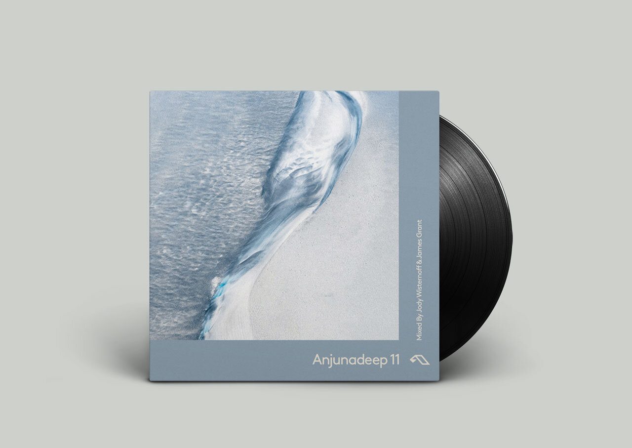
As well as the regular dose of BBC Radio 6 music, I’ve taken the opportunity during time at my desk to sample some new tunes from different artists, some who already feature on my regular playlists, others who aren’t normally on my release radar. Here is a sample of some of the albums that have been on shuffle in the home office:
Staying in is the new going out
I could probably count on one hand and have fingers left how many pub quizzes I’ve been involved in over the years. It’s not normally my scene. But with the lockdown taking its toll (we’re on our third jigsaw… another hobby I’ve taken up) when freelance copywriter Dan McCalla gave us the opportunity to participate in a virtual pub quiz, we jumped at the chance. This has now become a regular Saturday night activity, complete with alcohol and snacks. I’ve even ended up on a Thursday night football quiz night!
And of course working… from home
It’s not all been Netflix and chill. There’s been plenty to keep me busy. As you can imagine, a lot of our client work of late has been focused on the pandemic. This has included leaflets, social posts and PowerPoint presentations for virtual meetings, covering everything from promoting medical products through to contact tracing proposals.
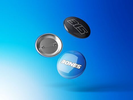
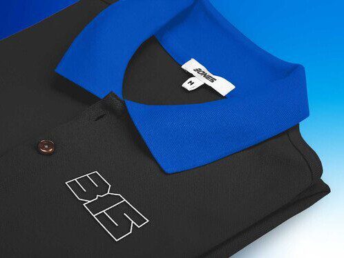
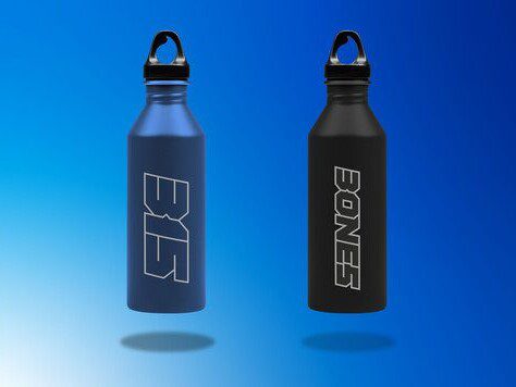
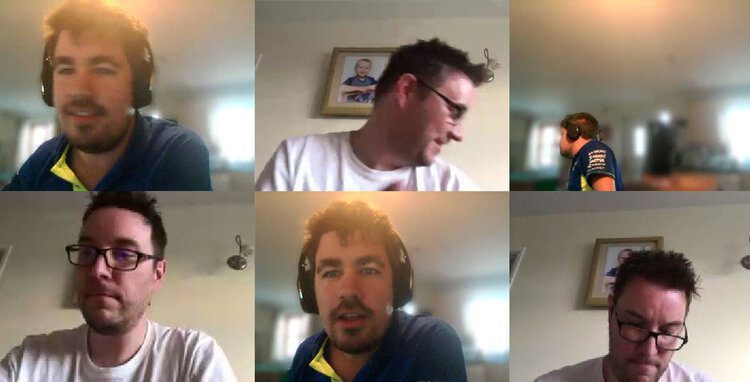
As well as this, there have also been a few branding projects to keep the creative juices flowing, including some development work for a new brand for a local racing driver. Here is a sneak peek at some work in progress.
Being isolated brings us closer together
One of the toughest parts of the lockdown has been not being able to see friends and family. But just because we’ve not been able to physically go round, it’s not stopped us from seeing them virtually. This is where FaceTime has been a blessing.
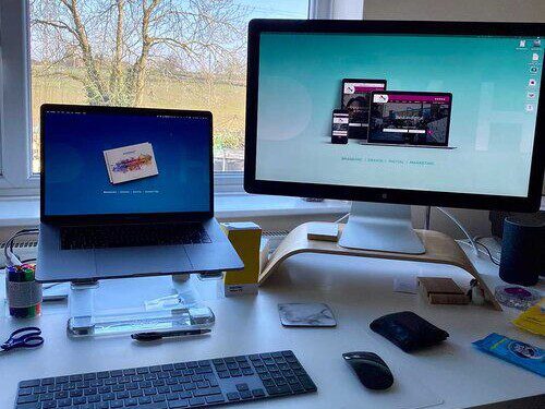
Rarely have I used FaceTime in favour of either Skype or Google Hangouts for work, but with the home office set-up, it’s enabled us to get the whole family on a group FaceTime on screens big enough to fit everyone in. It’s important in these strange times that we keep in contact as much as possible, especially so that Sam can see his grandparents and we can keep in contact with my niece, who is working on the front line with COVID-19 patients.
That is probably the biggest takeaway I can give you from this article. It’s more important than ever that we find a way to keep talking to one another. Just because we are either self-isolated or socially distancing, doesn’t mean we are alone. We need to work on our mental health as much as our physical health in this crisis. This can range from picking the phone up, setting up a video network or simply sending a tweet! As long as we can keep communicating, people will know that we are still there for each other. As the great Captain Tom Moore said:
“For all those finding it difficult: the sun will shine on you again and the clouds will go away”
So, stay home, stay safe and keep washing those hands!
Business as usual(ish)
Following government advice, the DWH team will be working remotely until further notice to prevent the spread of COVID-19. We see this as an essential part of our corporate responsibility, and nothing is more important to us than the safety of our staff, clients, and the public.
We are still fully operational and committed to providing a business-as-usual service to support our clients during this difficult time. By making use of virtual meeting tools such as Skype, Zoom and Google Hangouts, we can continue to meet with our clients in a safe yet personal manner, allowing us to better understand their needs.

The DWH team has been implementing remote working for a week already, giving us a chance to iron out the kinks, fix the technical issues and get accustomed to the new setup. We’re currently staving off cabin fever through endless cups of tea, Netflix-based lunch breaks and (for the lucky few) homeschooling the kids.
If you’re going through a difficult time with your business during the pandemic, please reach out to us via phone, email or Google Hangouts and we’ll do everything we can to help.
In these hard times, it’s important for small businesses to take care of each other. We are happy to provide more flexible options due to the uncertainty of the coming weeks, and will provide as much support as we can.
We’ll get through this together if we stay sensible and follow all necessary precautions, no matter how difficult they seem. The more careful we all are now, the quicker we can put the coronavirus pandemic behind us. Until then, DWH will continue to operate remotely for the foreseeable future.
Thank you to everyone for your continued support and understanding.
Stay safe, stay at home, and wash your hands!
The DWH team
Telling my story
In the first in a series of blogs, our Founder and Creative Director, David Huskison, tells us about his journey from agency freelancing to agency founder.
If anyone asks me ‘When did you decide to start your own agency?’, my honest answer would have to be… I didn’t!
Back in 2016, after years of contemplating going alone, I finally decided the time was right for me to venture out of my creative agency comfort zone and try something different. The original idea behind DWH was to be the trading name for my new career in the world of freelancing. So imagine my surprise when my first meeting was not at an agency, but for an internal comms piece for my first client!
While working on this piece, I was introduced to my first agency gig and I soon found myself surrounded by the familiar settings of agency life. This was a good way to start establishing myself as a freelance designer. It was also a good opportunity to start experimenting with taking on work outside my comfort zone.
Marketing in the making
I hadn’t been freelancing long when Global Health and Beauty (another one of my new clients) enquired about some social media marketing. This was when Jonathon Bright came on board. Having met while I was still working in my first job (which I held on to for 13 years!), we had stayed in touch and have been friends for almost a decade. This made it easy for us to work together on this project.
The project lasted for six months and during that time we generated some great results for the client. At the time, we had no idea how important this marketing experiment was going to become.
Our first pitch
In early 2017, Jonathon spotted an opportunity to pitch for a new website project for a local digital recruitment firm. Upon submitting our proposal, I found myself in my first project pitch with Sheba Karamat at Opilio Recruitment. I had done my research and went in with a bold suggestion of not only a new website, but whole a brand refresh.
They must have liked what they heard as before long I found myself working at their offices for four solid weeks working on the project, which had evolved to include brochures, email templates, business cards and social media graphics. I ended up rolling out a whole new look and feel for the entire organisation, which included their executive search arm.
Opening the door
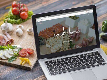
Around the time the Opilio project was finishing, I was approached by one of my old agency clients to create a new website for their catering business, Benjamin Lauren, based in Cheshire. This would end up as just the start of a long client relationship that quickly expanded from a design-and-build job through to content creation and social media marketing.
Little did we know that this would get our foot in the door at Abbeywood Estate. In 2018 we were approached to handle Abbeywood’s social media marketing, which would soon expand in to a new wedding brochure, a new website, content population and a PPC marketing campaign!
The shift in the tide
With the additional work for Abbeywood on top of the agency work I had on already (I now had three agencies on regular retainers), I found myself in the position where I needed additional support. Enter James Cadby.
He is a Warwick-based freelance designer who I was acquainted with through Jonathon. He started working with us on the Abbeywood project initially (including producing some stunning watercolours), but very quickly, with the acquisition of my next client, he became an essential part of what DWH was becoming.
In March 2018, I was contacted by Sheba, who had now left Opilio. She wanted to talk to me about a new venture. We discussed the name, the brand, the visual language and her long-term growth plans. This conversation was the beginning of Coin Rivet, a new cryptocurrency news website that aims to provide information, analysis, opinion and insight from the world of blockchain.
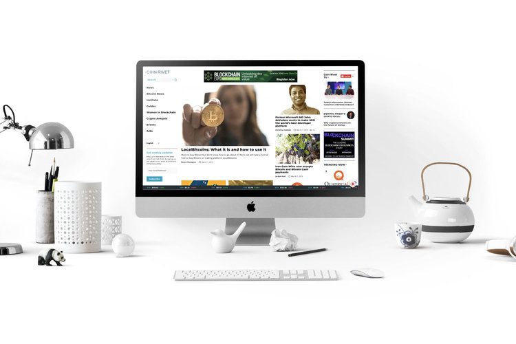
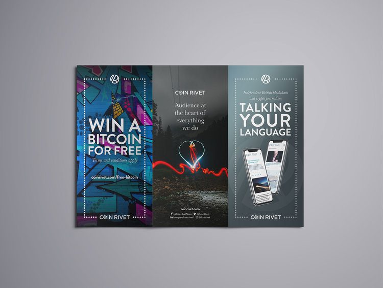
The brand and website was only the beginning of the journey. From this one project, we are now the preferred agency partner for Coin Rivet and their subsidiaries, as well as for their trading partners Luxon Payments. It quickly became apparent that even with the additional support I had put in place, the sheer amount of work I now had on a regular basis was becoming unsustainable on my own.
As a result, I made the decision in late 2018 to expand the business. DWH had now become an agency!
The future
So far in 2019, we have won five new clients, employed our first full-time member of staff, and expanded our team to include PPC marketing specialists, copywriters and web developers. We are currently talking to more prospective leads and for the first time are actively seeking out new business.
So, to go back to the original question of ‘When did I decide to start my own agency?’ the answer is I didn’t… but then again, if I had, it would probably be a much different agency to what it is today. I would have made a lot of decisions based upon my current skill set. So by not deciding to start an agency, DWH has been allowed to naturally evolve into something that was waaaay outside of my comfort zone!
But that’s the point! DWH stopped being about me a long time ago. It is an idea that a branding agency should be about more than the way something is designed. It’s about more than your marketing. It’s about more than copywriting. More than a website. More than the way you answer the phone, send a tweet or write an email. It’s all of these things and more, all working together to create a brand story.
So what’s next? To carry on doing what I love and love what I’m doing! Even after all these years, it still amazes me that I have made a career out of something that is so much fun!
Modern Retro
Following the recent re-release of the iconic Nokia 3310, colorware have announced the iPhone 7 Plus Retro, which harks back to simpler times with a paint job taken from the original 1980’s Macintosh. Check it out below:
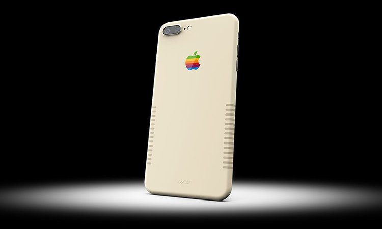

Complete with the original rainbow Apple logo, and dark beige edge stripes, colorware’s limited edition model incorporates the functionality of an iPhone into a device that has all the design hallmarks of 80’s pop culture.

The phone is only available for a limited amount of time, and if you’re lucky enough to own one of the first 25 made, your device will come with it’s own number of authenticity.
I so want one of these!
Pass the Heinz
If you were one of those Mad Men fans that felt that some of the fictional ad campaigns created in the show were better than any we’ve seen in real life, then you’ll be pleased to hear that one of them has crossed out of the world of TV into the real world (specifically onto the billboards of New York).
The campaign in question is a set of print and poster ads for Heinz ketchup that Jon Hamm as Don Draper pitched during a 2013 episode of the series. Draper pitched a daring ad campaign to Heinz execs, for the brand’s ketchup, that proposed not showing the product at all. Instead, the ads would show close-ups of foods that go great with ketchup—french fries, a cheeseburger, a slice of steak—but without any ketchup in sight.
Draper’s idea was rejected in the show, but now at last it is being given its time to shine having been brought to Heinz by ad agency David. Check it out below:


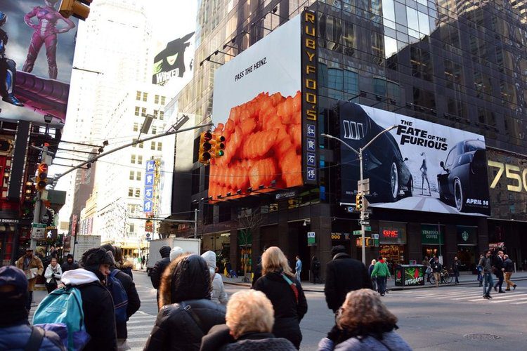
In recognition of its full co-opting of the Mad Men idea, David has listed fictional agency Sterling Cooper Draper Pryce alongside its name in the campaign credits. The campaign is only enjoying a limited run as it is mostly a PR stunt, but the simplicity of the ads’ message means they will still resonate with those who’ve never seen the show.
Well played Heinz! Now let’s see if any more of Don Draper’s ad concepts make it into the real world!
Let's Get Together
It's Friday! And not just any Friday... it's St Patrick's Day! Time to kick back and get a pint of the black stuff. Which leads me to the subject of today's blog.
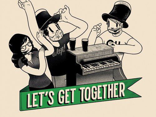
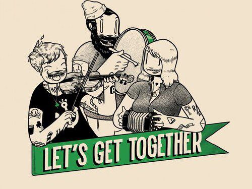
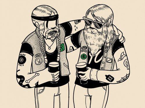
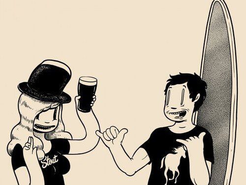
Guinness has released a new campaign based around the tagline ‘Let’s Get Together’. Artist McBess was commissioned by agency Iris to bring the idea to life. Check it out below:
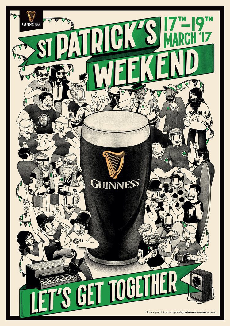
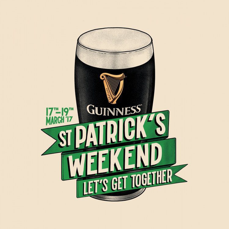
McBess’ character design is instantly recognisable (you can check out more of his awesome work on his website) and his monochrome palette is a perfect fit with Guinness. For this campaign, McBess has drawn a host of figures enjoying the craic, alongside referencing some other familiar aspects of Guinness’s previous visual identity and communications work – from the toucan, to the surfers and ‘sapeurs’.
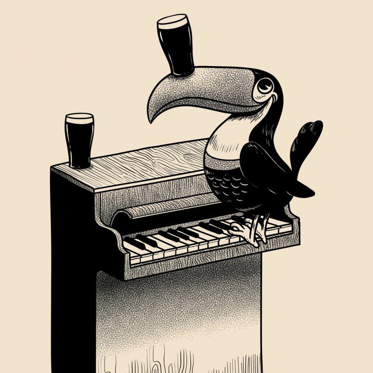
McBess’ work will feature anywhere that a pint of the black stuff can be purchased, as well as on new beer mats, T-shirts and displays. So for research purposes I’m off to the pub!
Have a great St Patrick’s Day weekend everyone!
Forget Me Not
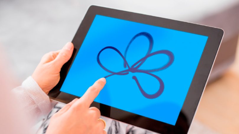
Today's blog is not only a brand review, but it's also a way of raising awareness for a charity I have supported for many years. Established in 1979 (which coincidently was the year I was born), the Alzheimer’s Society is a care and research charity for people with dementia and their carers. Many of the 25,000 members have personal experience of dementia (myself included), as carers, health professionals or people with dementia themselves.
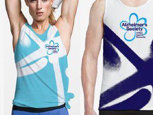
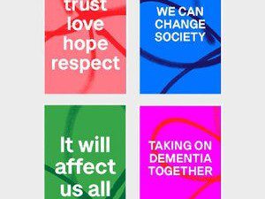
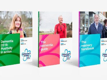
The charity aimed to ditch the previous “cold, clinical, passive” look with a new, vibrant visual identity system. London-based consultancy Heavenly created this new identity, alongside McCann London who are currently working on a new marketing campaign, which will launch in April this year. Check it out below:

The new system incorporates a forget-me-not flower emblem applied as a spray paint effect graphic element and introduces pop-art inspired colourways as background floods in the identity. The question people may ask is: what does graffiti spray painting have to do with dementia? As soon as I saw this I got the rationale immediately. As Heavenly managing partner Fi Case explains: “Because a lot of people affected by dementia lived through the 1960s and 1970s, our identity was a nod to pop art, bright, vibrant colours. We chose colours which resonated the most with people with dementia.”
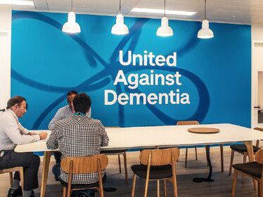
The previous strapline of “Leading the fight against dementia” has been replaced with the shorter, snappier “United against dementia”. The idea behind this new statement is a rallying call to “make Alzheimer’s everyone’s problem” and to rally for a “movement to galvanise opposition”.
A new typeface was also designed called A S Lettera. It is based on Neue Haas Grotesk, but adapted to make it accessible for those with dementia and those with impaired vision.

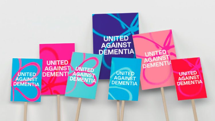

The previous identity adopted a green and blue colour palette… on everything! I still have memories of five years ago running the Birmingham Half Marathon for the Alzheimer’s Society in my green and blue running top surrounded by a sea of people in the same top. Seeing the new expanded colour palette is a welcome change which helps the brand look less cold and corporate (and I’d be happy to run a half marathon in those new tops).
From office spaces and literature, to placards and mugs, you can see how well the new system rolls out and how it works as individual pieces as well as a suite. Overall it is a welcome update for a brand that was starting to look a little dated. What I like about the new identity is that as well as targeting potential volunteers and corporate sponsors, it directly speaks to the people who are affected by dementia in one form or another, no matter what their age.
Now for the charity plug: if you would like to get involved with the Alzheimer’s Society you can check out their upcoming fundraising events on their website. Alternatively, you can make a donation here.
The Power of II!
Who doesn't love BBC Three? Known as the home of comedy, pioneering documentaries and infinite repeats of Family Guy, I for one was a little saddened when the channel moved from broadcast media to purely online platforms. I was also a little critical at the time when the move prompted a logo change that, to me, felt a little imbalanced.
They created this kind of cool representation of using the roman numerals for three by replacing the third numeral with an exclamation mark. But then they shoehorned the BBC logo on top of it and placed it in a magenta box which created all sorts of problems regarding spacing and flexibility. You can see what I mean below:
Following in the wake of this controversial new logo design for BBC Three which has now been around for just over a year, Studio Output has introduced a brand refresh to build on that redesign and tweak the channel’s online platforms to make it more relevant for the digital world it now lives in. Check it out below:
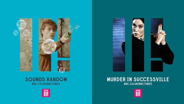
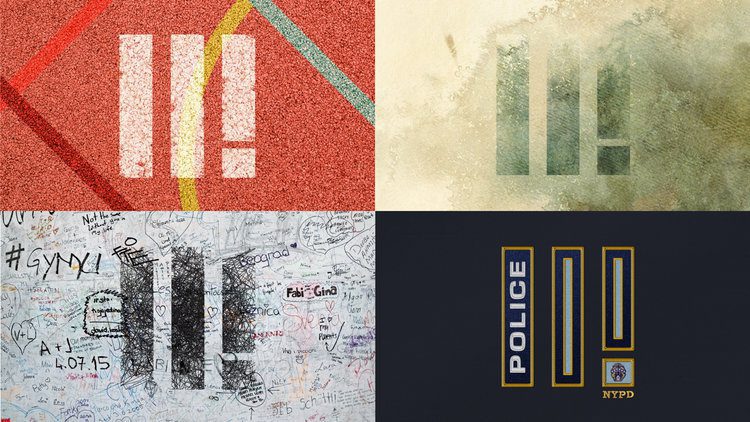
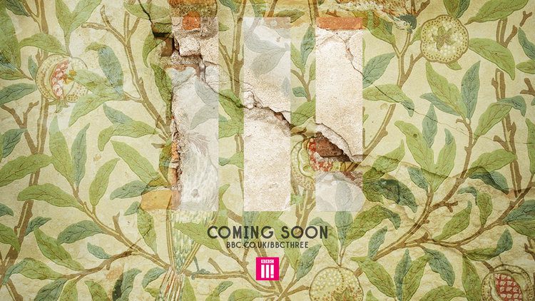
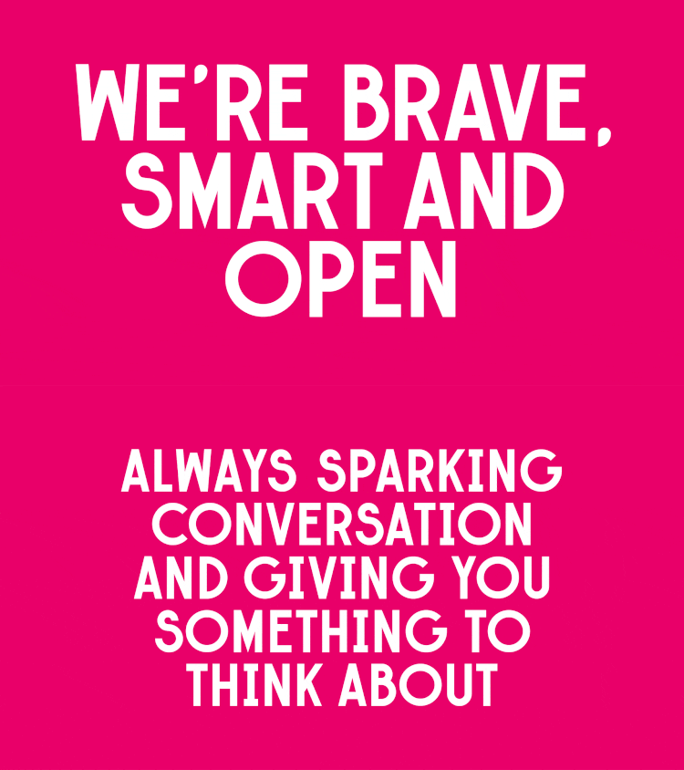
The beefed-up brand is “brave, smart and open” according to Studio Output. By introducing a simple but flexible system, it allows a range of expressions across all touchpoints, from social through to broadcast. This system retains a distinctive identity while promoting a huge range of themes.
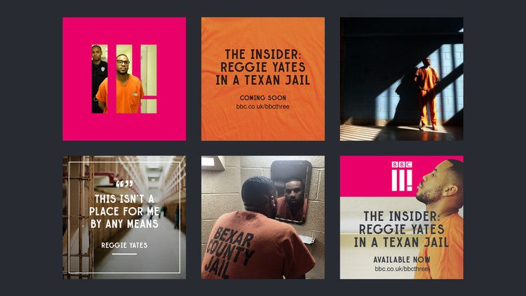
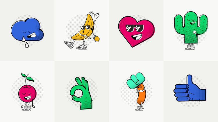
As well as refining the channel’s visual toolkit, the refresh also aims to define BBC Three’s character. Having been through a few iterations (remember the original Aardman characters from when the channel was first launched?), the brand has proved to be a confusing channel to create content for. Thanks to workshops with people behind the channel, Studio Output created a range of memorable characters which you can see below:
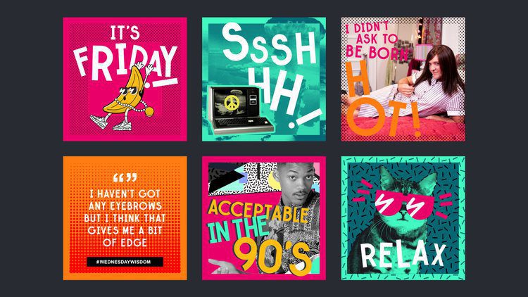
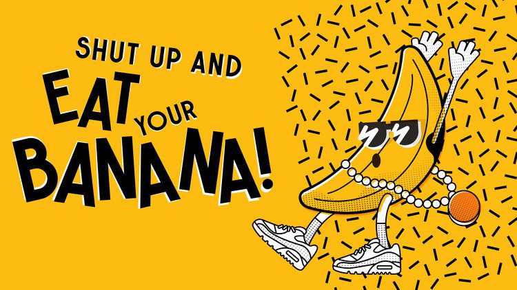
For me this brand refresh solves two of my biggest criticisms about the logo. First, for the most part, it does away with the BBC ident and uses the II! (or ‘Tricon’ as it is now called) independently as a graphic device which I think is a smart move. It frees this up to do its own thing.
The second improvement is it is no longer constrained to a box! Now liberated from this shape, it becomes flexible enough to use as a window through to an image or as part of a pattern on a larger image as demonstrated earlier.
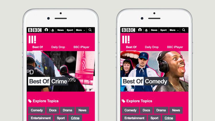


As BBC Three is now a digital brand that lives online across the BBC online portals and social platforms, it makes sense that the new guidelines reflected this. So rather than a static set of guidelines, Studio Output built an online hub which introduces the new brand and helps people to use it. This means that up-to-date downloadable assets are always to hand, alongside examples showing how to express BBC Three’s distinctive character.
Overall, this is a massive improvement on the original brand work and demonstrates a brand that is unafraid to flex its power online… and on montages!
Eye Candy
If you think opticians you immediately think Specsavers, Boots or Vision Express in the UK. However a stunning piece of Swedish design caught my eye recently (see what I did there).
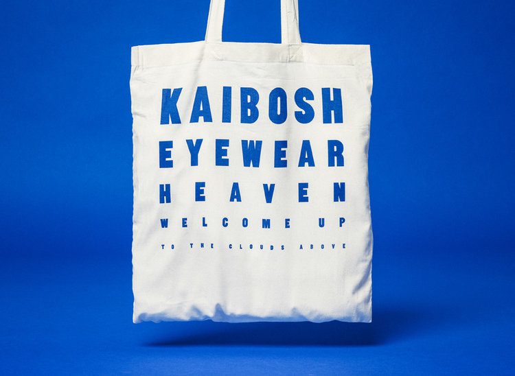
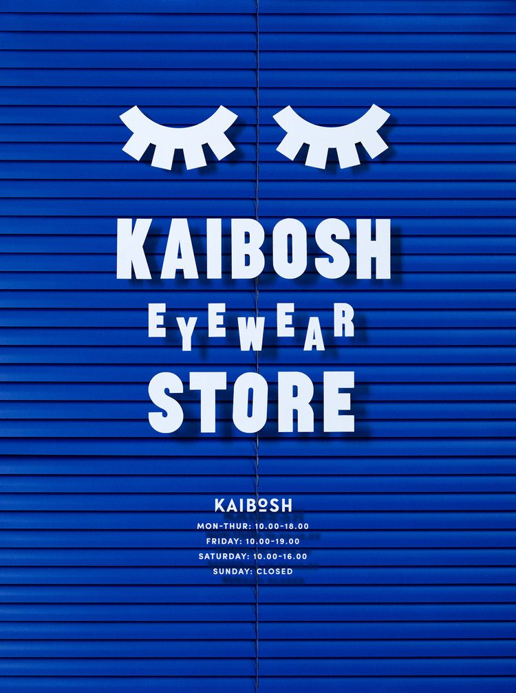
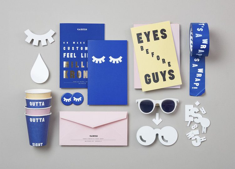
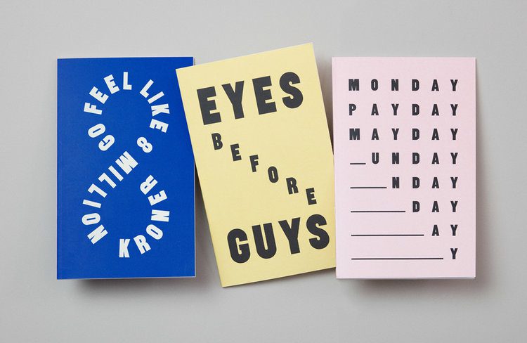
Design agency Snask has created a playful new identity for Norwegian eyewear company Kaibosh while still retaining the existing logo. The project encompasses a new brand identity, store fit out and a campaign launch. Snask developed a custom typeface and a series of bold icons that appear as recurring motifs throughout the brand.
Normally I would show a few pieces before going into a bit more detail and then give my opinion, but in this case I will just leave the work to speak for itself:



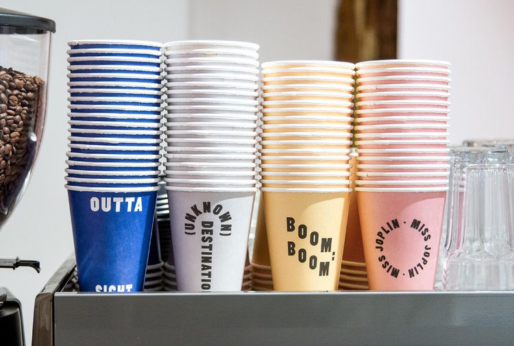


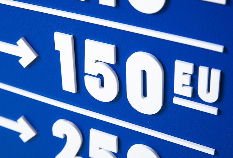
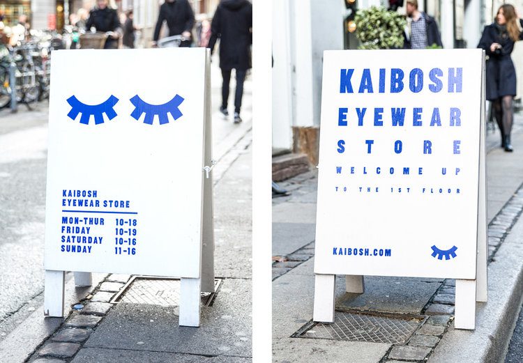
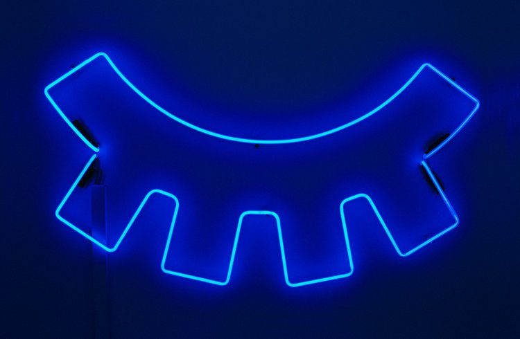
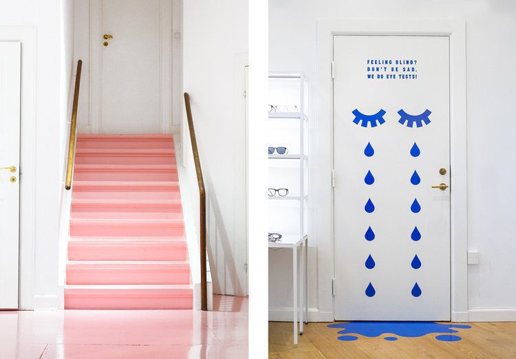
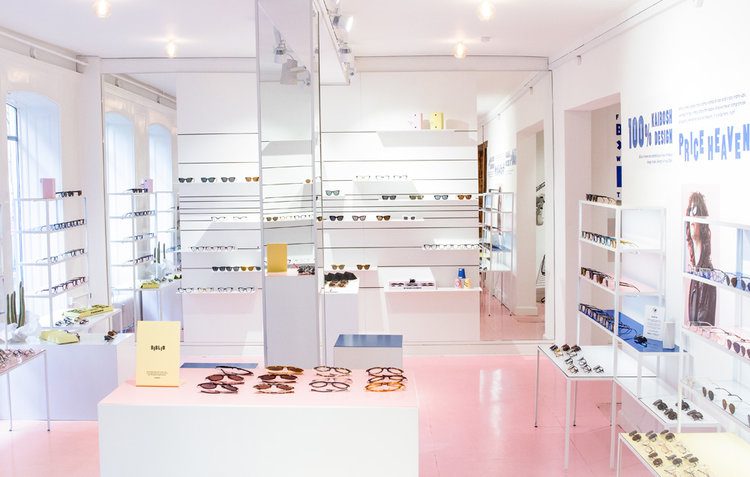
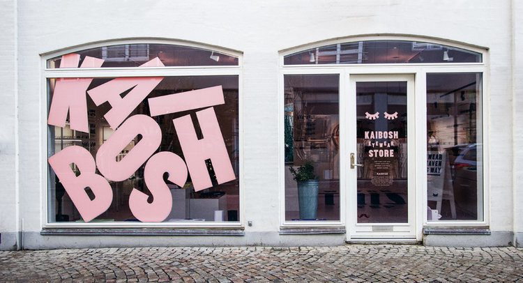
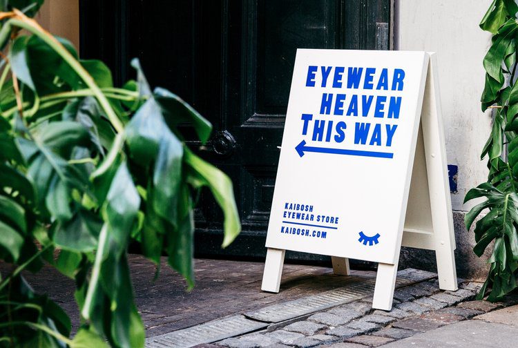
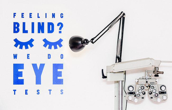
Why can’t my opticians as awesome as this?
V for Vibrant
Well I'm back on the blog! It's been a really busy couple of months, hence the lack of activity on the blogging front. But with Spring finally deciding to make an appearance, my thoughts start to turn to the upcoming music festival season with iconic venues such as Reading and Leeds, Glastonbury and of course, the Virgin V Festival in Weston Park which is a mere 50 miles down the M6.
This week, the festival has unveiled a brand new look for its 22nd incarnation this coming August created by London-based design studio Form in collaboration with artist and signwriter, Archie Proudfoot. Check it out below:
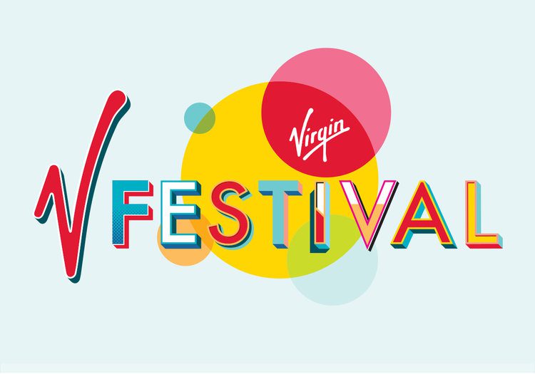

As you can see from the evolution above, the new logo is a significant departure from the previous flat, handwritten, single-colour logo with the Virgin heart. Bespoke letterforms, glyphs and numerals have been created by Archie Proudfoot to bring a “fairground and circus” feel to “reflect the celebratory feel of the festival”. It will be used on everything from posters to signage and merchandise.
The project has also resulted in series of additional graphic motifs – from various shapes and arrows to background patterns – which can be used in announcements in print and on social media in the lead up to V Festival 2017.
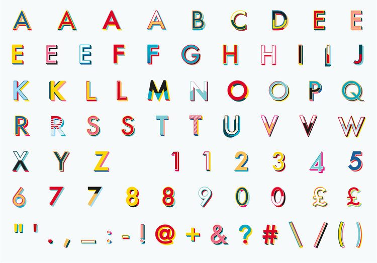

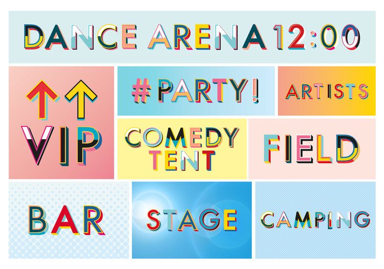
According to Form partner Paula Benson: “The Festival embraces many styles of music, so we felt the new identity should communicate an upbeat, optimistic summer experience of music.” We definitely think this new identity has succeeded in doing this. With acts such as P!nk, Jay-Z, Rudimental, Pete Tong, Ellie Goulding and Craig David on the bill so far, the vibrant look of the new brand will complement the weekend’s lineup. As new acts are announced, the visual language will help to promote these, especially on social channels.
Live music is big business with revenues for ticket sales nearly double compared with physical and digital music sales. With artists complaining that digital streaming is harming the music industry, live music performances are seen as more of a guaranteed income. Competition in the live music scene is hotting up with new venues and festivals popping up every year vying for our attention. This new brand for V definitely helps it to shouts out above the noise to appeal to both music lovers and performers alike.
The system is designed to be flexible enough to accommodate other Virgin Group brands in the future so here’s hoping we see this brand grow and evolve over the next few years.
