Today's blog is not only a brand review, but it's also a way of raising awareness for a charity I have supported for many years. Established in 1979 (which coincidently was the year I was born), the Alzheimer’s Society is a care and research charity for people with dementia and their carers. Many of the 25,000 members have personal experience of dementia (myself included), as carers, health professionals or people with dementia themselves.
The charity aimed to ditch the previous “cold, clinical, passive” look with a new, vibrant visual identity system. London-based consultancy Heavenly created this new identity, alongside McCann London who are currently working on a new marketing campaign, which will launch in April this year. Check it out below:

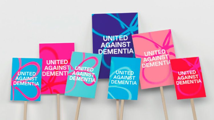
The new system incorporates a forget-me-not flower emblem applied as a spray paint effect graphic element and introduces pop-art inspired colourways as background floods in the identity. The question people may ask is: what does graffiti spray painting have to do with dementia? As soon as I saw this I got the rationale immediately. As Heavenly managing partner Fi Case explains: “Because a lot of people affected by dementia lived through the 1960s and 1970s, our identity was a nod to pop art, bright, vibrant colours. We chose colours which resonated the most with people with dementia.”
The previous strapline of “Leading the fight against dementia” has been replaced with the shorter, snappier “United against dementia”. The idea behind this new statement is a rallying call to “make Alzheimer’s everyone’s problem” and to rally for a “movement to galvanise opposition”.
A new typeface was also designed called A S Lettera. It is based on Neue Haas Grotesk, but adapted to make it accessible for those with dementia and those with impaired vision.


The previous identity adopted a green and blue colour palette… on everything! I still have memories of five years ago running the Birmingham Half Marathon for the Alzheimer’s Society in my green and blue running top surrounded by a sea of people in the same top. Seeing the new expanded colour palette is a welcome change which helps the brand look less cold and corporate (and I’d be happy to run a half marathon in those new tops).


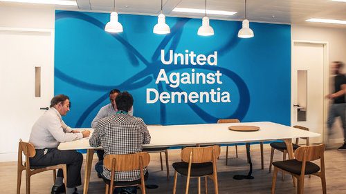


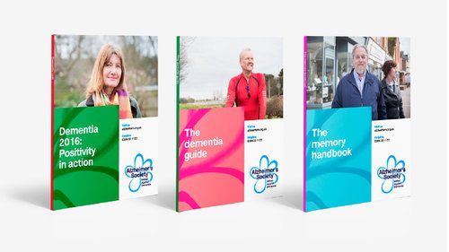
From office spaces and literature, to placards and mugs, you can see how well the new system rolls out and how it works as individual pieces as well as a suite. Overall it is a welcome update for a brand that was starting to look a little dated. What I like about the new identity is that as well as targeting potential volunteers and corporate sponsors, it directly speaks to the people who are affected by dementia in one form or another, no matter what their age.
Now for the charity plug: if you would like to get involved with the Alzheimer’s Society you can check out their upcoming fundraising events on their website. Alternatively, you can make a donation here.

David Huskison
David is the founder of DWH and is involved in all aspects of the design process from the initial creative concept through to final artwork stage. With over 20 years of experience working with agencies across the Midlands, his role is to provide significant creative injection into client projects. By personally delivering creative concepts, he ensures that client briefs are effectively executed and that the final project is delivered within budget.