Who doesn't love BBC Three? Known as the home of comedy, pioneering documentaries and infinite repeats of Family Guy, I for one was a little saddened when the channel moved from broadcast media to purely online platforms. I was also a little critical at the time when the move prompted a logo change that, to me, felt a little imbalanced.
They created this kind of cool representation of using the roman numerals for three by replacing the third numeral with an exclamation mark. But then they shoehorned the BBC logo on top of it and placed it in a magenta box which created all sorts of problems regarding spacing and flexibility. You can see what I mean below:
Following in the wake of this controversial new logo design for BBC Three which has now been around for just over a year, Studio Output has introduced a brand refresh to build on that redesign and tweak the channel’s online platforms to make it more relevant for the digital world it now lives in. Check it out below:
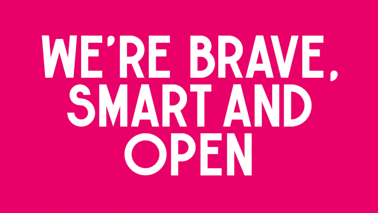
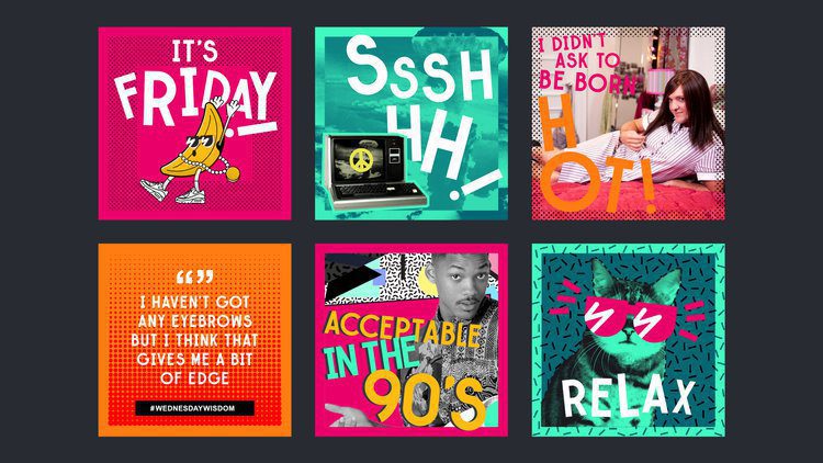
The beefed-up brand is “brave, smart and open” according to Studio Output. By introducing a simple but flexible system, it allows a range of expressions across all touchpoints, from social through to broadcast. This system retains a distinctive identity while promoting a huge range of themes.
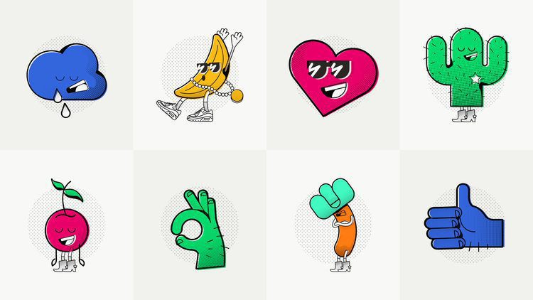
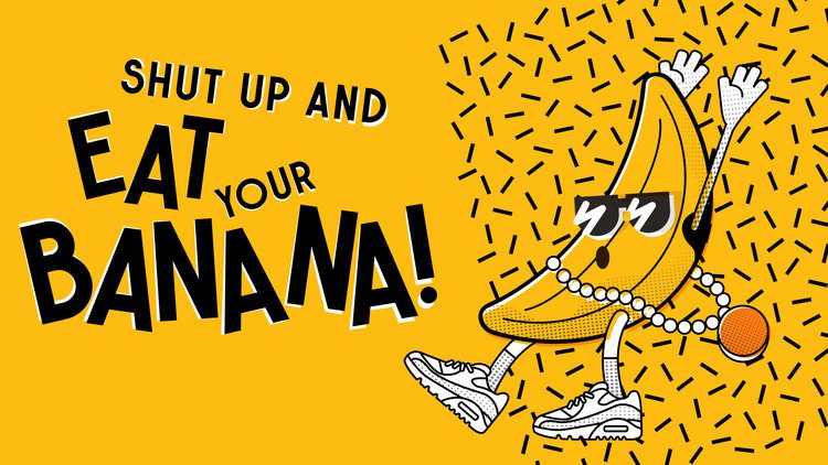
As well as refining the channel’s visual toolkit, the refresh also aims to define BBC Three’s character. Having been through a few iterations (remember the original Aardman characters from when the channel was first launched?), the brand has proved to be a confusing channel to create content for. Thanks to workshops with people behind the channel, Studio Output created a range of memorable characters which you can see below:
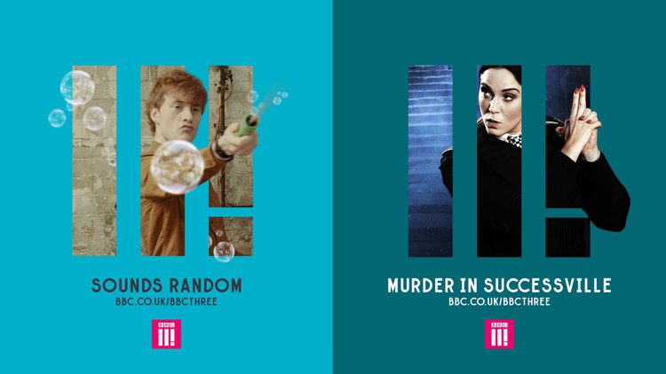
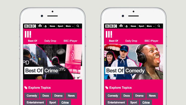
For me this brand refresh solves two of my biggest criticisms about the logo. First, for the most part, it does away with the BBC ident and uses the II! (or ‘Tricon’ as it is now called) independently as a graphic device which I think is a smart move. It frees this up to do its own thing.
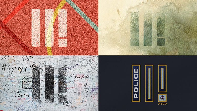
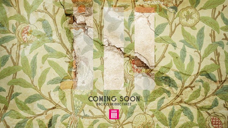
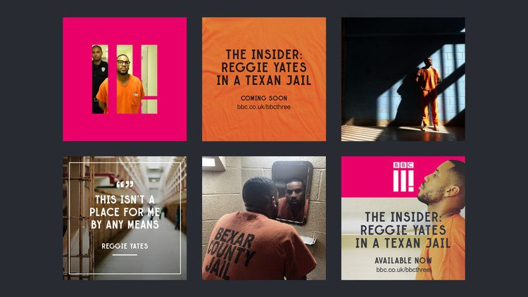
The second improvement is it is no longer constrained to a box! Now liberated from this shape, it becomes flexible enough to use as a window through to an image or as part of a pattern on a larger image as demonstrated earlier.

As BBC Three is now a digital brand that lives online across the BBC online portals and social platforms, it makes sense that the new guidelines reflected this. So rather than a static set of guidelines, Studio Output built an online hub which introduces the new brand and helps people to use it. This means that up-to-date downloadable assets are always to hand, alongside examples showing how to express BBC Three’s distinctive character.
Overall, this is a massive improvement on the original brand work and demonstrates a brand that is unafraid to flex its power online… and on montages!

David Huskison
David is the founder of DWH and is involved in all aspects of the design process from the initial creative concept through to final artwork stage. With over 20 years of experience working with agencies across the Midlands, his role is to provide significant creative injection into client projects. By personally delivering creative concepts, he ensures that client briefs are effectively executed and that the final project is delivered within budget.