Established this year, Race Against Dementia is a charity with the mission to raise money to help find a cure to dementia. This charity was kickstarted by famed Formula 1 driver Sir Jackie Stewart, whose wife of 54 years, Helen, has recently been suffering from the brain disease. A new brand identity for Race Against Dementia has been designed by Brand Union. Check it out below:
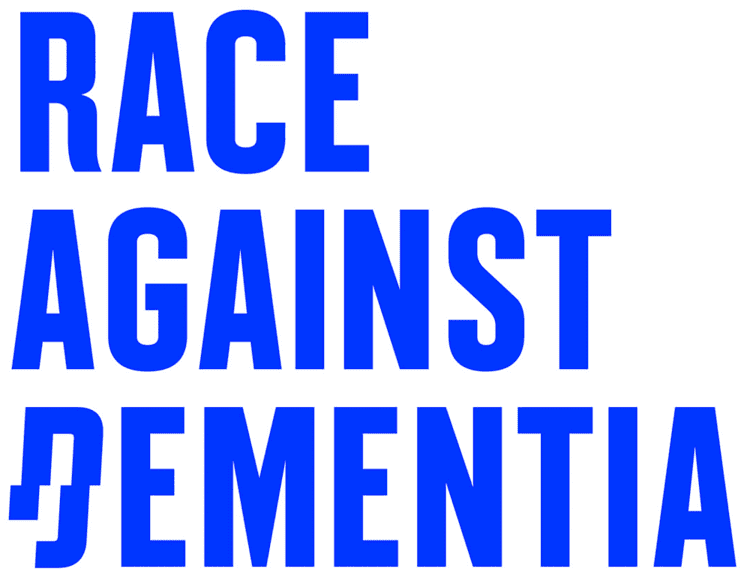
The logo’s condensed structure and rhythm is disrupted by the broken “D” that, in its italic depiction, alludes to racing, and in its disjointed appearance, represents dementia. It’s a surprisingly elegant and powerful combination that really works to convey multiple meanings. The custom font by Colophon Foundry is what gives the identity its strongest voice. It’s amazing what an impact that shift in each letter makes in creating a sense that something is wrong within something that’s so familiar.


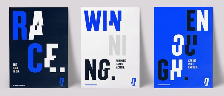

Personally, I think it would have been good to see this identity in use in real world application as it comes off a bit cold on its own. Ok, so the identity relies on archival images of the Stewarts to gives the charity a personal presence and build on the attraction to Formula 1. It also uses a hell of a lot of blue! But at least it has conceptual relevance as that was the color of Jackie Stewart’s car.
I think once the brand has been given time to work, it will become as synonymous with dementia as the Macmillan Green has with cancer. Dementia affected around 850,000 people in the UK last year and that number is rising fast. So a charity that is actively fundraising research to find a cure for this disease is definitely something I will get behind.

David Huskison
David is the founder of DWH and is involved in all aspects of the design process from the initial creative concept through to final artwork stage. With over 20 years of experience working with agencies across the Midlands, his role is to provide significant creative injection into client projects. By personally delivering creative concepts, he ensures that client briefs are effectively executed and that the final project is delivered within budget.