Last year, NHS Blood and Transplant launched Missing Type, a campaign where major brands including Odeon and Waterstones removed the letters A, B and O from their logos to emphasise the absence of donors for those blood types. Check out the film below, created by ad agency WCRS, explaining the campaign in more detail:
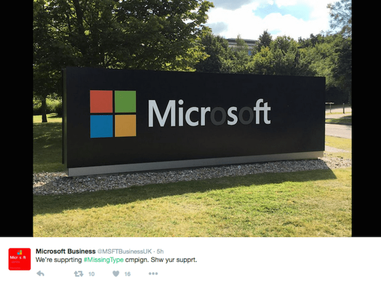
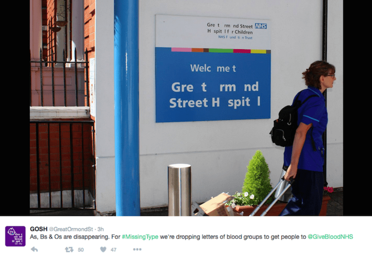
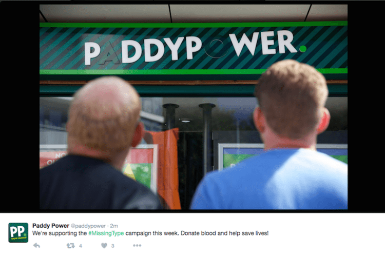
This inventive approach garnered a lot of attention so the NHS is running an updated version this year, with new corporate partners including Microsoft, Royal Mail, and Paddy Power. Many of these, as well as institutions such as Great Ormond Street Hospital, are sharing images of their new-look logos on Twitter. Here’s a selection:

Powerful stuff!

David Huskison
David is the founder of DWH and is involved in all aspects of the design process from the initial creative concept through to final artwork stage. With over 20 years of experience working with agencies across the Midlands, his role is to provide significant creative injection into client projects. By personally delivering creative concepts, he ensures that client briefs are effectively executed and that the final project is delivered within budget.