Officially launched at the Olympics in Rio, TTX (Table Tennis X) is a new version of table tennis initiated by the International Table Tennis Federation (ITTF), the governing body for all international table tennis associations, to attract younger players to the game. Check out the new brand created by Brand Union below:


The simple “T”s in the logo are offset by a wilder “X” that breaks from the baseline and x-height because it’s EXTREME! (TTX is meant to be super exciting with modified rules like sets being only two minutes long). The rise of X-this and X-that for extreme versions of normal sports has been around now for a couple of decades (BMX, FMX, etc) but it’s kind of fun to see it again. And the design of those paddles work really well with the understated single colour logo.
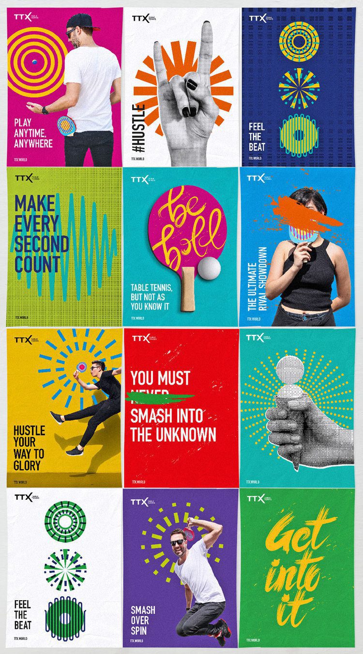

In application, they have gone for a more-is-more approach… and then took it a step further! Looking at it all together, it is a bombardment on the senses. I’m not sure what I should look at first! The halftone patterns? The squiggly lines? The radial motifs, brush lettering or silhouetted humans? Indeed, the only thing that ties it all together is the DIN Condensed typeface. I really liked how simple the brand was to start with but all of that simplicity has been completely lost in the noise. Lets hope as the sport evolves the brand can find its own tone of voice and roll with it.

David Huskison
David is the founder of DWH and is involved in all aspects of the design process from the initial creative concept through to final artwork stage. With over 20 years of experience working with agencies across the Midlands, his role is to provide significant creative injection into client projects. By personally delivering creative concepts, he ensures that client briefs are effectively executed and that the final project is delivered within budget.