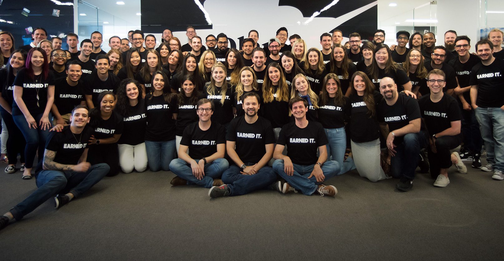
They've earned it
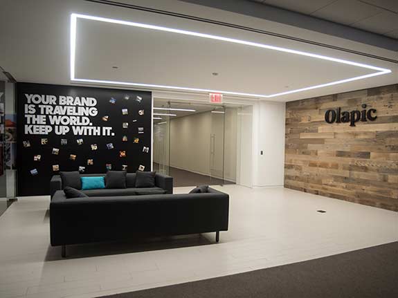
Olapic is an Earned Content Platform which amplifies engagement and performance in every channel with curated, high-converting images and videos taken by real people. They Olapic works with hundreds of global brands including Calvin Klein, West Elm and Target. Back in June 2016, the week before Cannes Lions, the international festival of advertising and creativity, Olapic officially launched their new brand. The redesign was created by New York-based branding consultancy Red Antler. Check out the before and after below:


As rebrands go I’m a bit late to the party with this one as I’ve only recently become aware of Olapic. Their aim is to enable brands to visually communicate in a new way, using real customer images and videos in every touchpoint. In the age of the ‘visual web’ where people use social media as their news feeds and Instagram as their photo library, you can see how white backdrops, studio lighting, and simulated friend groups don’t get people’s attention anymore. With brands needing better content that relates to their audiences’ lives, the Olapic solution is a definite step in the right direction.
Olapic’s algorithm tracks 46 different signals to determine which photos drive the highest engagement and conversion rate, and it feeds the results back into its curation engine to make it smarter over time. And consumers seem to be more than willing to have their photos featured by brands according to Olapic founder Pau Sabria.


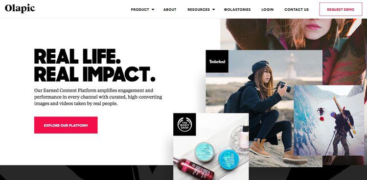


The logo itself uses a custom typeface that’s sophisticated, but with an edgy consumer feel. According to Rachel Meranus, Olapic’s Chief Marketing Officer, the brand is “purposely black and white so that we can let the earned content that we’re collecting and curating for our clients stand out,”. Looking at the way the new website uses these curated images I would say that decision was spot on. The new logo and visual language styling looks great on all touchpoints. The brand has been elevated to reflect their growing client base of blue chip companies and the new tone of voice is more professional and sophisticated in nature.
According to Olapic, in five years time, we will all wonder how we ever relied so heavily on stock photography to sell products. Judging by the results on their website (they influenced $350m of revenue for their clients last year) I’d say they’re definitely on to something there. Here’s hoping more brands sign up to ‘earn’ their success.
Dull Dell
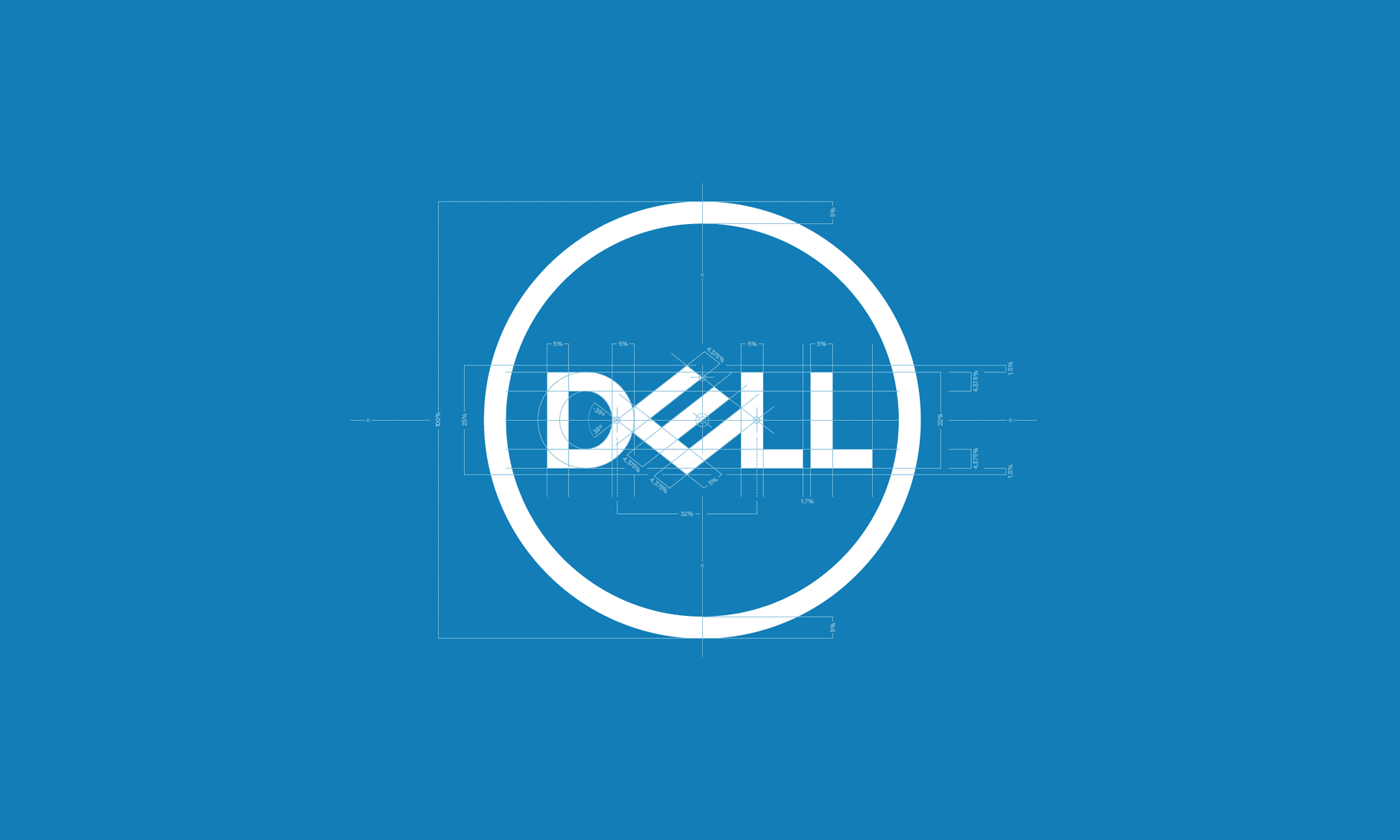
Dell has been around since 1984 so it's certainly one of the more recognisable tech brands. Although it's not been around as long as the likes of Apple, IBM and Hewlett-Packard, their acquisition of EMC Corp has made them one of the largest technological corporations in the world. The brand has been given a refresh by New York-based Brand Union. Check it out below:

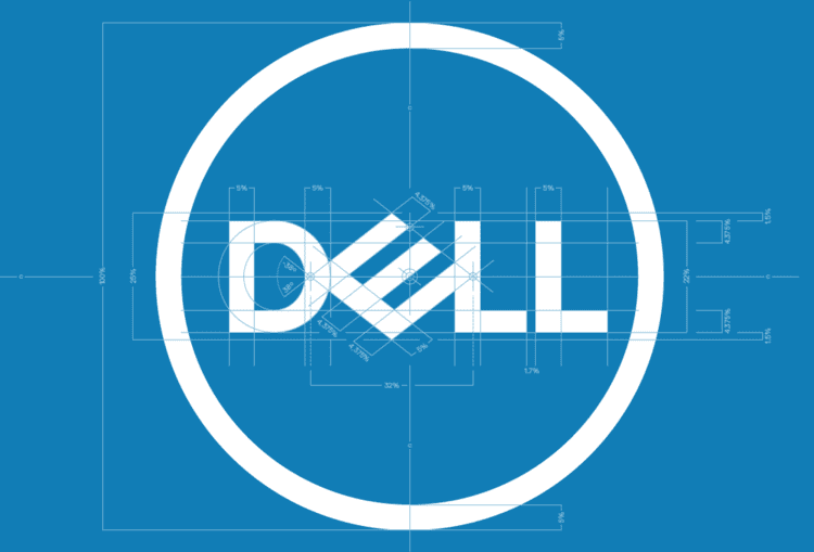
Now I know there are lovers and haters of the previous logo. Way back in 1984, Michael Dell commissioned branding agency Siegel+Gale to create the first version of the logo. The large slanted “E” symbolised Dell’s wish to “turn the world on its ear”. It was also noted how similar the design of the ‘E’ was to the floppy disk, which of course makes sense in the early era of personal computing.
In 2010, the logo was placed in the circle by Lippincott to represent a graphical appearance of a globe. The ‘Ls’ were moved slightly to the left and the ‘E’ was tilted a bit more downward. Personally, I think this solved the problem of the eye being drawn to the larger ‘E’ without losing any of it’s original character.
What Brand Union has done is refine the logo to make it clearer and sharper for use on all devices. But looking at it, I can’t help but feel that some of the personality has been lost. Sure the old logo had thick, clunky letters and the ‘E’ was a bit jarring, but in a way, that’s what gave it personality. Now the typeface looks like any old standard sans serif typeface that seems to be creeping into brands of late.


When Apple Computers became Apple Inc, they dropped the wordmark altogether and relied solely on the logo symbol to usher in a new era. This was considered a bold move at the time but nowadays it is as symbolic as the Nike ‘tick’ and the ‘hp’ of Hewlett-Packard. Dell have gone the opposite way…
Dell Technologies is the umbrella corporation for the seven brands which form part of Dell. How is this represented? Well gone is the circle (which draws the attention back to that ‘E’) and instead, the wordmark is used alongside a thinner version of the same san serif typeface. It seems so… bland.
Above is the overview video showing the rationale behind the new brand and introducing Dell Technologies to market. It does exactly what it says on the tin and serves its purpose well. Then there’s this video…
OK… I get the concept. The sky is no longer the limit… but from the ‘face off’ moment which turns into an embrace from 20 seconds in I started cringing. I was hoping it would end there. But then it turns into some weird, Mission: Impossible-esque, team building exercise where members of the sub brands conduct a skydive to ‘work together’ to unveil the new Dell Technologies brand. From here on in the video is just annoying. Even the repetitive soundtrack is irritating.
So overall I’m unimpressed with this. The personality of the Dell product has been diluted by the corporate Dell Technologies machine. Let’s hope their products will be more innovative than their brand.
Superhumans
Last night's opening ceremony in Rio officially kicked off the 2016 Paralympic Games. Amongst the backdrop of colour and music was more controversy as the Brazilian president Michel Temer was booed throughout. One of the most striking parts of the ceremony was when bright lights temporarily 'blinded' the crowd to try to show spectators the reality Paralympic athletes face, forcing them to rely on other senses such as hearing.

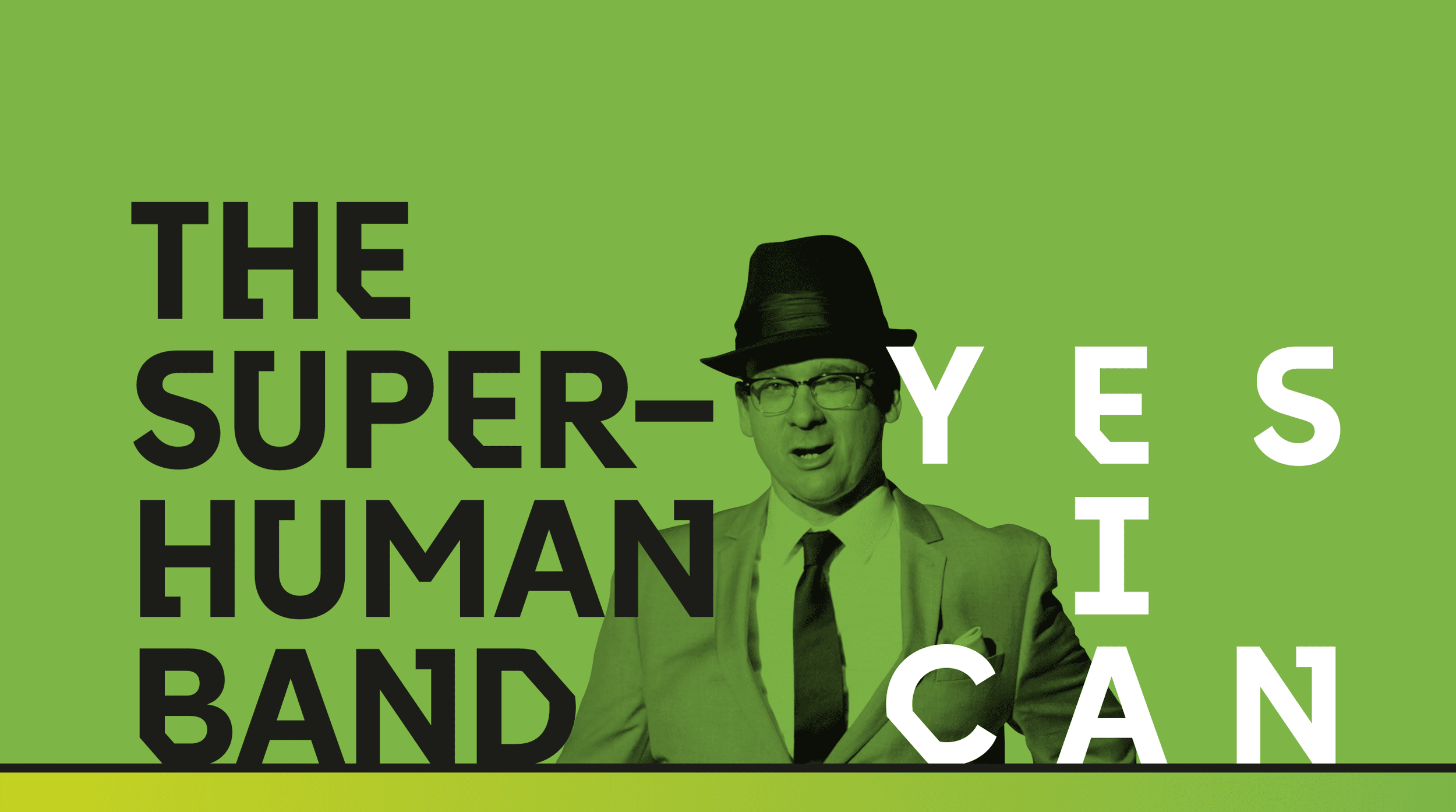
The games are being covered by Channel 4 and their TV spot for the games caught my eye. Featuring 140 disabled people from around the world (which might be more disabled people shown in three-minutes than in all the ads ever shown on British TV). There are dancers, swimmers, gymnasts, fencers, a brass band, a rock climber and a rally driver as well as a mum, an office worker and children with prosthetic limbs. Check it out below:
Some are doing extraordinary things – from wheelchair stunts to competing in the Paralympics – while others have found extraordinary ways to do everyday tasks. The film’s aim, says 4, is to challenge negative perceptions of disability and show that disabled people from all walks of life can be just as talented and capable as those who are able-bodied. The ad is set to Sammy Davis Jr. track Yes I Can, performed throughout by a specially assembled band of disabled musicians.


Channel 4’s 2012 Superhumans spot was praised for its portrayal of disabled athletes, and the number of ads featuring disabled people has increased since – Smirnoff launched an ad featuring deaf dancer Chris Fonseca earlier this year, while Axe’s Find Your Magic campaign featured a man in a wheelchair dancing at his wedding, and in 2013 – but ads featuring disabled people remain far from the norm. Alice Tonge, creative director at 4Creative, hopes this campaign will change this and the way people think about disability as a whole.
You can check out all the latest from the Paralympic Games on Channel 4’s official Paralympics website. You can also download the ‘Yes I can’ track here, with all profits going to the British Paralympic Association.
Apple doesn't give a jack
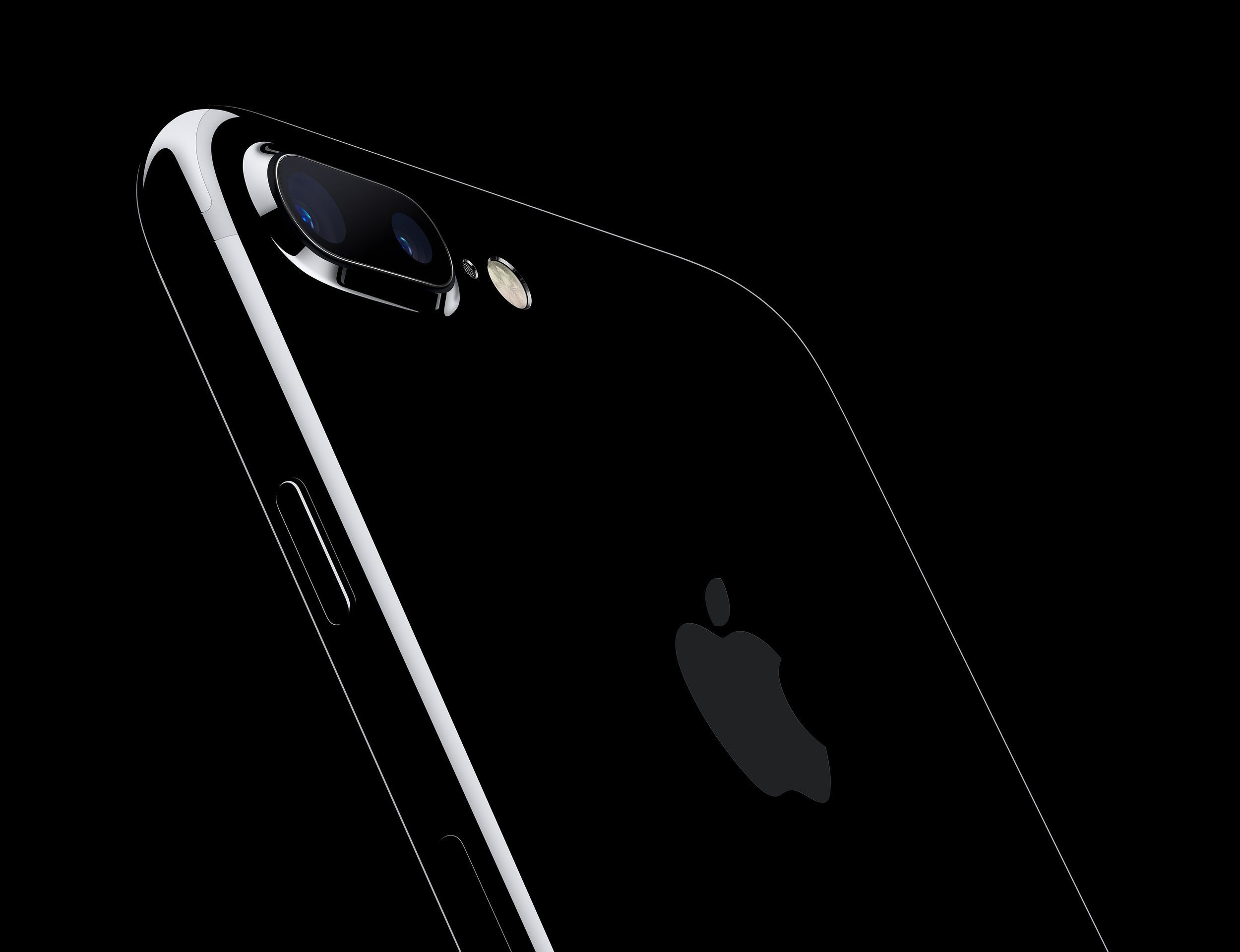
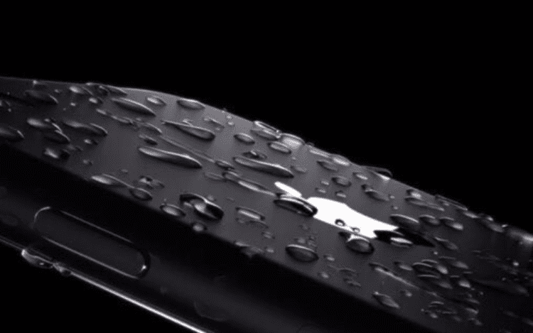
So what have we learnt from tonight's big Apple Keynote? Well the big news was of course the iPhone 7 with a new camera systems, improved battery life and finally they have made the phone water and dust resistant. Hurrah! Check it out below:

I have to admit, the new jet black version looks awesome. The water resistant design means no more seams on the phone which overall improves the whole look. The new 12-megapixel camera on the back includes optical image stabilisation on both iPhone 7 and iPhone 7 Plus, and a larger aperture and 6-element lens, enabling brighter, more detailed photos and videos, and a wide color capture allows for more vibrant colors with more detail.
That’s the back, but other than an improved ‘home’ button, the front looks exactly the same as the previous 6s model. A lot of the improvements have been made internally with an improved battery and a new 4-core Apple A10 Fusion chip.
Of course, Apple confirmed what we already knew… there’s no jack in the iPhone 7! So what are we to do? Ok so they’ve added another speaker in to the phone to make the sound twice as good as it was before, but what if I want some privacy or want to go out and run to some Drum ‘n’ Bass?
Well thats where the new Airbuds come in…

They sync up with you iPhone and iTunes account as soon as you open the box (which is also a charging case) near the phone and the sound quality is supposed to be pretty damn good too. This represents a major shift towards a completely wireless future. If only they could get wireless charging off the ground. Suppose we’ll have to wait for the iPhone 8 for that!
Thing is, as a long time user of previous Apple headphones, I find they don’t fit as well as they should, especially when you’re running. So imagine running along and one of your Airbuds falls out. No cord means you’ve just potentially lost one half of about £160 worth of tech!
Personally, if I was going to invest in some decent wireless headphones, I’d go with the new Beats Solo 3. Sure, they’re more expensive and it uses the same Apple W1 chip as the Airbuds, but with the trademark Beats sound quality and the option of a 5 minute fast charge for 3 hours of music is a winner.
What I’m more excited about was the release of the Apple Watch Series 2 which features 50 meters water resistance, GPS, 2x brighter display and a dual-core processor. Check it out below:

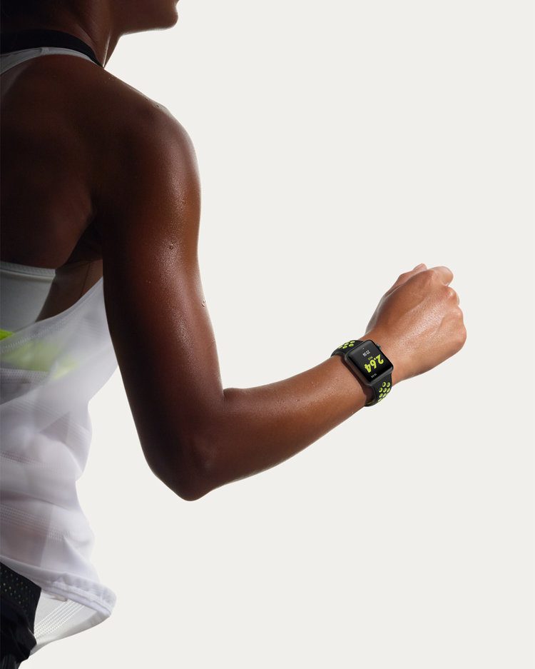

I bought my wife the first generation of Apple Watch and I have seen the useful applications of it so I’ve been waiting to see what the next generation would bring. The big winner for me is the added GPS and water resistance. What was a surprise was the release of the Apple Watch Nike+ model which has all the same features, but is obviously personalise with the Nike brand along with Nike Sport Bands which are perforated for even better ventilation and sweat management when you’re out running. When I first glanced at this I wasn’t sure about the design of the straps at all, but now they’re really starting to grow on me.
I won’t even go into the release of iOS 10, watchOS 3 or the new home hub app that will rival the likes of Hive, Nest and SmartThings as I would be here all day. To summarise the iPhone is a solid enough update with a great looking jet black option, but I can’t help but feel a little underwhelmed by the look of the front. I would have thought now would have been the perfect time to introduce a solid glass front to compliment the jet black back with no home button, but again, we’ll have to wait for the iPhone 8 for that (along with retina unlock… yeah the rumours have started already!) The Apple Watch update is a great improvement on the first gen iWatch so happy days. Overall, I’d rate the Keynote a 7 out of 10!

Gordon's Alive!
I'm going to start this blog off a little differently. I'll admit... I don't like gin! Ever since an unfortunate incident on a stag do in Prague involving double shots of Bombay Sapphire I can't stomach the stuff! However, I do admire the process of making gin.
A few years ago I went to the Plymouth Gin distillery for a tour (and a free sample which reminded me why I don’t like gin) and was fascinated by the many levels of distillation the gin berries go through to become the bottled product. I was also unaware of the variety of flavours of gin and the fact that the Plymouth Gin distillery is one of the oldest in England (making gin according to the original family recipe since 1793) and is widely believed to be the gin that led to the invention of the martini.
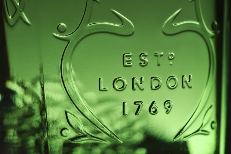
So from the oldest gin, we move swiftly on to the best selling gin brand in the world, Gordon’s. Design consultancy Design Bridge and Diageo have worked together on the new packaging design for Gordon’s gin, almost 15 years after previously redesigned the gin brand’s bottle. Check it out below:
The new bottle is slightly slimmer and taller than previously, while the label has been applied to the D-shaped curved side of the bottle instead of the flat side like before. The ‘Estd London 1969’ features more prominently thanks to the new heart shape. This was reintroduced after being inspired by a trip to the brand’s archives, which revealed an old advertising campaign with the tagline “the heart of a good cocktail”, along with heart-shaped labels from the 1920s bottles.


The Gordon’s wordmark has been redrawn by hand, and the brand’s original boar logo has been made more visible, moving from the bottom to the front of the bottle.
The new design has also been introduced to Gordon’s collection of flavoured gins including sloe, elderflower and cucumber, and Gordon’s Export gin. The newly designed packaging will roll out globally this month.


This is a welcome update to the classic Gordon’s bottle. It manages to feel modern and clean without losing the brand heritage and class. I especially like the treatment on the Slo and Elderflower bottles. So although I won’t be drinking this any time soon, I will certainly admire the new bottles from afar.

Fast Food
Deliveroo was founded in 2013 and is now one of London’s fastest growing startups. The company delivers restaurant food to customers in 12 countries and recently raised £200 million to help it expand into new markets. Today, the company revealed a new logo and visual identity created by DesignStudio. Check it out below:


The new branding sees Deliveroo’s original logo – a kangaroo holding a bag of food against a teal backdrop – replaced with a more minimal graphic symbol.
The old logo illustration was quirky and had a lot of character to it. However, the detail did get lost at smaller sizes which this new logo addresses (it certainly stands out as an app icon on smartphones now). It has managed to retain it’s character, although it has been likened to a hand flipping a ‘V’ sign (which is unfortunate as Deliveroo have been accused of not pay workers fairly and failing to offer protection to employees in the event of an accident or injury).
DesignStudio explored several options for the new logo. The agency consulted with staff and carried out a semiotics analysis of what the symbol means in other countries and cultures before deciding on a final design. Here are some of those options:
“What the process highlighted was that both internally and externally our Roo had become a beloved part of our brand.” writes the design team on the blog announcing the rebrand. “What we landed on was an evolution from our original and more literal take on the kangaroo, turning it into a striking new mark bold and impactful, but still maintaining the character and charm of the Roo.”
The new logo features on the company’s new app and website and has also inspired the design of colourful jackets and jerseys for riders.


Rider kits feature designs based on the shape of the word mark and come in a range of bold colours. Deliveroo and DesignStudio consulted with road safety organisation Brake to create the new kits, which are designed to be more reflective and safer than previous black-and-teal uniforms.
The company’s new website features bold colours and up-close shots of meals from burgers to sushi. The brand says its new photography style aims to capture “the messiness of food in its tangible, up-close glory” – whether a burger dripping in cheese sauce or pancakes topped with maple syrup.


What I like about this rebrand is the boldness of everything! From the vibrant teal colour to the new up-close food photography that’s featured on the new website. I know we seem to showcase a lot of work by DesignStudio on this blog. The simple reason is because they continually produce great work. The main reason for this: collaboration. In this case it was their collaboration with the brand’s in-house design team that resulted in an ‘evolution’ rather than a ‘revolution’ which, with all the controversy surrounding their current image, was exactly the right call for this brand.
A global launch campaign will be revealed on Friday and Deliveroo says it will delve deeper into various aspects of the new identity on its blog over the next few weeks. We look forward to seeing how this new identity will roll out.
Their Mortal Remains
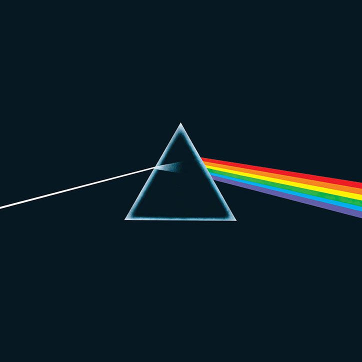
The V&A has announced the first international retrospective of one of the world’s most iconic and influential bands, Pink Floyd. The exhibition will showcase the bands innovative work in graphic design, photography, sound, stage and performance design from the 1960s and 70s to the present day, and it's important influence on the psychedelic movement. Check out some of the classic album covers below:


The show will feature Pink Floyd’s work with modern surrealist Storm Thorgerson, satirical illustrator Gerald Scarfe and psychedelic lighting pioneer Peter Wynne Wilson. It will feature more than 350 objects and a custom-designed laser light show, the gallery promises an “immersive, multi-sensory and theatrical journey”. The exhibition marks 50 years since the band released its first single Arnold Layne.


It’s hard to believe that it’s been almost half a century since Pink Floyd released their first single! I wouldn’t say I’m an avid Floyd fan but I appreciate their music and as a designer I’ve always admired the art of these covers. I will definitely be checking out this exhibition at the V&A next year and I’m sure the visual and sensory experience will leave me “comfortably numb”.
The Pink Floyd Exhibition: Their Mortal Remains takes place from 13 May – 1 October 2017, with tickets on sale today.
A WKD rebrand
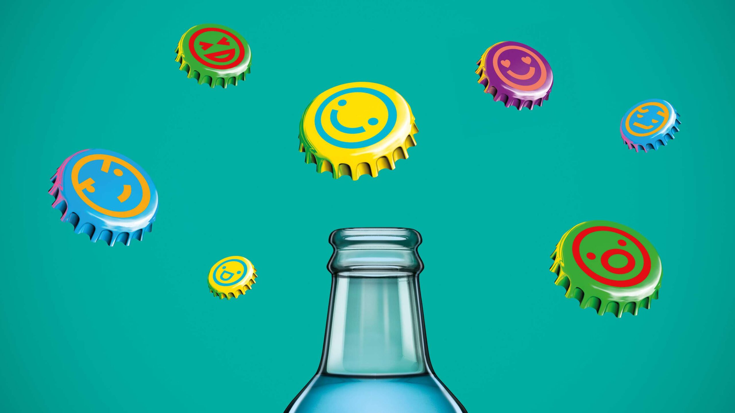
To coincide with the vodka-based drink’s 20th anniversary, WKD has rebranded featuring an entirely redrawn logo and showing a visual language thats a marked departure from their previous branding. Check it out below:


The new identity by JKR is centred around an exclamation point concept to represent the brand’s “sense of fun and excitement,” as it looks to become relevant for today’s 18 to 24 year-old market. The exclamation mark was chosen as a nod to the previous WKD branding’s rectangular device, which now appears elongated down the bottle above a circle. This new dot shape is used across the identity, acting as a holding divide for flavour information or as a flexible icon across other channels. The bottle caps in bright contrasting colours feature simple icons and designs such as smiley faces, winking faces and hearts that aims to “further emphasise the element of fun”.


JKR have chosen bold colours associated with the WKD brand for the secondary packaging for the bottles, and also as the cut through for the logo itself as part of the lettering on the brand mark for the Blue and Iron Brew bottles, while the designs for Berry and Passion Fruit feature oil-painting inspired brushstrokes.
Being old enough to remember WKD first appearing in the bars and clubs during my college days the brand to me always represented the ‘pound a bottle’ promo culture of the time. The new brand certainly seems more up-market and the shape of the bottle is a vast improvement. with the smaller neck as opposed to the long and thin version. The colours look sharp and will certainly jump off the shelf in the supermarket. Whether the alcopop culture can make a comeback in the mainstream bars and clubs remains to be seen.
Push the button
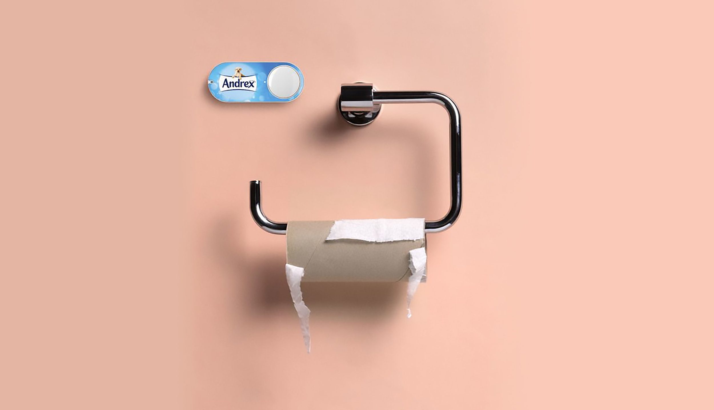
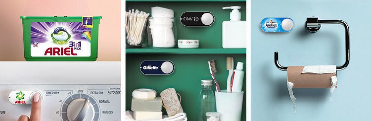
If Amazon has its way, the weekly trip to the supermarket to pick up washing up liquid, toilet roll and laundry detergent will soon be a thing of the past.
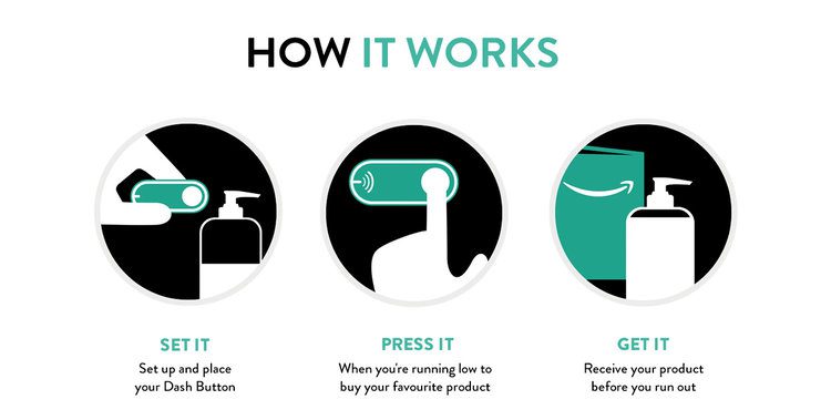
Yes, Amazon’s UK customers can now push a button when they run out of toilet rolls or washing powder – and within 24 hours a package will arrive at the front door. Check it out below:
Here’s how it works. There are Dash buttons for about 40 brands at launch, ranging from dishwasher tablets, to instant coffee to condoms. You buy the button – but get the cost off your first purchase. Then you set it up with the Amazon shopping app, choosing the exact product and your delivery preferences. From now on, when you run out of that product, pressing the wi-fi-connected button will simply trigger an order via the shopping app.
Sound too good to be true? Well what if you have a 3 year old (like I do) who loves to go around pressing buttons repeatedly? Am I going to get a mountain of toilet rolls delivered? Well… no. Amazon have thought about this and enabled a one button press per 24-hours which eliminates the worry.
But what if I forget to press the button and I run out of dishwasher tablets leaving me with a day’s worth of dirt dishes? (I mean… that would involve washing them myself!) Not to worry! Amazon have thought of that as well by launching a sister product, which takes removing the hassle of shopping a stage further. Dash Replenishment involves devices such as dishwashers and printers automatically ordering new supplies of tablets or ink cartridges without their owner needing to do anything, except sign up in the first place.
So with the need for the weekly shop eliminated what will that mean for our local supermarkets? Indeed, what impact will this have on the environment with all those extra deliveries from the Amazon fulfillment centre on the roads? Are we happy to tie ourselves to the big brands whose buttons we will push, or appliances which will automatically order their overpriced supplies on our behalf?
In this day and age of on demand television and music streaming services, I suppose instant product ordering was inevitable!
Now excuse me while I go and top up my loo roll…
The Power of Bass
Back in 2001, I wrote a dissertation on the semiotics of opening title sequences and Saul Bass featured heavily (especially the infamous title sequence from Psycho). He was truly one of the greatest influencers of design and film-making in the 20th Century, responsible for some of the most iconic brands including Bell, Kleenex and AT&T. He produced a diverse and powerful body of work full of evocative images of intense clarity and subtle ambiguities.
He is best known for his iconic film posters, and more than 50 title sequences for Hollywood films, each featuring an image or symbol that served as a metaphor for the film itself. His visual style influenced many designers and visual storytellers including R/Greenberg Associates and Imaginary Forces (who we featured a few weeks ago in our blog for their work on Stranger Things).
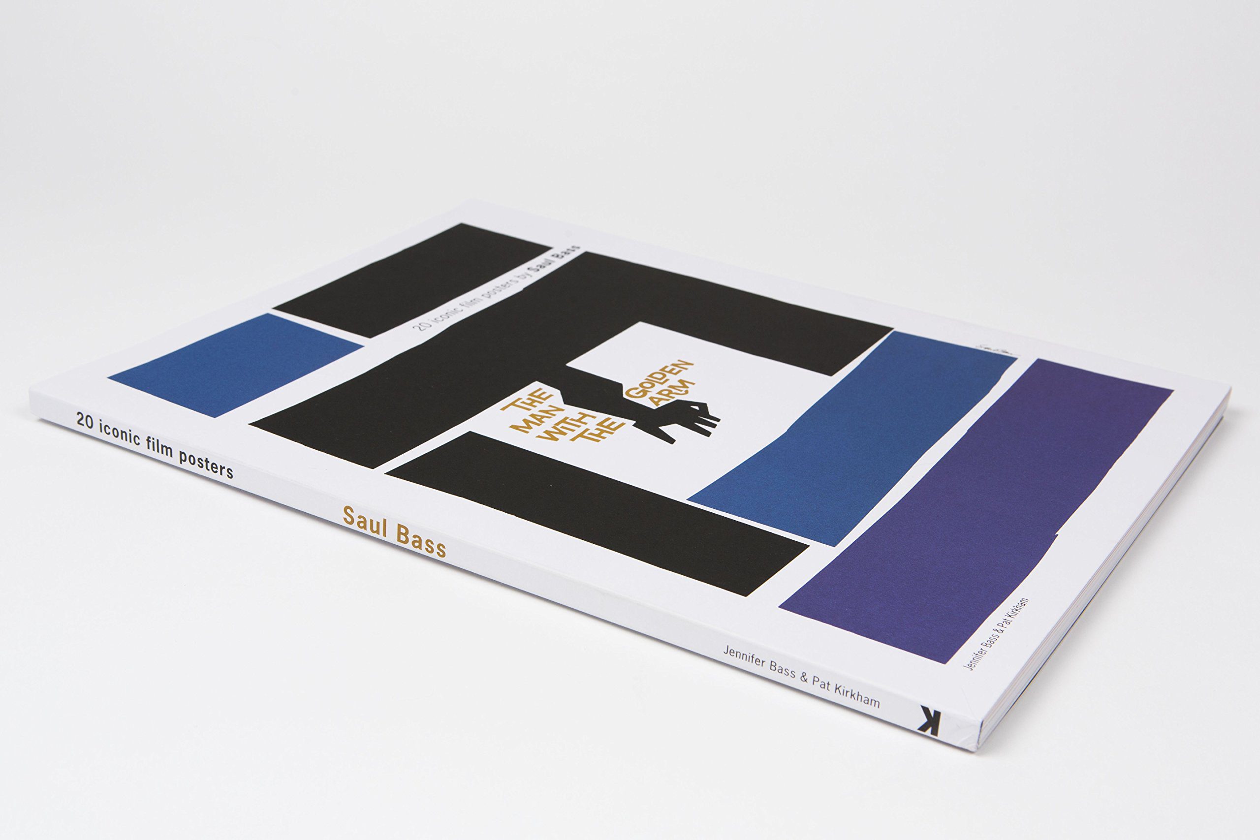
In a new large-format book Saul Bass: 20 iconic film posters, Pat Kirkham and the designer’s daughter Jennifer Bass explore his lasting influence on film poster design. Check out a selection of these posters below:


I think it’s safe to say his visual metaphors and graphic styling are still as iconic today as they were 50 years ago. I can’t wait to add this book to my collection!
Saul Bass: 20 iconic film posters by Pat Kirkham & Jennifer Bass is published by Laurence King on 5 September.