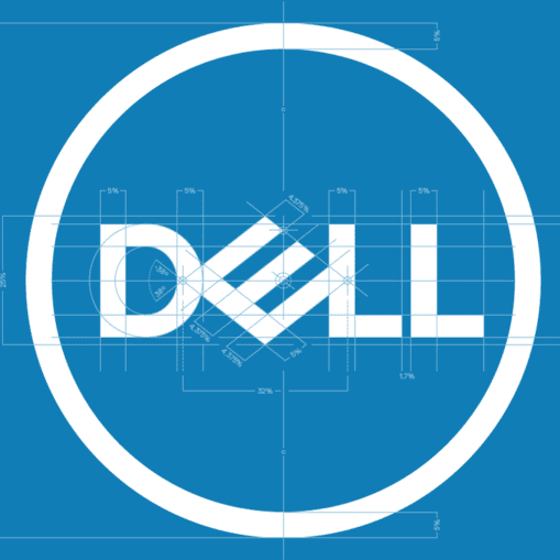
Dell has been around since 1984 so it's certainly one of the more recognisable tech brands. Although it's not been around as long as the likes of Apple, IBM and Hewlett-Packard, their acquisition of EMC Corp has made them one of the largest technological corporations in the world. The brand has been given a refresh by New York-based Brand Union. Check it out below:
Now I know there are lovers and haters of the previous logo. Way back in 1984, Michael Dell commissioned branding agency Siegel+Gale to create the first version of the logo. The large slanted “E” symbolised Dell’s wish to “turn the world on its ear”. It was also noted how similar the design of the ‘E’ was to the floppy disk, which of course makes sense in the early era of personal computing.
In 2010, the logo was placed in the circle by Lippincott to represent a graphical appearance of a globe. The ‘Ls’ were moved slightly to the left and the ‘E’ was tilted a bit more downward. Personally, I think this solved the problem of the eye being drawn to the larger ‘E’ without losing any of it’s original character.
What Brand Union has done is refine the logo to make it clearer and sharper for use on all devices. But looking at it, I can’t help but feel that some of the personality has been lost. Sure the old logo had thick, clunky letters and the ‘E’ was a bit jarring, but in a way, that’s what gave it personality. Now the typeface looks like any old standard sans serif typeface that seems to be creeping into brands of late.
When Apple Computers became Apple Inc, they dropped the wordmark altogether and relied solely on the logo symbol to usher in a new era. This was considered a bold move at the time but nowadays it is as symbolic as the Nike ‘tick’ and the ‘hp’ of Hewlett-Packard. Dell have gone the opposite way…
Dell Technologies is the umbrella corporation for the seven brands which form part of Dell. How is this represented? Well gone is the circle (which draws the attention back to that ‘E’) and instead, the wordmark is used alongside a thinner version of the same san serif typeface. It seems so… bland.
Above is the overview video showing the rationale behind the new brand and introducing Dell Technologies to market. It does exactly what it says on the tin and serves its purpose well. Then there’s this video…
OK… I get the concept. The sky is no longer the limit… but from the ‘face off’ moment which turns into an embrace from 20 seconds in I started cringing. I was hoping it would end there. But then it turns into some weird, Mission: Impossible-esque, team building exercise where members of the sub brands conduct a skydive to ‘work together’ to unveil the new Dell Technologies brand. From here on in the video is just annoying. Even the repetitive soundtrack is irritating.
So overall I’m unimpressed with this. The personality of the Dell product has been diluted by the corporate Dell Technologies machine. Let’s hope their products will be more innovative than their brand.

David Huskison
David is the founder of DWH and is involved in all aspects of the design process from the initial creative concept through to final artwork stage. With over 20 years of experience working with agencies across the Midlands, his role is to provide significant creative injection into client projects. By personally delivering creative concepts, he ensures that client briefs are effectively executed and that the final project is delivered within budget.


