Deliveroo was founded in 2013 and is now one of London’s fastest growing startups. The company delivers restaurant food to customers in 12 countries and recently raised £200 million to help it expand into new markets. Today, the company revealed a new logo and visual identity created by DesignStudio. Check it out below:

The new branding sees Deliveroo’s original logo – a kangaroo holding a bag of food against a teal backdrop – replaced with a more minimal graphic symbol.
The old logo illustration was quirky and had a lot of character to it. However, the detail did get lost at smaller sizes which this new logo addresses (it certainly stands out as an app icon on smartphones now). It has managed to retain it’s character, although it has been likened to a hand flipping a ‘V’ sign (which is unfortunate as Deliveroo have been accused of not pay workers fairly and failing to offer protection to employees in the event of an accident or injury).
DesignStudio explored several options for the new logo. The agency consulted with staff and carried out a semiotics analysis of what the symbol means in other countries and cultures before deciding on a final design. Here are some of those options:
“What the process highlighted was that both internally and externally our Roo had become a beloved part of our brand.” writes the design team on the blog announcing the rebrand. “What we landed on was an evolution from our original and more literal take on the kangaroo, turning it into a striking new mark bold and impactful, but still maintaining the character and charm of the Roo.”
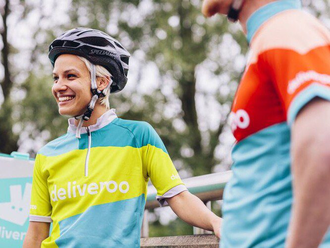
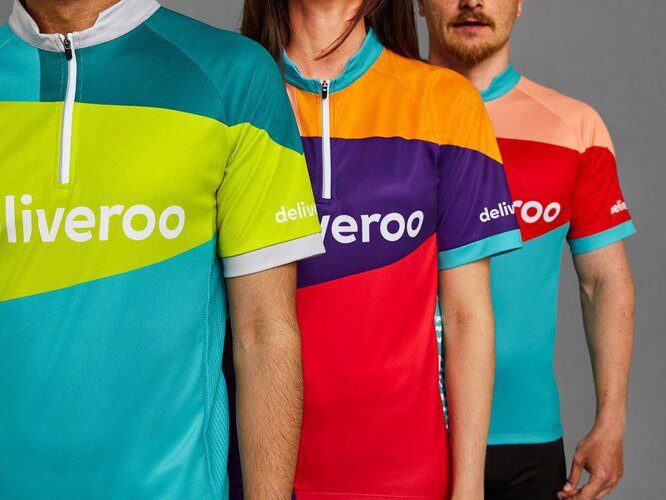
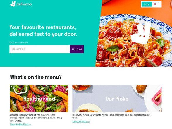
The new logo features on the company’s new app and website and has also inspired the design of colourful jackets and jerseys for riders.
Rider kits feature designs based on the shape of the word mark and come in a range of bold colours. Deliveroo and DesignStudio consulted with road safety organisation Brake to create the new kits, which are designed to be more reflective and safer than previous black-and-teal uniforms.
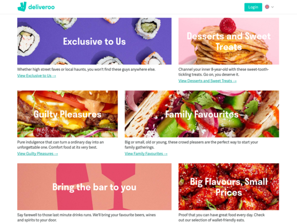
The company’s new website features bold colours and up-close shots of meals from burgers to sushi. The brand says its new photography style aims to capture “the messiness of food in its tangible, up-close glory” – whether a burger dripping in cheese sauce or pancakes topped with maple syrup.
What I like about this rebrand is the boldness of everything! From the vibrant teal colour to the new up-close food photography that’s featured on the new website. I know we seem to showcase a lot of work by DesignStudio on this blog. The simple reason is because they continually produce great work. The main reason for this: collaboration. In this case it was their collaboration with the brand’s in-house design team that resulted in an ‘evolution’ rather than a ‘revolution’ which, with all the controversy surrounding their current image, was exactly the right call for this brand.
A global launch campaign will be revealed on Friday and Deliveroo says it will delve deeper into various aspects of the new identity on its blog over the next few weeks. We look forward to seeing how this new identity will roll out.

David Huskison
David is the founder of DWH and is involved in all aspects of the design process from the initial creative concept through to final artwork stage. With over 20 years of experience working with agencies across the Midlands, his role is to provide significant creative injection into client projects. By personally delivering creative concepts, he ensures that client briefs are effectively executed and that the final project is delivered within budget.


