
Making a Spectacle of themselves
I've never been a huge fan of Snapchat. Sure when it first came out it was quite cool, but the novelty quickly wore off. Since Instagram has built in 'Stories' in their latest update, which essentially is exactly what Snapchat does, I wondered if this would spell the beginning of the end.
As it ends up, far from it! Snapchat has instead attempted to reinvent itself by renaming its company Snap Inc. and launching its first product, Spectacles, a pair of sunglasses with a built-in video camera. Check out the new logos below:


So with this they are positioning themselves as a ‘camera company’ rather than any kind of social sharing portal which Snapchat was previously perceived. The familiar black, white and yellow remain. However, Snap Inc has its own wordmark unique from Snapchat using a serif typeface which I think works nicely. It’s not setting the world on fire but it serves its purpose as the ‘parent’ company for its products.
The wordmark for Spectacles also works (even if it does look like an opticians logo, but hey, maybe thats the point). Here’s where it starts to unravel for me. You use a serif typeface for the parent company but then refer to a sans serif when referring to the company underneath your product. Where’s the consistency? Would you see the likes of Apple or Samsung being this inconsistent in a product market? Or Facebook and Instagram in the social media market?
The logo icon that has been created for Spectacles is clean and minimalistic reminiscent of Instagram’s recent refresh which is not a bad thing. And when seen with the product it maes even more sense. Speaking of which…


Available in three colours, the glasses are “capable of storing a day’s worth of Snaps on a single charge,” says Snap Inc, and connects directly to Snapchat via Bluetooth or Wifi, without the need to connect to a phone. Ten or 30 seconds of video is captured by tapping a button on the top left of the frames which displays LED lights so others know you’re filming.
From a design perspective, they actually look quite cool and are a lot more ‘retro’ than the Google Glass effort (remember them?). The field view of 115 degrees means the glasses capture circular videos—kind of like a GoPro for your face. This is pretty cool as it means the footage will fit both portrait and landscape mode which means it will fill the screen, depending on how the phone is held. And users will also be able to toggle between modes to see different perspectives.
The price will be a reported $130 when they launch (which means you may as well change the $ to a £ sign for the UK market) which is a hell of a lot cheaper than when Google Glass first came out.
Saying that, there’s one problem with the glasses… they will ONLY work with Snapchat! If only they would have opened this up from the start, they could have really changed the game with how we take day-to-day photos.
Prehaps, as Snap Inc evolves, it will open the potential to use Spectacles as a content capture device without the need for Snapchat. I mean, look at what it could do for the advertising industry if they could port unique video content that would work in any format. It’s likely that brands will embrace them.
Now I wonder if, in the future, they’ll cater for people who require prescription lenses?

Phoneless Friday
As a slave to my smartphone which I use everyday for email, web browsing, gaming and even as a sat nav I ask myself "Could you do without that glowing screen for one whole day?"
Well that’s what Save the Children has challenged us to do with the launch of Phoneless Friday, an initiative to ditch smartphones for an entire day to raise money for the charity, and help save children’s lives around the world. The campaign was art directed by James Wright with photography by Jon Enoch. Check it out below:


According to the tongue-in-cheek campaign, this “isn’t about digital detox or wellbeing”, but a test of determination and willpower. The money raised will help transform children’s lives and could even enable Save the Children to give phones to families, so they can safely transfer money for them to buy food.
If you’re up to it, sign up here, pay £5 and lock up your phone for Phoneless Friday on 7 October.
Because #whynot?
It’s a rain drenched Monday morning. I've just got back from holiday and already I'm planning for my next one. Know the feeling? Well, here comes easyJet with a new TV ad to help encourage you. Themed around the notion of ‘Why not?’, their latest brand campaign encourages people to embrace all the possibilities that travel has to offer, because with prices still as low as £29.99, “Why not?”. Dinner in Barcelona? Why not? Trumpet festival in Budapest? Why not? Six hours in Amsterdam? Seriously, Why not?
The ad was created by creative agency VCCP and shot by critically acclaimed directors, CANADA. Check it out below:
When I first saw this I thought to myself ‘this is a bit weird and wacky for easyJet’… which is why I quite like it!
I must be in holiday mode still as this is a short blog for me… but as the campaign goes… Why not?
Building Bridges
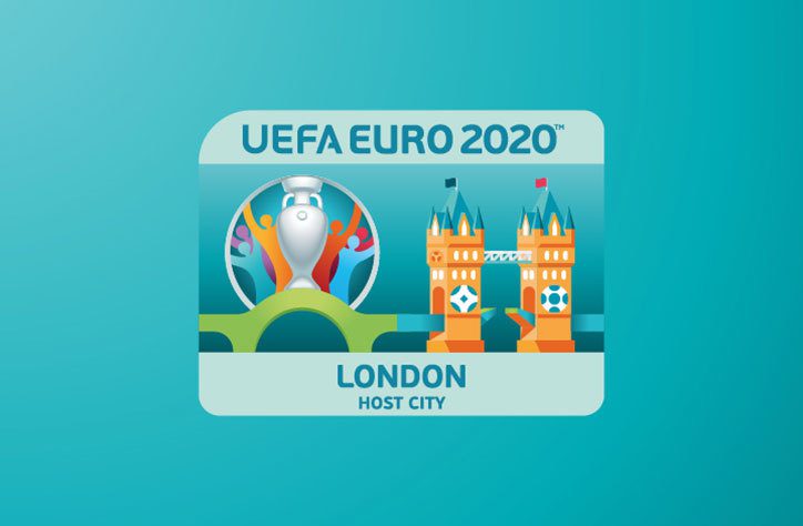
UEFA has revealed the logo design and branding for the UEFA 2020 Euro Championship, which for the first time will be held in 13 different cities across Europe (with London's Wembley Stadium chosen to hold the semi-finals and final). Young & Rubicam Portugal was selected as the creative agency following an international pitch to develop the brand for Euro 2020. Check it out below:
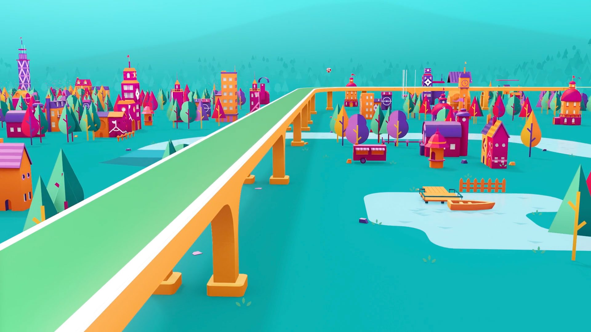
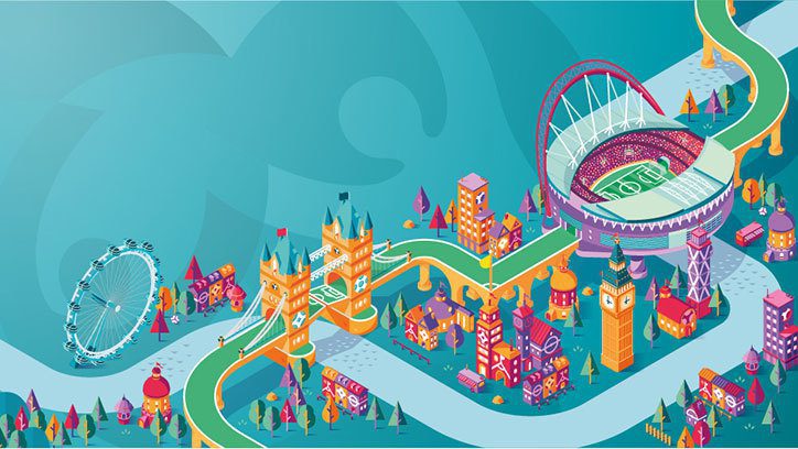
The new identity refers to the event’s unique multi-national approach by using a bridge as a symbol throughout the branding. This is visualised underneath the logo as a green bridge, which joins to illustrated bridges representing each host city, such as London’s Tower Bridge below. The bridge, according to Y&R, represents “a simple, universal symbol of connection”.
Each host city, such as Amsterdam, Baku, St Petersburg and Rome, is illustrated in a playful and vibrant style, showing its landmarks and stadiums connected universally by a green road that links to the bridge in the logo.
What this new identity does well is the ability to visualise the new ‘Euro for Europe’ concept in a way which works without over complicating the main branding. This certainly goes a long way to answer the brief of ‘how do you create an identity for a tournament where there is no main city’.
Rather than trying to ramp up the concept in the main Euro 2020 logo, Y&R have taken a leaf out of Euro 2016’s brand book and used the Henri Delaunay Trophy as its centrepiece with the ‘bridge’ concept as a subtle motif for the rest of the identity which flows seamlessly throughout. This is best demonstrated in the video below:
European Championship idents since Euro 96 have been pretty awful. For example, the previous tournament’s identity attempted to introduce some fun illustrations into their ident which, for me, fell well short of the mark in execution.
This identity tries to correct this by injecting more personality into the tournament with the use of their illustrations. Although I have to admit, they work a lot better as a 3D style cityscape linking landmarks to stadiums rather than those flat versions that are incorporated with the logo.
The main criticism I have with the logo is those vector people in the background. They look a little too stock/clipart to me. The rest of the identity has a particular illustrative style with flat tones of colour to give it some depth, but the main logo itself jars with this as it suffers from gradient overload!
It will be interesting to see how the ident is rolled out closer to the tournament and I’m especially keen to see how the on-air idents will look. If done correctly this could look quite fun and be an iconic tournament ident which is as diverse as the 13 cities it represents.
If done the way the Euro 2016 ident was done, it could spiral into clipart heaven that’s been mashed together in a gradient wonderland!
No-zilla!
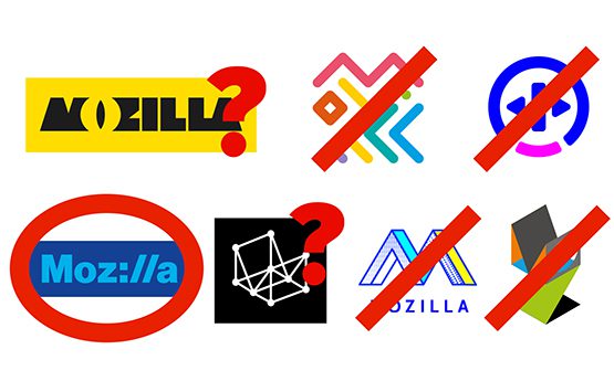
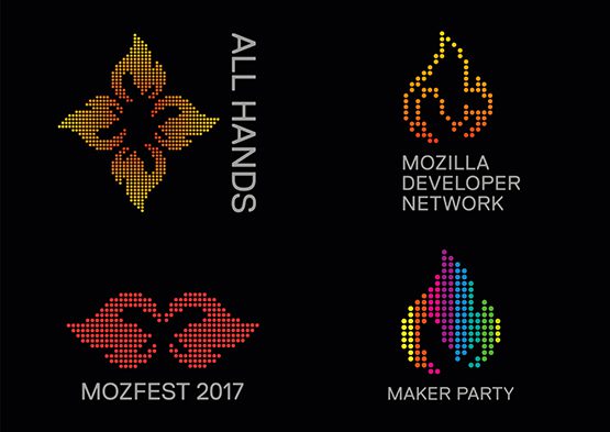
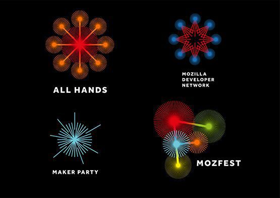
In the latest phase of its open rebrand, Mozilla has published four possible options for its new identity. Check these out below:


Right… where to start? Perhaps it’s worth showing the process that Johnson Banks and Mozilla have gone through to get to this stage…
So, although they state that a couple of options spawned new idea’s, the only option from round one that has survived is the protocol concept in route one. There’s a reason for this… it’s the strongest!


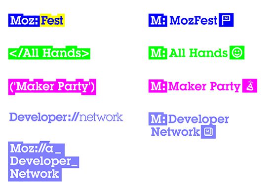
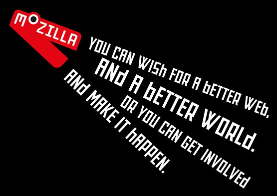
According to Johnson Banks blog: “By putting the internet http:// protocol directly into the word – Moz://a – it creates a typeable word mark, and by doing so alludes to Mozilla’s role at the core of the Internet (and hence the ‘Pioneers’ positioning).” Ok I get this! It works on multiple touch points. The Rockwell-esque typeface with the thick keyline makes the wordmark look modern while keeping it routed to the original concept. By using :// for the ‘ill’ gives it originality and helps it to stand out from its competitors.
I get that Mozilla is a pioneer of open-source. I even applaud them trying something different by opening the process up to the public domain. However, here is where the process has fallen down for me. They went through an initial design process. They are now in the refinement process. They should have chosen the strongest concept, stuck to their guns and developed this to it’s conclusion.
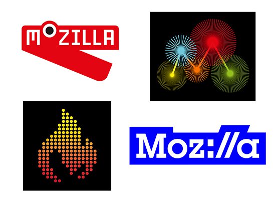
Instead, they have taken the strongest concept and diluted this by introducing three other designs to throw back out for public opinion that, lets face it, don’t work! Lets start with the flame:
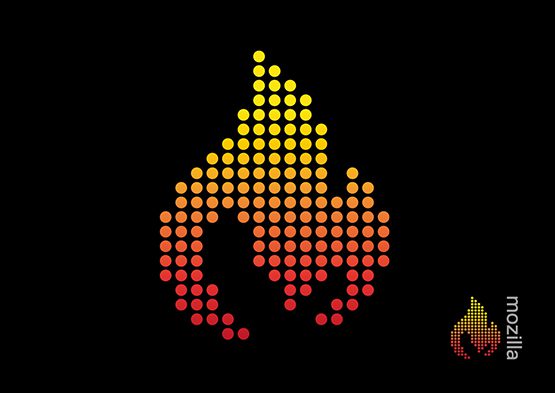

The rationale for this is the combined flame and ‘m’ is a “beacon for an open, accessible and equal internet for all”. The problem with this is that it looks dated by about 25 years! Everything from the dot matrix flame to the gradient screams retro 1990s (which is not really on message for a forward-thinking open-source organisation). I’m not sure why this was put forward to be honest.
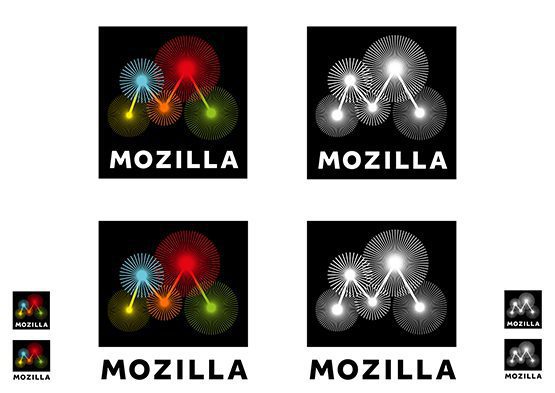
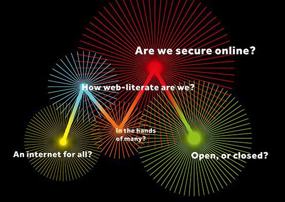
Loosly based on the original ‘wireframe’ concept from the previous round, Johnson Banks states: “As we looked harder at data sources we realised that five was a key number: Mozilla is collecting data around five key measurements as we type (and you read), and there are five nodes in a capital ‘M’. So we combined the two thoughts.”
As a graphical device I really like it, especially when it’s animated and I can see it working great online. As a logo… it doesn’t work. Paired with the word mark it looks disjointed and and the word ‘Mozilla’ seems an afterthought. Plus this really doesn’t work well at smaller sizes. The bursts will get lost and there would be serious legibility issues with the word mark.

This concept is the one that most excited Johnson Banks exclaiming: “Essentially this Dino is just a red chevron and some white type – but somehow that one raised eye can watch and blink in a very unique way. And those jaws can merrily chomp when needs be.”
The problem is, it looks neither like a dinosaur or a chevron… it looks like a stapler! Even the way the mouth animates is more like a stapler than a dinosaur’s jaw.
Look closely… I bet thats all you can see now!
So the next steps are to pick three of the above to go into public research. Really?
Personally, I would run with the idea that works and refine the visual language more so the highlighted words look more in line with the logo rather than the Johnson Banks website!
Hidden Clues
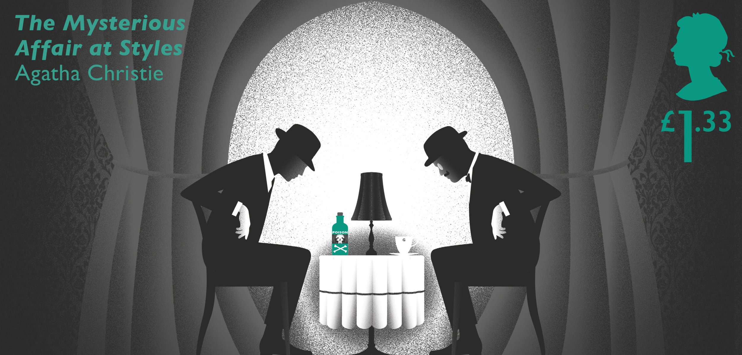
2016 marks the centenary of Agatha Christie writing her first detective story – The Mysterious Affair at Styles. The Royal Mail is marking the occasion with a set of six stamps created by Jim Sutherland of Studio Sutherl& in collaboration with illustrator Neil Webb. The series represent some of her best-known novels. Check them out below:


Each stamp sums up the complex plots in a single framed illustration, with clues that point to the murderer hidden within the artwork. What makes particular set of stamps unique is the way that the clues are hidden. They are revealed through exposure to UV light, heat, and of course, the traditional magnifying glass.


As well as the ‘hidden clues’ each stamp also has a hidden letter, which combine across the set to spell ‘Agatha’. These stamps are presented in a pack that is designed like a bookshelf packed full of original objects, photographs, book covers and a timeline of the the author’s life.


The Royal Mail have also developed an augmented reality feature for the ‘The Mysterious Affair at Styles’ stamp which triggers a 3D animation. Check it out below:
The thought and effort that has gone into this series is reminiscent of a plot of an Agatha Christie novel. The execution creates a styling that fits the author’s era, but also feels modern and contemporary. This is a book of stamps you certainly wouldn’t want to part with!
A Moon Shaped Pool
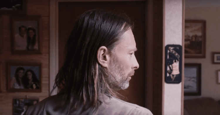
This week sees the latest single from Radiohead's latest album 'A Moon Shaped Pool' released. The video for 'Present Tense' is a relatively simple set-up: just Jonny Greenwood and Thom Yorke performing live with nothing but two guitars and a Roland CR-78 drum machine. Check it out below:
The video was directed by Oscar-nominated director Paul Thomas Anderson. Although he is known best for the 2007 Oscar-nominated ‘There Will Be Blood’, I’ve been a fan of his since the late 90’s with his early films ‘Boogie Nights’ and ‘Magnolia’ being on my all time favorite list.
‘Present Tense’ follows up the video for ‘Daydreaming’ (also directed by Anderson) which was released back in May. The film sees Thom Yorke walking restlessly through a series of rooms, which change with each new door. If these are the corridors of Yorke’s mind, it is crammed and complex – taking in a hospital, a laundrette, and countless homes, before bursting into the outside world.
Both of these video’s, in true PT Anderson style, are beautifully filmed and feel cinematic.
However, my favourite video (and track) off the album remains ‘Burn the Witch’.
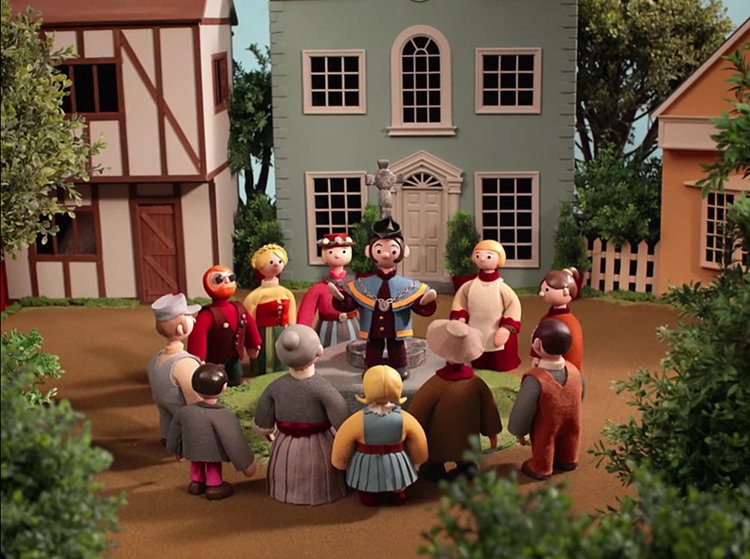
Combining the stop-motion animation style of a classic 60’s children’s programme with a decidedly sinister edge, ‘Burn the Witch’ is a dark, folkoric tale which combines ‘Camberwick Green’ and ‘The Wicker Man’. Directed by Chris Hopewell, the film builds to its troubling conclusion via stabbing Steve Reich-like strings and ritualistic scenes featuring ducking stools, gallows and bunting!

Everything about this album, from the initial pre-release social media ‘blackout’, the album artwork by Stanley Donwood and the visually gorgeous music videos has nailed it! After the less than impressive ‘The King of Limbs’ from 2011, ‘A Moon Shaped Pool’ sees Radiohead definitely back on form.
Beer, Glorious Beer!
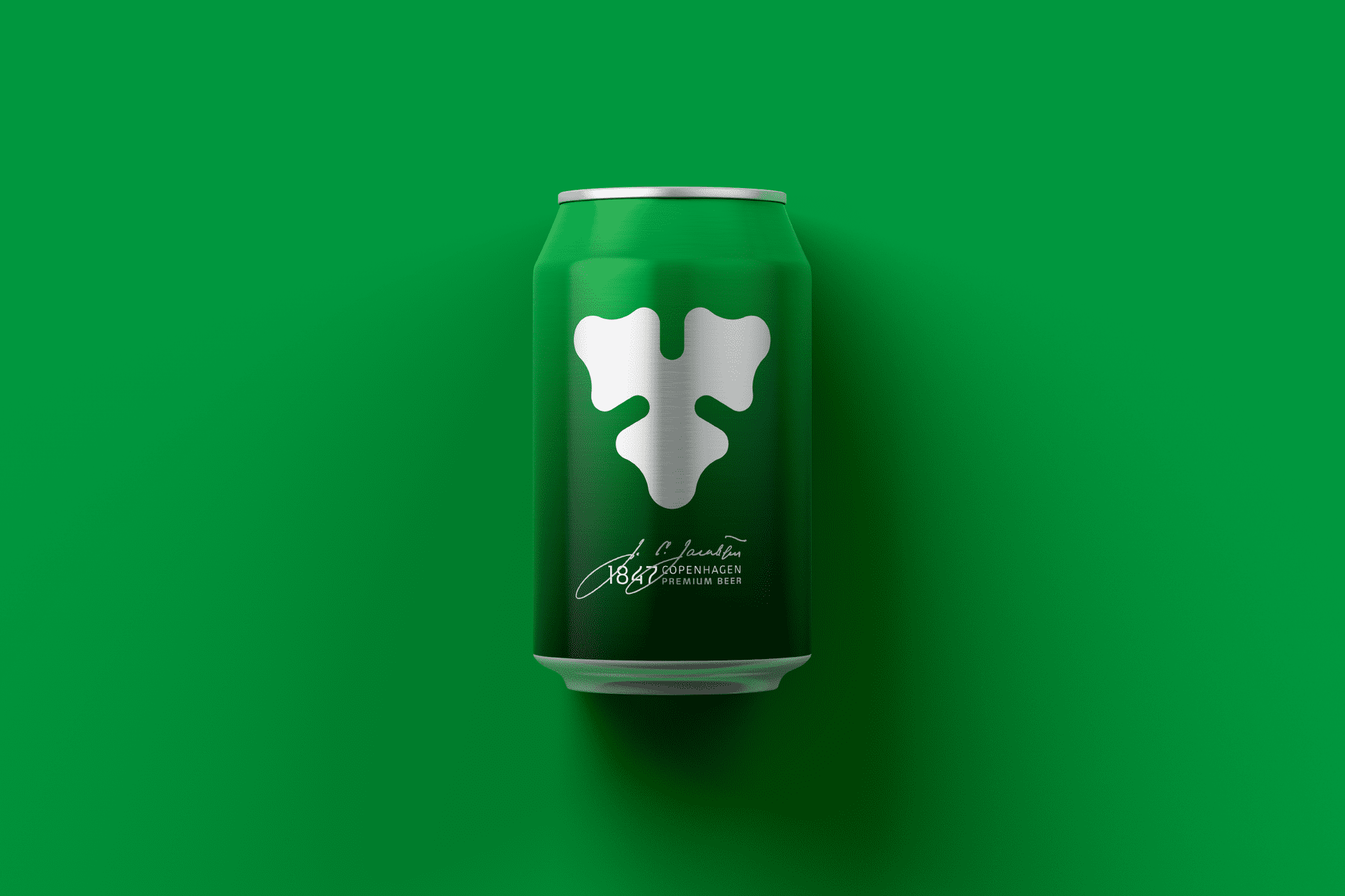
Copenhagen-based Kontrapunkt has worked with Carlsberg for 14 years (on the main brand and also on Tuborg, Holsten and Kronenbourg) and serves as its external brand guardian. They've recently released the new design for the packaging for Carlsberg. Check it out below:


The new can has been released initially in Germany but other markets may also adopt the new look down the line. The star of this new look is Carlsberg’s ‘hop leaf’. As well as appearing as part of the main mark, an enlarged version now also features on the reverse of the can and has also been die cut out of the can’s ring-pull.
The new design follows the minimalist example of other recent major brand packaging redesigns by stripping away all unnecessary decorations and finishes. A classic example of this is the redesign of Budweiser’s packaging back in January. Check this out below:


Designed by Jones Knowles Ritchie, the stripped-back logo now spans wide beyond the visible edges of their packaging including cans and bottles. The fact their brand has so much equity in the marketplace makes this work.
The Budweiser bottles and the Carlsberg cans have both been stripped back to a single colour without losing any of the detail that makes the brand stand out. The results on both of these examples are spectacular.
Time for closer inspection. I’m off for a beer!

Got a fiver?
On Tuesday, The Bank of England announced the new £5 note to the public. The new plastic fiver is being launched in England and Wales, but most people may have to wait up to a week to get one. Check it out below:

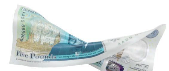
The new polymer note – which is much more durable than the old fiver – will initially only be available from a handful of banks and cashpoints. However, most bank branches are expected to have the notes within a week or so, suggesting those who want to obtain one may have to go into a bank and ask for one.
“The use of polymer means it can better withstand being repeatedly folded into wallets or scrunched up inside pockets, and can also survive a spin in the washing machine,” according to The governor of the Bank of England, Mark Carney. Despite this, the notes are not completely indestructible. The polymer notes are expected to last an average of five years – compared to the current note’s two years.
The note comes with new security features – such as a transparent window – to make it harder to counterfeit.


Compared to our previous currency, the design of the new note looks clean and crisp. The polymer material and transparent window has allowed the Bank of England to take a bolder approach to the design with more clear space to allow the design to breath. This places more emphasis on the characters of The Queen on the front and the iconic image of Winston Churchill in front of the maze at Blenheim Palace (his birthplace) on the back.
This also introduces the Bank of England’s new augmented reality campaign with Blippar. Once users have downloaded the app, they can point their smartphone camera at a physical £5 – and watch it transform into the new fiver in their hands!
The launch of the note was accompanied by a new website designed by Cyber Duck that goes into detail about the new notes design and security features, and a full tribute to the life and work of Sir Winston Churchill.
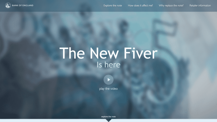


There’s some great use of iconography throughout the site which helps to break up the information into bit sized chunks. The interface of the site looks great. The use of video, a 360° view of the new note, and parallax scrolling makes a welcome change for a website of this nature.
Overall, this has been a well thought out and well executed campaign by the Bank of England.
The fiver is the first of a series of new note launches which will see Jane Austen on the £10 in the Summer of next year and JMW Turner on the £20 note by 2020.
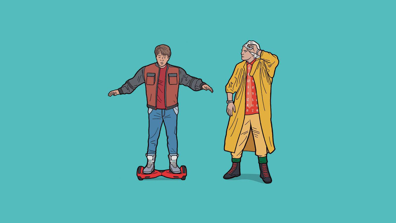
Great Scott!
What if E.T. had visited earth in 2016? What would RoboCop's duties be in today's law enforcement? To answer this, illustrator Tom Ward has combined his love of films with his unique style to create a series that reimagines famous '80s icons in a modern-day setting. Check them out below:

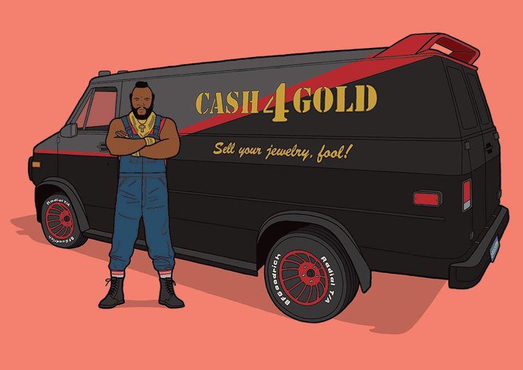
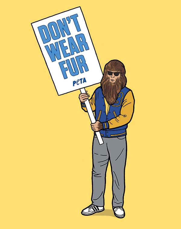


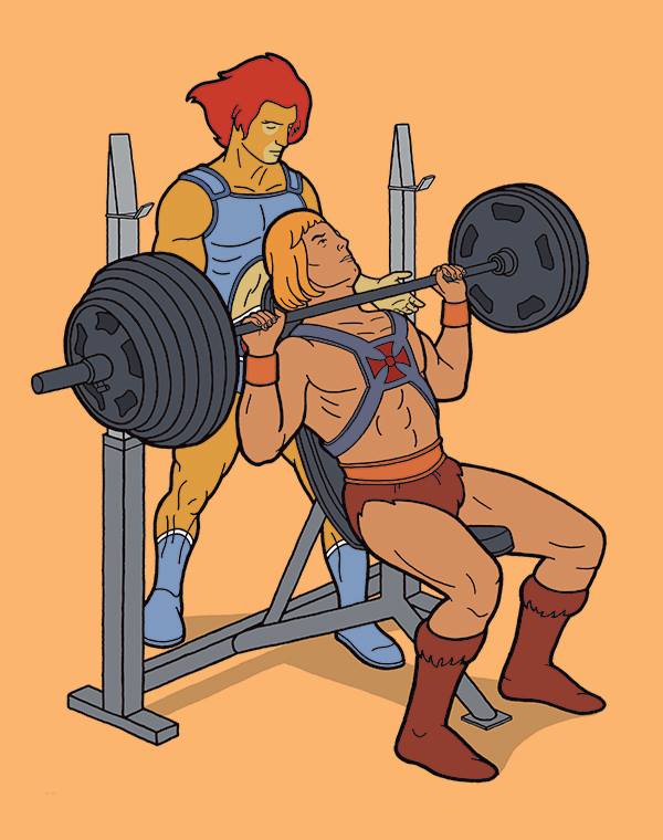


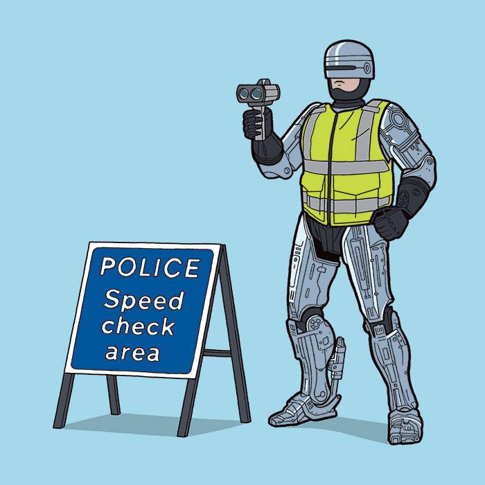
This is an awesome series that celebrates some of the best of my childhood 80s heroes. As the first film I ever saw at the cinema, the illustration E.T. on the segway is my personal favourite. (although Lion-O spotting He-Man at the gym is genius!) With plenty of other movie- and pop culture-themed projects in the pipeline, I look forward to seeing more of Tom’s work. In the meantime, why not check out his Facebook, Twitter and Instagram pages.