In the latest phase of its open rebrand, Mozilla has published four possible options for its new identity. Check these out below:


Right… where to start? Perhaps it’s worth showing the process that Johnson Banks and Mozilla have gone through to get to this stage…
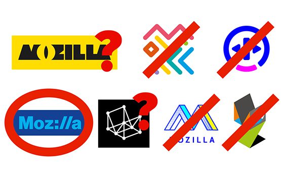
So, although they state that a couple of options spawned new idea’s, the only option from round one that has survived is the protocol concept in route one. There’s a reason for this… it’s the strongest!


According to Johnson Banks blog: “By putting the internet http:// protocol directly into the word – Moz://a – it creates a typeable word mark, and by doing so alludes to Mozilla’s role at the core of the Internet (and hence the ‘Pioneers’ positioning).” Ok I get this! It works on multiple touch points. The Rockwell-esque typeface with the thick keyline makes the wordmark look modern while keeping it routed to the original concept. By using :// for the ‘ill’ gives it originality and helps it to stand out from its competitors.
I get that Mozilla is a pioneer of open-source. I even applaud them trying something different by opening the process up to the public domain. However, here is where the process has fallen down for me. They went through an initial design process. They are now in the refinement process. They should have chosen the strongest concept, stuck to their guns and developed this to it’s conclusion.
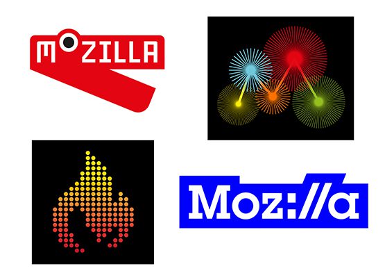
Instead, they have taken the strongest concept and diluted this by introducing three other designs to throw back out for public opinion that, lets face it, don’t work! Lets start with the flame:
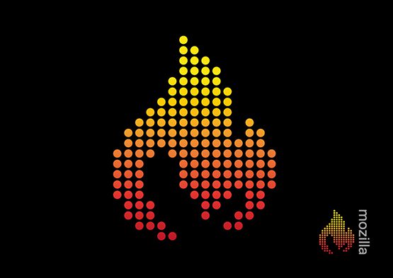
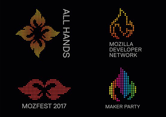

The rationale for this is the combined flame and ‘m’ is a “beacon for an open, accessible and equal internet for all”. The problem with this is that it looks dated by about 25 years! Everything from the dot matrix flame to the gradient screams retro 1990s (which is not really on message for a forward-thinking open-source organisation). I’m not sure why this was put forward to be honest.
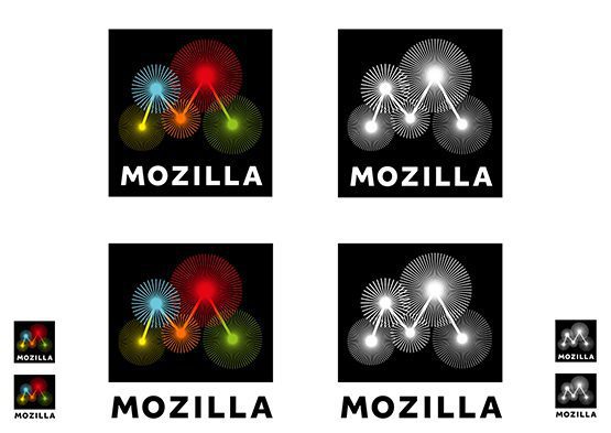
Loosly based on the original ‘wireframe’ concept from the previous round, Johnson Banks states: “As we looked harder at data sources we realised that five was a key number: Mozilla is collecting data around five key measurements as we type (and you read), and there are five nodes in a capital ‘M’. So we combined the two thoughts.”
As a graphical device I really like it, especially when it’s animated and I can see it working great online. As a logo… it doesn’t work. Paired with the word mark it looks disjointed and and the word ‘Mozilla’ seems an afterthought. Plus this really doesn’t work well at smaller sizes. The bursts will get lost and there would be serious legibility issues with the word mark.

This concept is the one that most excited Johnson Banks exclaiming: “Essentially this Dino is just a red chevron and some white type – but somehow that one raised eye can watch and blink in a very unique way. And those jaws can merrily chomp when needs be.”
The problem is, it looks neither like a dinosaur or a chevron… it looks like a stapler! Even the way the mouth animates is more like a stapler than a dinosaur’s jaw.
Look closely… I bet thats all you can see now!
So the next steps are to pick three of the above to go into public research. Really?
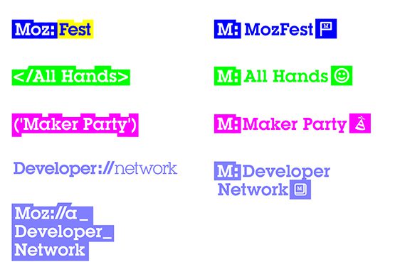
Personally, I would run with the idea that works and refine the visual language more so the highlighted words look more in line with the logo rather than the Johnson Banks website!

David Huskison
David is the founder of DWH and is involved in all aspects of the design process from the initial creative concept through to final artwork stage. With over 20 years of experience working with agencies across the Midlands, his role is to provide significant creative injection into client projects. By personally delivering creative concepts, he ensures that client briefs are effectively executed and that the final project is delivered within budget.