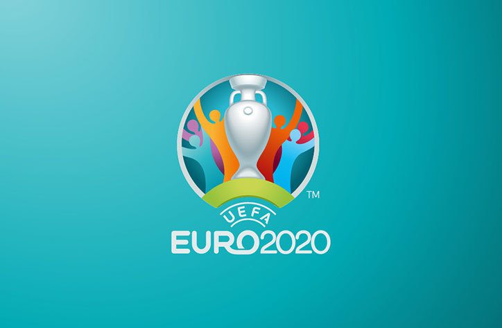
UEFA has revealed the logo design and branding for the UEFA 2020 Euro Championship, which for the first time will be held in 13 different cities across Europe (with London's Wembley Stadium chosen to hold the semi-finals and final). Young & Rubicam Portugal was selected as the creative agency following an international pitch to develop the brand for Euro 2020. Check it out below:

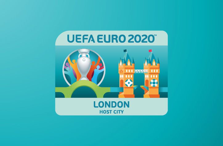
The new identity refers to the event’s unique multi-national approach by using a bridge as a symbol throughout the branding. This is visualised underneath the logo as a green bridge, which joins to illustrated bridges representing each host city, such as London’s Tower Bridge below. The bridge, according to Y&R, represents “a simple, universal symbol of connection”.

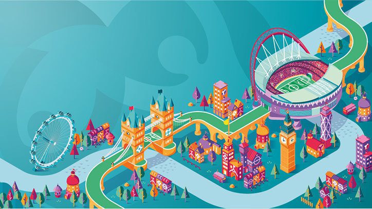
Each host city, such as Amsterdam, Baku, St Petersburg and Rome, is illustrated in a playful and vibrant style, showing its landmarks and stadiums connected universally by a green road that links to the bridge in the logo.

What this new identity does well is the ability to visualise the new ‘Euro for Europe’ concept in a way which works without over complicating the main branding. This certainly goes a long way to answer the brief of ‘how do you create an identity for a tournament where there is no main city’.
Rather than trying to ramp up the concept in the main Euro 2020 logo, Y&R have taken a leaf out of Euro 2016’s brand book and used the Henri Delaunay Trophy as its centrepiece with the ‘bridge’ concept as a subtle motif for the rest of the identity which flows seamlessly throughout. This is best demonstrated in the video below:
European Championship idents since Euro 96 have been pretty awful. For example, the previous tournament’s identity attempted to introduce some fun illustrations into their ident which, for me, fell well short of the mark in execution.
This identity tries to correct this by injecting more personality into the tournament with the use of their illustrations. Although I have to admit, they work a lot better as a 3D style cityscape linking landmarks to stadiums rather than those flat versions that are incorporated with the logo.
The main criticism I have with the logo is those vector people in the background. They look a little too stock/clipart to me. The rest of the identity has a particular illustrative style with flat tones of colour to give it some depth, but the main logo itself jars with this as it suffers from gradient overload!
It will be interesting to see how the ident is rolled out closer to the tournament and I’m especially keen to see how the on-air idents will look. If done correctly this could look quite fun and be an iconic tournament ident which is as diverse as the 13 cities it represents.
If done the way the Euro 2016 ident was done, it could spiral into clipart heaven that’s been mashed together in a gradient wonderland!

David Huskison
David is the founder of DWH and is involved in all aspects of the design process from the initial creative concept through to final artwork stage. With over 20 years of experience working with agencies across the Midlands, his role is to provide significant creative injection into client projects. By personally delivering creative concepts, he ensures that client briefs are effectively executed and that the final project is delivered within budget.