New BT brand comes "full circle"
One of the best things about being a long-standing company is the public’s connection with your brand. Unfortunately, this can throw a spanner in the works when it comes to rebranding. Claire Baldwin looks at BT’s new logo and whether it’s a misstep or a step in the right direction.
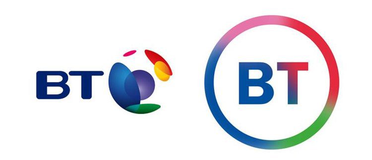
BT filed a trademark application last week for a new logo, which is simply the letters “BT” in a circle.
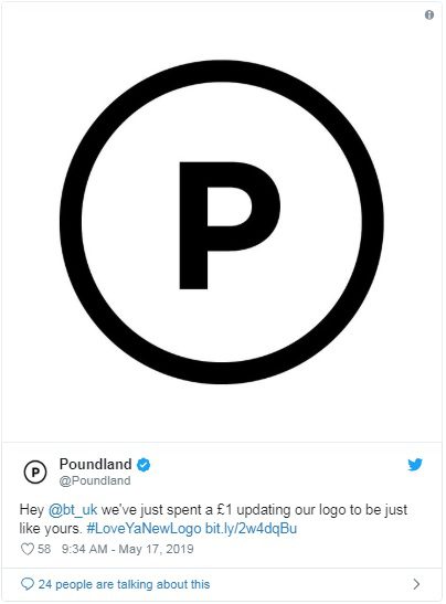
As the redesign has been in the works since 2016, the company has received criticism for the uninspiring result. Graphic designers, members of the public and even other companies have dissed the design, including Poundland’s Twitter jab: “we’ve just spent a £1 updating our logo to be just like yours.”
Haters of the new logo may be pleased to learn that the new branding is apparently still being finalised. However, given how little it has changed since its first appearance in 2016, it looks like BT is pretty set on the simple circle.
BT’s logo history
Since being privatised in 1984, BT have sported a few different logos, reflecting changes in both their company and in contemporary design trends.
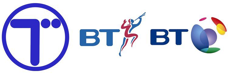
Back when they were British Telecom, the original logo was a simple blue T in a circle, designed to resemble a telegraph pole. It was a fairly clean design but didn’t present much in the way of brand identity.
In 1991, the company rebranded as BT and revealed their new logo of “BT” accompanied by the blue-and-red Piper. Apparently intended to represent the empowerment of the consumer, some said it looked like the company was blowing their own trumpet.
The Piper stuck around for a few years until the multicoloured ‘connected world’ globe icon replaced it in 2003. This logo better represented BT’s more modern service, with mobile, internet and TV packages bringing people together. It also fit well with the trend of creating spherical logos in the mid-2000s, championed by the likes of Xbox and Sony Ericsson.
The curse of modern design
A big issue that brand managers come up against these days is the necessity for logos and designs to work in a vast array of different media. Designing the logo isn’t the end of it; every use of the company branding has to be considered.
While thinking about how branding will look on tangible objects like business cards, storefronts, uniforms and vehicle livery has been standard practice for decades, modern consumers interact with brands in many different ways on a near-constant basis.
How your logo will be viewed on a website, social media stream or banner advert on a mobile device are more modern challenges. These smaller, more fleeting appearances of branding mean that the impact of delicate, detailed designs is lost and, as such, they are falling out of favour.
In the never-ending battle for attention and online real estate, simple logo designs have been taking over, giving consumers more breathing space and a better appreciation of the message behind the branding.
Coming full circle
Usually, when the public bemoans a veteran company’s new logo, it’s because they feel it has strayed from their brand identity or thrown away years of heritage. BT’s critics are no different.
While at first the new BT logo looks like a bit of a cop-out, it actually feels like a combination of the company going back to their roots while embracing modern design trends.
The new design has a crisper, more modern feel, but it’s pretty similar to the capital-T-in-a-blue-circle logo of 1984. What builds on heritage more than returning to your original logo? And at least the new version has both of the company’s initials in it!
The complete removal of any reference to what the company actually does is also testament to BT’s confidence in their brand. After all, there’s no mistaking what company it represents. It might not be a groundbreaking design, but there’s no denying that it gets the job done.

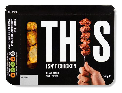
THIS is branding
With the ever-growing call to arms to address the threats of climate change and the shift towards a healthier vegan lifestyle, Claire Baldwin looks at some of the brands leading the change in the use of brand messaging, product innovation and downright honesty. In this first article, we’re checking out plant-based food brand THIS.
It’s 2019, and veganism is growing daily. At the start of the year, Veganuary saw a record-breaking 250,310 people from 190 countries register for the month-long plant-based pledge. For the first time ever, health was the major reason cited for participants’ decision to pledge (46%), followed by animals (34%) and then the environment (12%).
Despite this increase in veganism, there is still somewhat of a stigma around the lifestyle choice, with many omnivores scoffing at the notion of vegan food and proclaiming that it’s not for them.
Enter THIS.
What is THIS?
“THIS is what happens when two meat-lovers checked out meat-free food, and decided that we didn’t want any of it.”
Created by two former burger restaurateurs, THIS is a vegan food company that’s set to change the way we think about plant-based foods.
The website states: “It’s ridiculously high in protein, it tastes sensational and it’s produced by people who won’t guilt-trip you if you also eat meat.”
While many people still harbour the notion of preachy vegans telling them that their lifestyle choices are wrong, THIS aims to push the other reasons why you might choose their products over meat.
The message behind the brand is ‘plant-based food for everyone’.
Why does the message work?
The creators of THIS, along with Johnson Banks, who spearheaded their marketing campaign, aimed to tempt people with the benefits of their product, rather than trying to scare people off meat or shame them for eating it.
Together, they worked to create “a provocative, challenging tone of voice that embraces and promotes the idea that meat is no longer a necessity”.
The simple monochrome branding and the emphasis on the ‘naked’ product allows THIS to speak for itself. There are no fancy graphics, no lifestyle shots, and no artfully constructed serving suggestions. It’s just THIS.
Creating a focus
The creators of THIS have focussed their campaign on three main aspects that are of utmost importance to consumers: the taste, the environment, and the animals.
The taste
It should go without saying that taste is a key factor for food marketing, but vegan brands are often faced with an uphill battle against omnivores who think that vegan food is bland or boring.
In response to the question “What does THIS taste like?” the website’s FAQs playfully state: “Meat.” It’s a pretty clear and concise answer.
The environment
The packaging of the entire range features some handy graphics of the environmental impact of THIS versus other meat products.
Check out the graphs on their website for statistics of water consumption and CO2 production for THIS compared to beef, chicken and pork.
The animals
THIS’ website states that it’s “a bunch of food that allows you to virtually eat meat, without killing stuff.” It’s perhaps not the most delicate of statements, but the very matter-of-fact delivery of this message is what makes it so compelling.
When you put it that way, why not eat THIS instead of meat?
What have we learned?
The marketing for THIS is noteworthy because of its simplicity. It focuses on what the product is, and what it isn’t. And nothing else. There are no gimmicks, no false promises, and no distracting set dressing.
What THIS does is take what consumers care about and deliver it to them in a clear, no-nonsense manner, which isn’t something we can often say about marketing campaigns. The message is clear: THIS is not meat. It’s even better.

Impress your print company with your knowledge of printing terminology
Following our rundown of the essential graphic design terminology that will help you to better describe what you want, we’re taking a look at sprint-specific terms. Whether you’re printing flyers, hardback books or catalogues, knowing what you’re talking about will help you to ask for the right things from your print company. Here are some of the most common printing terms that you should know.
Binding
Binding is how the pages of a book or brochure are held together. There are many choices, which are suitable for different numbers of pages or particular aesthetics. Common types of binding include saddle stitched, perfect bound and hardcover (also called case bound). Take a look at this great resource for some visualisations.
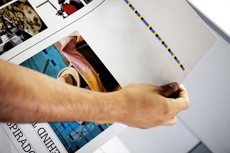
Bleed
Bleed is a buffer to allow for movement during the printing and cutting process by extending the design past the crop marks. In most cases, printers require a 3mm bleed around the edge of each page to prevent white lines around the edges. This means printing on a larger size of paper than the required end result, as the sheets will be trimmed.
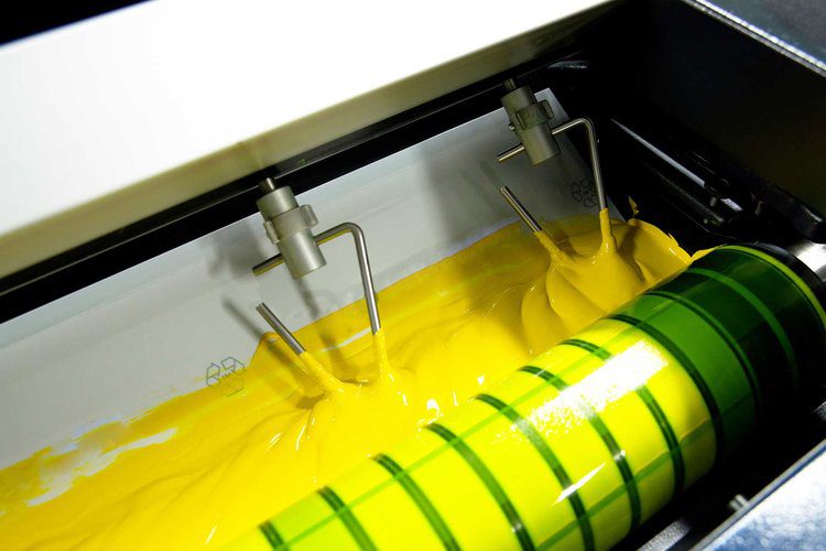
CMYK
While digital design uses RGB color (Red, green, blue), CMYK (Cyan, magenta, yellow, black) is preferred for print media. Traditional lithographic printing presses use individual plates of each of these four colours to create the final shade. If you use Pantone or spot colours, you should bear in mind that there may not be an exact CMYK colour match for litho printing.
Crop or trim marks
These are lines printed in the corner of each page to show the printer where to cut the paper for the finished size. They usually cut through the bleed to ensure proper printing of the design.

Die-cut
This process is often used when you require a specific shape to be cut out of your printed sheet. You might want patterns or letterwork cut from the centre of the page, a shaped outline, or any number of creative options. The process is done by moulding a metal cutter (die) for the desired shape, so it can be costly if you require something bespoke.

Embossing and debossing
Embossing is the creation of a raised design by pressing a die into the paper. Debossing follows the same principle as embossing, but the design is recessed rather than raised.
Foiling
Foiling is the process of adding a shiny, metallic finish to a particular area of your design. You may choose to foil your logo, your business name or design elements to make them stand out. Foiling comes in a variety of colours, including a holographic finish.
Folds
Particularly useful for leaflets, it’s important to know the different ways that your printed material can be folded to create the effect you want. Concertina or Z-fold is when the paper is folded back and forth, creating a zig-zag. Gate fold is when the left and right edges fold in to meet in the centre. Roll fold is where the paper is folded multiple times in the same direction, like folding a letter or takeaway menu.

GSM
GSM stands for “grams per square metre” and is used to define the weight or quality of paper. GSM is not a measure of thickness, though the two often correspond, so you should always request samples to get a good feel for the paper. If you’re interested in thickness, this is measured in microns.
Laminating
While you’re likely familiar with this in an office setting, print laminating is a much more subtle finish. Lamination adds a thin layer of plastic to the surface for durability. It is available in a range of finishes, including gloss, matt or soft-touch, which gives an almost velvety feel.
Lithographic printing
This traditional type of printing press uses plates and ink to apply colour to the paper, and is commonly used for mass printing of documents with graphics that need to look sharp. While lithographic printing dates back to the 18th Century, modern litho printers are much more advanced.
Offset printing
This is the most common and cost-effective method of commercial printing. The inked image is transferred (or ‘offset’) from a laser-etched plate to a rubber blanket, which is then pressed onto the paper. It is ideal for creating large volumes of high-quality prints, such as magazines, newspapers and brochures.
Pantone
The Pantone Color Matching System is a largely a standardized color reproduction system, created by the company Pantone. Pantone colours use 13 base pigments (14 including black) to create a broad range of shades. This means that they can’t always be exactly reproduced in CMYK or RGB.

Process colour
This is a type of colour that is made by layering a series of dots in different colours over each other to create a particular shade. This is how CMYK colours are printed, with a pass from each of the four colour plates. If you view process colour printing under a microscope, you can see the tiny dots that make up the colour.
Proof
A proof is a visual representation of the final project, either as a hard or soft copy. Carefully checking proofs before they are sent to print is essential to avoid costly mistakes. You may be given several proofs to check throughout the design process, allowing amends to be made before the final proof is signed off. When checking PDF proofs, be aware that your screen may not show colours exactly as they will appear in print.
Spot colour
A spot colour is one that is printed in a single run, rather than process colours, which require layering of different hues. In spot colour printing, each individual colour will require its own lithographic plate. There are many spot colour classification systems, the most well-known of which is Pantone.
Spot UV
Spot UV is a glossy finish that is applied to certain parts of your design to make them stand out. It creates a slightly raised surface and catches the light, giving a subtle yet impressive effect. It is often used on a dark-coloured matt background, and it works best on coated paper.
Stock
Stock is the term for the paper or card on which your design is to be printed. There are many different types of stock, which vary in quality, intended application and finish. Some examples include cover stock, which is a thicker, more durable material used for outer covers, linen stock, which has a luxurious, textured feel, or coated stock, which has a smooth, glossy finish. This list of stock terms has more useful examples.

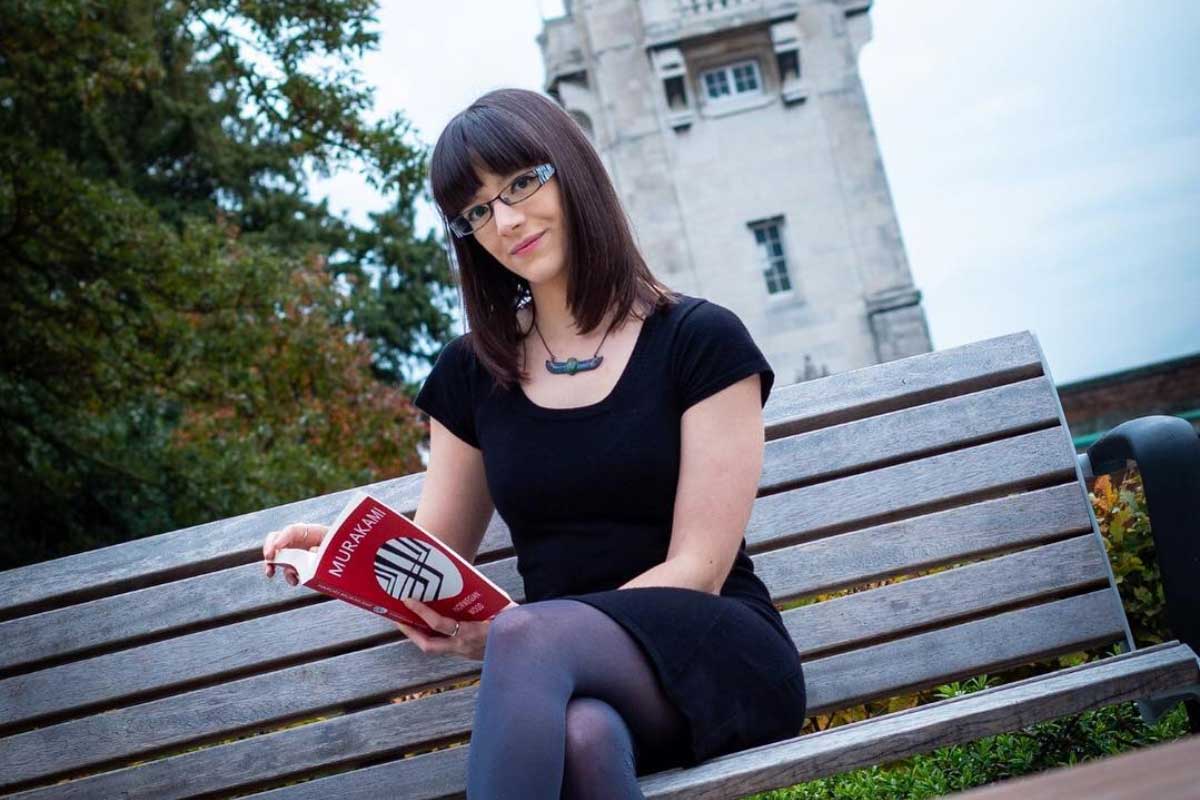
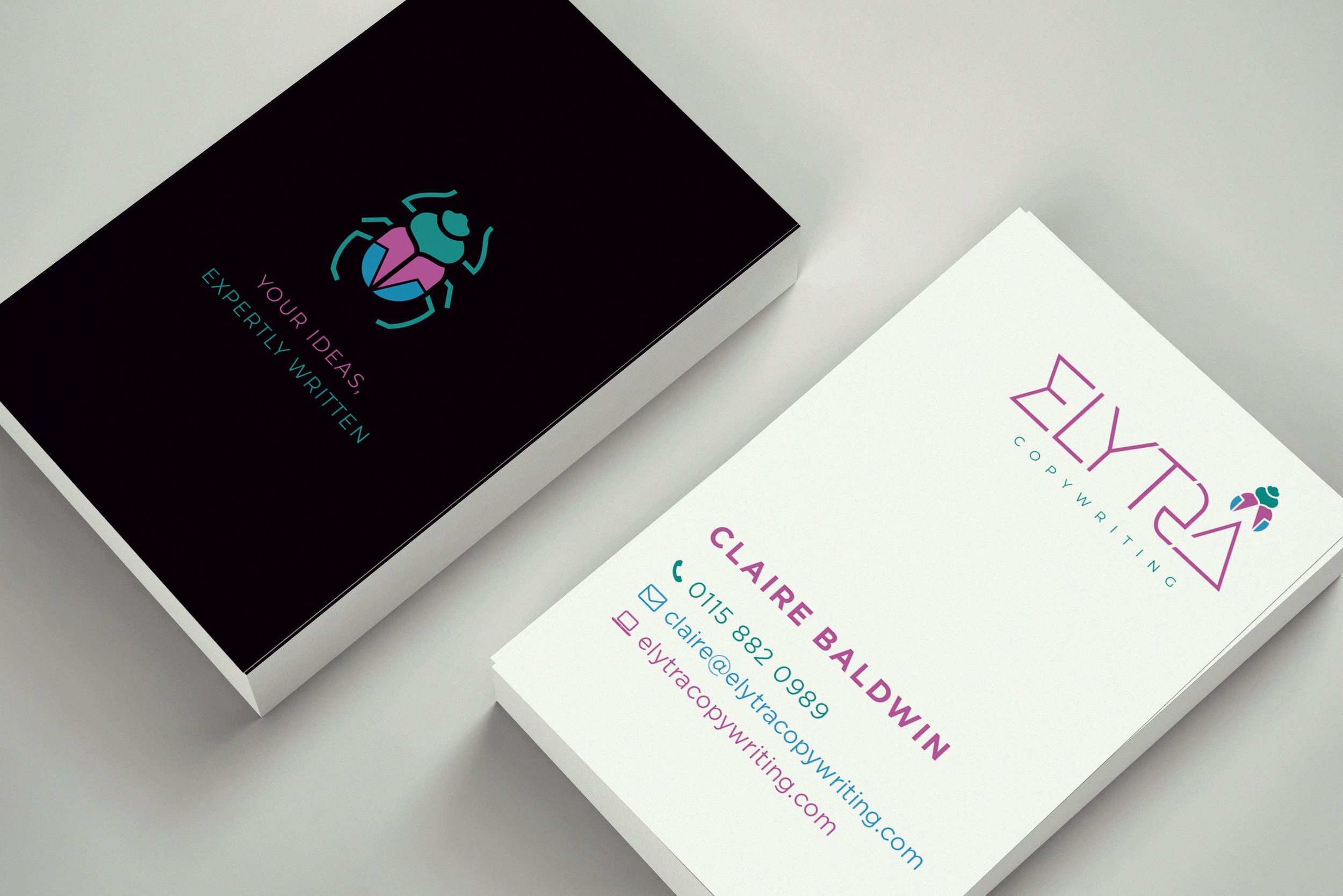
My DWH story
Continuing our series of DWH Stories, Claire Baldwin gives us the lowdown on her copywriting journey and how she came to work with DWH.
I’ve been working with DWH for nearly a year now, writing articles, proofreading documents, handling social media and basically tackling the agency’s word-related needs.
I’ve known Dave for about 15 years and I had no hesitation when he asked if I’d be able to provide him with some support. He’s one of the kindest and most enthusiastic people I know, and he’s really dedicated to his work. You’re in good hands with Dave!
Following my dream
I’ve always known that I wanted to be a writer in some form or another. I have a degree and an MA in Creative Writing, both from De Montfort University, and I’ve had both creative and academic work published in a couple of books and magazines.
I graduated from university and tumbled straight into the murky depths of the recession, which was a very unfulfilling welcome to the world of work. I had a lot of temporary jobs in the following years because people weren’t exactly focusing on hiring creatives during the recession.
Making ends meet
This meant that I had to take pretty much anything I could to get by before working on actually getting into writing. I was a cleaner, a receptionist (twice), and I had three jobs in accounts receivable—none of which was what I was expecting to use my Creative Writing MA for!
Eventually, I scored a great temporary job copywriting for Boots, writing the product descriptions for their Christmas line. It took me over 100 job applications to get there. I was then able to get my first permanent job at a digital marketing agency and I stayed there for about three years. After that I was an in-house copywriter, before moving to another content-based role at an agency.

Something missing
While I enjoyed many of the positions that I’d held over the years, I always felt that there was something missing and that I wasn’t able to make full use of my talents. I had toyed with the idea of freelancing shortly after leaving university, but had been put off by the hard work. I just wanted to find a normal job that didn’t require worrying about where the money was going to come from and how much of it needed to be put aside for tax.
Everything that I learned during my time at ‘normal’ jobs prepared me well for finally taking the step towards freelancing. Initially, I worked part-time at a small digital marketing agency for around the first year of my freelance business. This helped me to pay my mortgage while developing my business, as well as giving me additional experience. However, I wasn’t properly applying myself to the pursuit of freelance work, as I was fairly stable financially. If I had quit my full-time copywriting job to pursue freelance straight away, I would have perhaps approached things differently.
Goodbye, safety net!
Eventually, it was time to part ways with my temporary job and properly focus on expanding my business. I had more time to go to networking events, build up my social media and try to develop my network of contacts both in person and on LinkedIn. Before long, I had a pretty solid base of clients requiring both regular and ad-hoc copywriting.
This is also around the time that I began working with DWH. Initially starting with the occasional article (Check out my blog archive!), the relationship developed to the point that I now work two days per week exclusively for DWH. I write articles and social media content for both the main brand and our clients, as well as proofreading and writing those odd bits and pieces that need an expert eye.
Working with DWH has allowed me to work on new and interesting projects, such as proofreading Abbeywood Estate’s stunning brochure, delivering social media training, and performing content audits to see where existing websites can be improved for usability and SEO. Every day is different and there are lots of exciting things on the cards in the future.

A dedicated team
Dave has done a great job of building up DWH to be a full-service digital agency by bringing on board people that he knows are experts in what they do and, perhaps more importantly, are passionate about doing them. Every project at DWH is handled with enthusiasm and a keen eye for detail, leading to great results that make our clients happy.
I’m proud to be part of such a dedicated team that helps companies to share their stories and achieve their goals. Looking to the future, I’m excited to see what other projects DWH will get to work on as the company continues to grow and develop.

Impress your graphic designer with your knowledge of design terminology
Whether you’re an Account Director at an ad agency, an in-house Marketing Executive, or a client, the barrier between knowing what you want from your marketing collateral and trying to explain this to your designer can be infuriating. Help is at hand as Claire Baldwin breaks down some basic terminology that will bowl over your designer at your next meeting.
When you’re working with a graphic designer, you sometimes come across elements of the design that you’re not quite sure about but don’t know how to explain why. A basic knowledge of graphic design terminology can help you to better explain amendments rather than saying “It’s just a bit … you know. Can you make it look cleaner? I’ll know what I want when I see it.”
Typography
Copy
Copy is the proper term for the text part of a design or layout. There are various different bits of copy that you can refer to, such as body copy, which is the main bulk of the text.
Serif or Sans Serif Font
A serif is the decorative stroke or curve at the ends of lines on letters. These can be elaborate or quite basic. Think Georgia or Times New Roman. The word ‘sans’ is Latin for ‘without’, so these fonts are plainer and don’t include the extra flourishes. Think Arial or Calibri.
Kerning
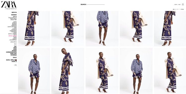
Kerning is the amount of space between two individual letters. It’s used to create a pleasing balance of space between each character. Check out our article on Zara’s new logo design for an example of extreme kerning.
Tracking
While kerning concerns the spaces between individual pairs of letters, tracking is the overall spacing of a group of letters. Normal, tight and loose tracking can be used to adjust the visual density of a block of text.
Leading
Leading (pronounced like the metal) is the space between lines of text. You might have seen this in word processing and design software as ‘line height’ but this is the proper typographical term. Tight leading can make copy difficult to read, while loose leading can cause copy to look sparse.
Layout
Hierarchy
Hierarchy is the arrangement and design of elements by importance. This is often broken up into levels, with Level One being the most important element, such as the title, followed by Level Two, which might be a subheading or image, while Level Three might be the body copy.
Orphan
When dealing with copy, single words or short lines can sometimes fall at the end of a paragraph or column, causing an uneven appearance. This lonely-looking bit of text is called an orphan.
Widow
The term widow usually refers to either a line that ends a paragraph but falls at the top of the following page or column, or a line that starts a new paragraph but falls at the bottom of the page, splitting it from the rest of the content.
White Space or Negative Space
While it’s referred to as white space, this term refers to any area of the design that is left blank, so it can be any colour. White space can give a design room to breathe and stop things from feeling cluttered. It’s tempting to want to ‘make the most of the space’ by filling it with something, but white space can be a very effective use of space.
Branding
Logotype or Wordmark
When referring to a company’s logo, people are often talking about their logotype or workmark. This is a visually unique representation of the company’s name for branding purposes. Think Coca Cola, FedEx, Disney … basically any company logo that’s a stylised version of their name.
Logomark or Brandmark
This is a type of logo that doesn’t contain the company name but instead uses an image or symbol to represent the brand. So instead of the company name “Apple”, you usually just see the apple-shaped logo. Brandmarks can be accompanied by a logotype, but often stand alone for simplicity.
Thumbnail Sketch
This is a quick drawing of a potential concept, allowing the designer to share lots of different ideas without having to spend too much time on those that will be discarded. While it’s called a sketch, this might be a digital design created on the computer but without the full care and attention that a final design would receive.

Are two brands better than one?
After we were presented with a brief to create some dual-branded material for one of our clients, Claire Baldwin conducted some research into the winners and losers in the world of dual branding. The results are in.
When done well, brand partnerships can be hugely beneficial for everyone involved. Unfortunately, there are also plenty of opportunities to ruin the reputations of both companies.
Let’s look at some dual branding and see what makes a good collaboration.
Spotify and Uber
One factor in the success of dual branding is both companies having similar objectives and target markets. This was definitely the case for the collaboration between music streaming service Spotify and taxi service Uber.
Spotify announced in 2014 that premium account holders would be able to stream their own playlists during Uber rides. This enhanced the experience of riding with Uber and also encouraged Spotify users to upgrade their account to benefit from the collaboration.
By understanding the whims and interests of their target markets, rather than just their needs, Spotify and Uber managed to create a successful collaboration that was beneficial for both companies, as well as their customers.
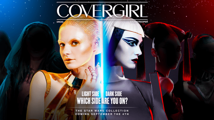
Covergirl and Star Wars
When you think of collaborations, makeup brand Covergirl and sci-fi franchise Star Wars don’t necessarily seem like the best fit. However, when Covergirl released a Star Wars collection to coincide with the 2015 release of The Force Awakens, it was a huge success.
The limited edition range featured lipsticks and nail polishes in bold, sci-fi shades, and even mascara with iconic Star Wars quotes on the tubes (Of the 10 choices I’d opt for: “Do. Or do not. There is no try.”).
A makeup collaboration at the time of the original Star Wars movies in the ’70s would likely have been a flop, as the movies were seen to be ‘for guys’. However, modern audiences and cultural shifts allowed Covergirl to take advantage of a crossover audience that didn’t exist at the time of the original movies. And with The Force Awakens’ strong, female protagonist Rey, the joint branding felt all the more appropriate.
Shell and Lego
Both being Danish companies, the partnership between Shell and Lego seemed to make sense when it first started around 50 years ago. Lego created Shell-branded petrol stations and race cars in its toy range, benefiting from added realism and access to Shell’s supply streams. Shell got its brand exposed to new customers from a young age and was able to convey a family-friendly image.
However, with increased global awareness of some of Shell’s less-than-environmentally-friendly practices, the suitability of the partnership was called into question. In particular, people asked whether Shell was an appropriate brand for children to be so blatantly exposed to from such a young age.
Greenpeace put heavy pressure on Lego to cut ties with Shell, and the accompanying public outcry eventually led to the end of the partnership.
So what makes good dual branding?
Dual branding seems to work best when:
the brands have complementary audiences
both brands have similar ethics
there is a clear objective or goal
the collaboration benefits both brands as well as their customers
However, success can be hard to predict. Collaborations that sound perfect can sometimes fall flat, and those that seem doomed to fail can turn out to be wildly successful.
It’s important to think about what your aims are with dual branding and not to jump into a partnership without considering how it will affect both brands and their audiences.

Flatter to deceive
There’s no such thing as an original idea. We hear this all the time. You come up with a brilliant idea, or you write that killer tagline, only to find that somewhere along the line someone has done it before. So, when does inspiration become plagiarism? Claire Baldwin explores the differences between the two and investigates what can be done to avoid the situation.
Inspiration vs plagiarism
One of the biggest fears for designers is having their work stolen or copied.
Creativity can’t exist without inspiration: artists inspired by nature, musicians inspired by other musicians, filmmakers inspired by real-life stories. By reacting to this stimulus and combining it with our individual ideas and experiences, we create something new.
However, it’s hard to tell when inspiration ends and theft begins. While it’s an important part of the process, you should never let inspiration become imitation.

Tokyo 2020 Olympics
The Japanese Olympic Committee made headlines in 2015 after revealing the Games’ official 2020 logo.
Kenjiro Sano was accused of stealing Belgian designer Olivier Debie’s 2013 design for the Théâtre de Liège. Debie undertook legal proceedings for copyright infringement due to the similarity of Sano’s work.
Comparing them side by side, it’s clear why Debie was unhappy. Sano claimed to have never seen Debie’s work, but further allegations of plagiarism surfaced from his past work and the logo was scrapped.

Solo: A Star Wars Story
Last year, posters for the ‘Star Wars’ spinoff ‘Solo: A Star Wars Story’ attracted media attention for their similarity to a series of Sony Music France album covers.
Created by Hachim Bahous and released in 2015, the album covers feature large, colourful typography and graphics, which are almost exactly replicated in the Disney designs. While this could be considered coincidence, the posters even use the same colour scheme.
Bahous said: “I am flattered that the quality of my work is recognised, but it is still pure and simple forgery, I have not been asked for my permission, I wish to be credited and paid for this work I have done for Sony!”

Little Swan
This year, Chinese washing machine manufacturer Little Swan was criticised for stealing adverts created by Design Army for the Hong Kong Ballet.
In a series of ads, Little Swan almost exactly replicated the artistic shots used for the Hong Kong Ballet. They included ballet dancers wearing the same outfits, and even copied and pasted portions of the original images.
While China has long been known for its copycat culture, it’s hard to understand why Little Swan would copy the adverts so precisely with so little connection between ballet and washing machines.
How to avoid design plagiarism
With the current media saturation, being consistently original can be a tall order.
Here are some tips to avoid accidentally copying something, or creating something so generic that it’s hard to tell if it was copied or not.
Avoid the familiar
Try to create something unusual, as you’ll have more chance of this being a unique design.
If something seems like ‘the obvious choice’ then steer clear! You might accidentally copy something or just end up creating something really dull.
Do your research
Do whatever you can to check that your idea doesn’t exist. Search online, look at design books, and hunt through trademark databases.
Don’t limit yourself to the sector or medium you’re working with, as common designs can be found almost anywhere.
Track your process
Keep note of your inspiration, how you researched ideas, any initial drafts or sketches, and date everything.
Should the worst happen despite your best efforts, you can better prove that it was a coincidence, show what inspired you, and that you used due diligence to avoid plagiarism.

Letters too tight to mention
Following up on her recent blog about fashion rebrand trends, Claire Baldwin examines the recent rebrand by Zara who, by deciding to buck this trend, have invited a whole new wave of criticism. Was it a step too far, or a genius piece of marketing?
A good logo should capture the essence of your brand and be instantly recognisable. Of course, design trends change and logos can look dated over time.
When rebranding, how important is it to stick to your roots? Should you follow current trends or make a statement with something different?
Unfortunately, there’s no one-size-fits all answer. No matter what you do, you’re bound to be met with a mixture of praise and criticism … as Spanish fashion brand Zara have discovered.
Let’s investigate.
The Case
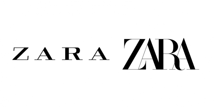
Zara’s new logo was met with criticism following its introduction with the brand’s Spring/Summer 2019 campaign.
The typeface is similar to the one used in the brand’s previous logo. The serifs have been simplified on all letters apart from the Z, where they have been exaggerated, and the R has been given a more organic, curvy shape.
The most obvious change is the kerning, or lack thereof. The four letters overlap across the bottom, although the tops have been given a little breathing room. While designers said the old logo was too spaced out, the new one is being criticised for being too squished up.

Whodunnit?
French design agency Baron & Baron are responsible for the redesign. They’re no stranger to fashion brands, boasting collaborations with Dior, Ralph Lauren, Louis Vuitton, Balenciaga and more.
Baron & Baron’s website refers to Zara’s new look as “an approach that blends elegance with edge” and “an artful new elevation” for the brand.
Prosecution
Critics of the new logo have been pretty vocal with their opinions. Complaints include “overcorrected”, and “claustrophobic” and “barely legible”.
German typographer and designer Erik Spiekermann said that it was “the worst piece of type I’ve seen in years” and wondered whether it was “done by one of those new robots that will replace humans”.
The logo’s individuality and creativity have also been called into question, as it looks similar to Baron & Baron’s own wordmark. It also bears a strong resemblance to the logo used by Harper’s Bazaar in the 1990s, when Fabien Baron was creative director.
Defence
On the plus side, Zara haven’t followed the recent trend of stylish but bland sans-serif wordmarks. This means they will stand out against increasingly similar logos on the high street.
The logo retains visual links to the original font, making it easier to associate with the brand. It feels like Zara has kept its heritage more than many recent redesigns have.
The shapely Z and R letters add character to the logo, whereas the old letters were very uniform. Baron & Baron shared lookbooks where the individual letters are used alone, presenting an interesting new design element.
The logo takes up about half the horizontal space of the old version, making it more versatile for sizing and placement. It nicely fills out the area and is easy to read from a distance.
Verdict
Personally―and I admit that I’m a writer, not a designer―I quite like the new logo. It seemed a little harsh at first, but the more I’ve looked at it (and I looked at it a lot while writing this), the more it’s grown on me.
It’s definitely more interesting than the previous version and feels quite dynamic. With all these boring sans-serif, all-caps logos coming out of the woodwork, I think Zara will do well to have something that divides opinion.

Are luxury logos going out of fashion?
With high-end fashion houses opting to rebrand themselves with ‘clean’ and ‘contemporary’ sans serif logos, Claire Baldwin asks whether this modern typeface trend is nearing the end of its shelf life or if this is merely the beginning.
If there’s one thing you’d expect designer brands to be good at, it’s design. So why are so many luxury brands opting for such similar plain text logos?
Over the last decade, many brands have updated their logos and wordmarks to simple, sans-serif fonts.
While this trend has been really picking up speed in digital sectors, the most surprising takers have been luxury fashion houses. The last few of years have seen several designers revealing simplified redesigns of their classic logos.
Is this simply a passing trend or will these logos be on our screens for the next fifty years?
Who has thrown out their serifs?
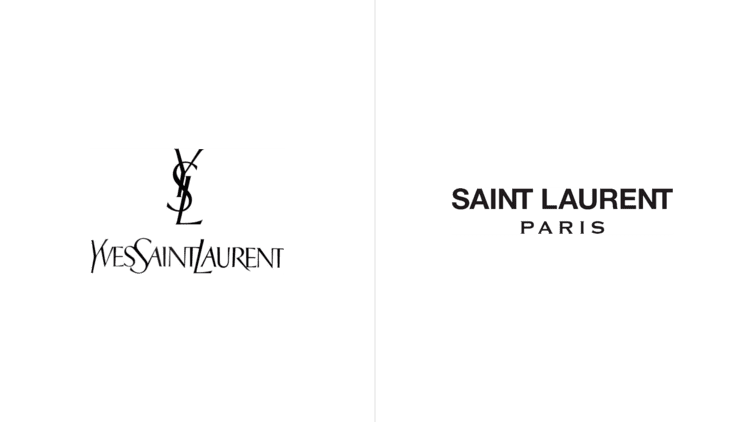
Yves Saint Laurent
2012 saw French brand Yves Saint Laurent change their name to Saint Laurent Paris. A new logo was clearly required, but the look and feel was very different. The skinny lettering and italic initial capitals were thrown out and a bold, sans-serif font took their place.
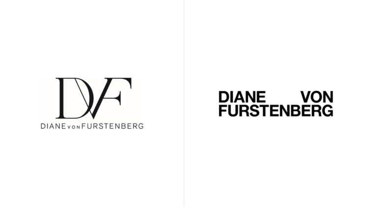
Diane Von Furstenberg
In 2017, Diane Von Furstenberg dropped the serifed “DVF” monogram, which was accompanied by a sans-serif version of the full brand name. The redesigned logo is sans-serif, bold, and in all-caps.
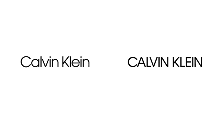
Calvin Klein
Calvin Klein also chose to adopt all-caps in 2017. While their previous logo was already a sans-serif font, the updated version is bolder with thicker lines and all capital letters.
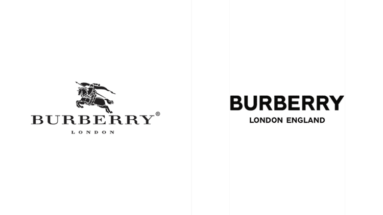
Burberry
In 2018, Burberry dropped the unique squat, serif font of their brand name, as well as the loopy calligraphy of the words “London, England”. Instead, the’ve opted for … you’ve guessed it! Bold, sans-serif capitals.
Why do companies redesign their logos?
Brand and heritage are key parts of a luxury designer’s appeal, so it seems counterintuitive to reinvent the whole look and feel so drastically. When brands can sell a simple T-shirt for £100 just because it’s got a specific logo on it, changing that logo seems pretty risky.
So why are all these fashion houses doing this?
Current design trends
With so much of the world being online, both in terms of shopping and advertising, many companies are opting for sans-serif fonts for three main reasons:
They display more clearly on a screen
They look cleaner and more ‘modern’, gelling better with current website design trends
They are easier to read, especially for those with dyslexia
These are all factors that can affect the perception of a brand and are important to consider.
Realigning with customers
For brands to succeed, that must build a rapport with their customers. Two of the main ways in which this is done within the fashion industry are by being relatable or being aspirational.
Designer brands often market themselves in one of these two categories, but sometimes there are changes within the customer base that spark an evaluation of brand perception.
Fashion houses may choose to either steer into the change, rebranding to embrace their new clientele, or to reaffirm how they wish to be seen.

Moving the brand forward
There comes a time for any brand when it’s necessary to reevaluate your goals and what you’re looking to achieve. For some of the fashion brands we’ve discussed, this time has come with a change of creative director.
Diane von Furstenberg handed over creative direction of the label to Jonathan Saunders. It’s been theorised that the new logo was intended to make the brand ‘more masculine’ under his direction.
YSL also underwent a logo revamp following the appointment of a new creative director. Hedi Slimane announced the change to Saint Laurent Paris, and the new design was aimed to support the rebrand and usher in a new era for the label.
Keeping up with the Joneses
Peer pressure isn’t just something that kids experience at school; it also thrives in the business world.
Comparing themselves to their contemporaries and competitors helps brands to stay relevant and try things that others aren’t doing, but it also means trying to fit in.
If lots of companies in a particular sector opt for a sleek, modern redesign of their logo, those that don’t follow suit run the risk of being seen as behind the times.
While a big part of branding is differentiating your brand from others to give people a reason to choose it, it’s also important to be seen as a viable or comparable choice. Designing your logo to look consistent with other similar companies aligns your brand with theirs and allows you to feed off their reputation.
Are sans-serif all-caps here to stay?
It’s hard to say for sure. It seems likely that the trend will continue for the time being, as displaying well in digital formats and presenting a modern image are both pretty important for brands right now.
It’s possible that there will be an oversaturation of very similar branding, leading companies to either branch out into something new, or to revert to their ‘vintage’ branding. Both of these options offer great opportunities for marketing campaigns.
For now, I think we’ll be seeing more brands jumping on board before we see logo trends move on to something new. But once a company has broken the seal on updating their brand, it’s often the case that frequent redesigns will follow, and it’s not unheard of for a company to revert to their old branding following backlash from customers.
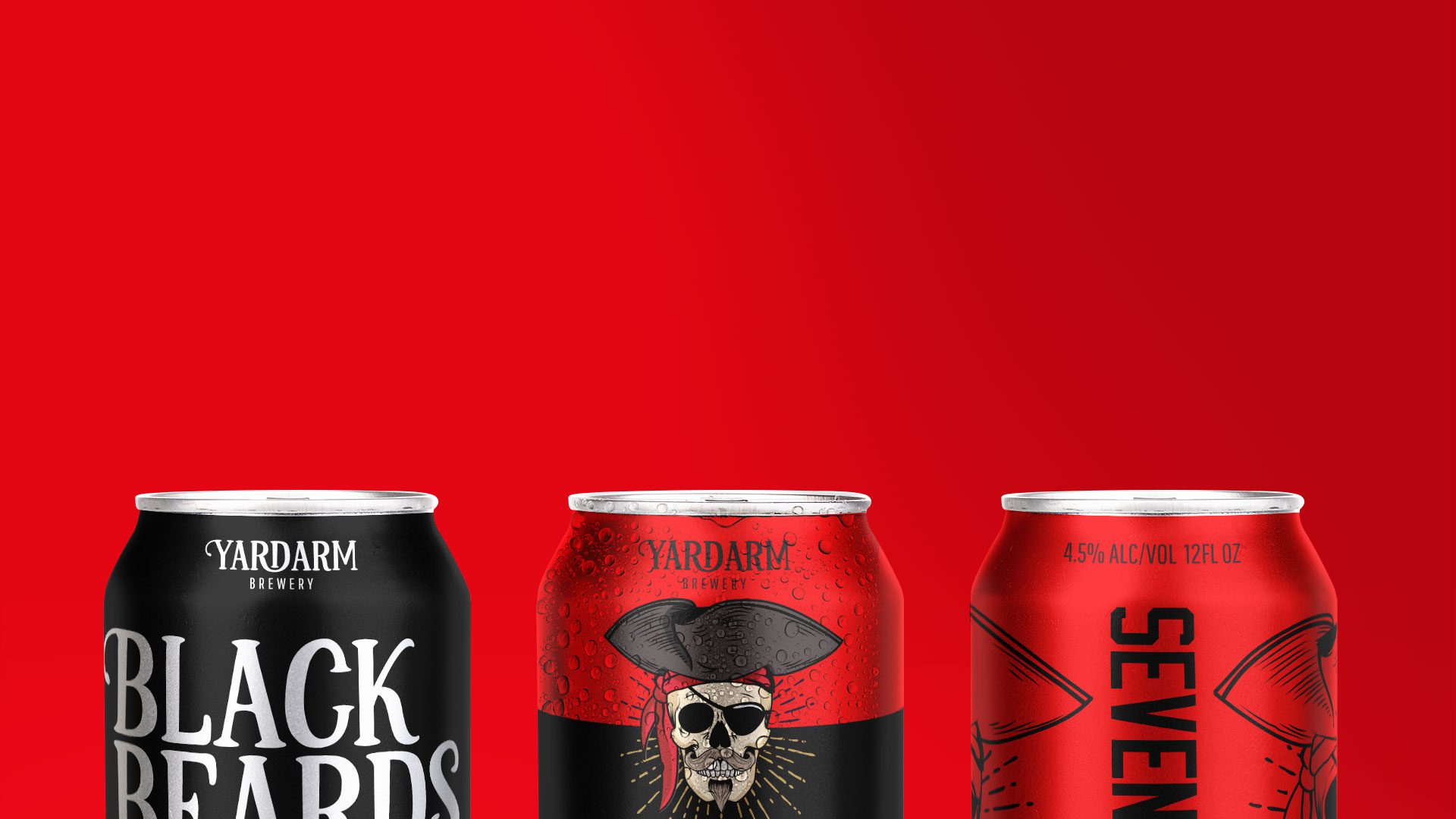
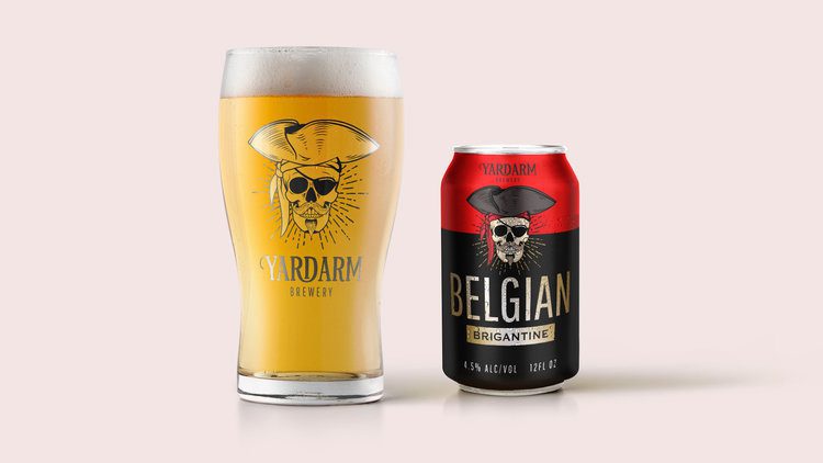
Crafting a beer brand
Having recently embarked on creating a brand for a new craft beer brewery, we asked Claire Baldwin to analyse the craft brewing scene in 2019, what styles are currently trending, and what you can do to stand out from an ever-growing crowd.
If you’ve been in a pub, bar or microbrewery lately, you’ll have likely noticed a few eye-catching beer designs. With the rise of craft breweries both in the UK and worldwide, even the most local of pubs seems to be offering a marshmallow milk stout.
Choices, choices
Beer is so much more than just lager, bitter or ale, and the endless choices can be pretty baffling. What’s the difference between an India pale ale and an American pale ale? Do you want a hoppy or a malty beer? What exactly is a sour and why does it taste so … sour?!
You might think that choosing a beer has become as complicated as choosing a bottle of wine. And how do most people choose a bottle of wine when they don’t know anything about wine? They pick the one with the coolest label.
Recent craft beer branding trends
There’s no denying that craft beer branding has been getting more and more creative, from intricate label designs to weird and wonderful pun names. Let’s look at a few trends that might get some ideas brewing for your own brand.
Unique colours for each beer
Lots of breweries are opting for a standard design across their range, using bold splashes of colour to differentiate between the brews. This offers a clean but clear look and makes it easy for both drinkers and bartenders to grab the one they want.
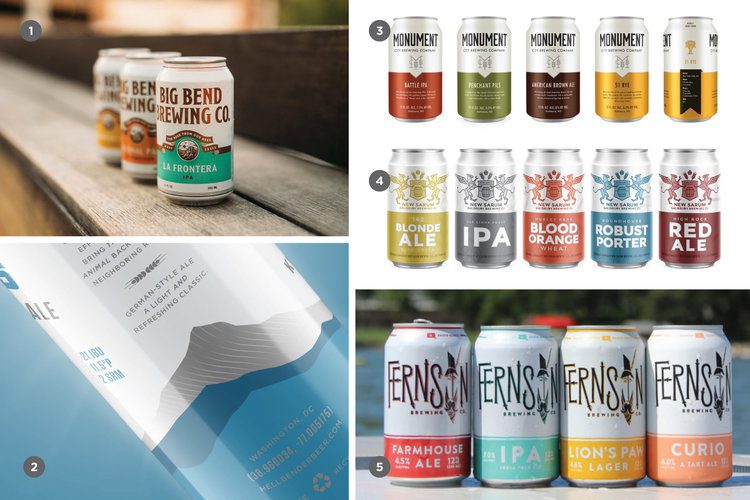
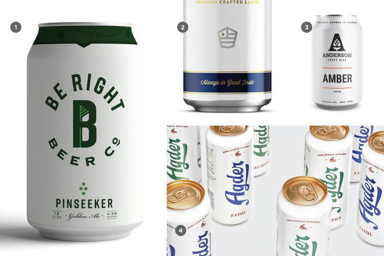
Minimalist designs
While lurid, eye-watering designs have grown in popularity, some breweries are starting to focus on sleek, modern designs that let the beers speak for themselves. Simple cans featuring little more than the brewery name and the type of beer give a sense of simplicity and sophistication that echo their contents. If everyone else is offering up designs that would make Jackson Pollock say “That’s a bit much,” stark white minimalism will make your brand stand out.
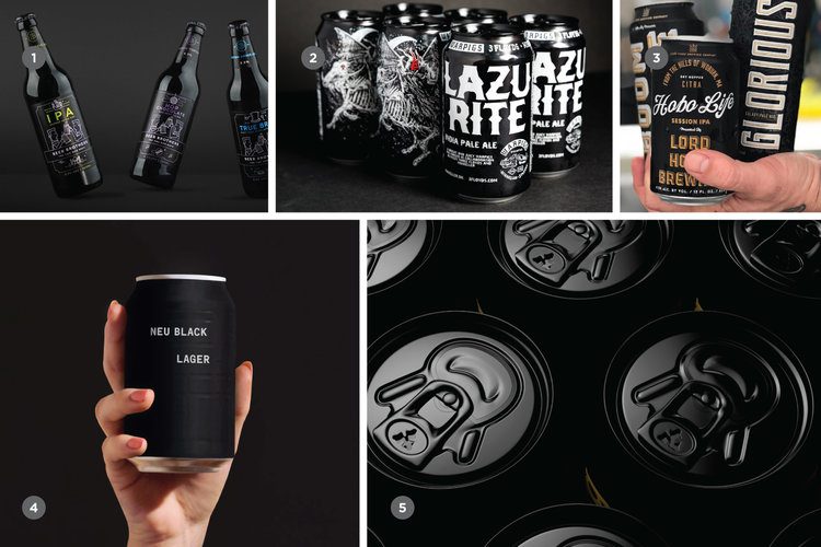
Bold and black
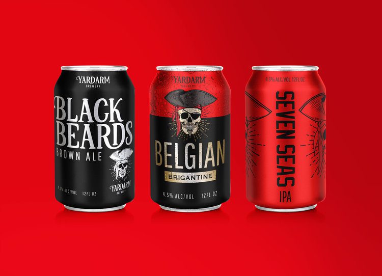
Again, seemingly in direct response to the bright, cartoony designs that have become prevalent, we’re starting to see more dramatic black bottles and cans on the scene. Bold, black designs are always going to make a statement. Whether you’re looking for an edgy vibe, a no-nonsense approach or a feeling of luxury, black can be pretty versatile.
So, how do you plan a craft beer brand?
If you’re serious about creating a craft beer brand that will really stand out and be successful, there are lots of things to consider. We recommend taking a look at the amazing and in-depth guide from American design agency CODO. It’s pretty lengthy, so here are a few key takeaways.
What are your core values?
There are countless breweries out there. What makes yours different? What do you stand for? What are you proud of? Are you a traditional brand or a playful one?
Think about everything that’s important to you and your brand, and try to come up with a handful of values that will govern everything you do for both marketing and day-to-day business practices.
Who do you want to buy your beer?
Like any business, you need to think about your target audience. Your brand will be heavily associated with its drinkers, so make sure that your name, packaging and marketing aim in the right direction. If you see yourself as a classy, sophisticated beverage for the older gentleman, you’ll attract a different crowd altogether if your cans are decorated in a playful, comic-book style.
What is your brand tone of voice?
Tone of voice is something that ties together all of your other decisions. Is your brew light and playful? Maybe your name and branding should follow suit. Another consideration is the names of your individual beers. Create a theme or opt for something wacky and memorable, and your customers will be able to recognise your beer from the name alone.
How do you convey your core values and tone of voice through design?
This is a hard task, and something that will require many meetings (ugh!), a handful of dodgy sketches and at least one trip back to the drawing board. For some brands, the task may be easier than others, so if you’ve got a gimmick or a local connection, run with it! For example, Nottingham’s Magpie Brewery has a range of ten seasonal beers that follow the traditional rhyme “One for Sorrow”. Of course, if you’re struggling, it’s worth contacting a branding agency to hash out a few ideas with you.
Some examples of great beer branding
It would be a bit weird if we didn’t look at a couple of examples of branding, right? Crack open a cold one and let’s get stuck in.
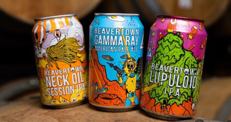
Beavertown
Beavertown is a London-based brewery that has become well known for its colourful can artwork.
Channeling something between a sci-fi B-movie and a post-apocalyptic nightmare, Beavertown’s cans are so unique that they tempt people to buy them just to get a better look. While each beer has its own bespoke illustration, the consistency of the design layout and art style makes them instantly recognisable.
This styling is naturally more appealing to some demographics than others, but if Beavertown is looking for a younger audience that loves cult movies and comics then they’re probably spot on.
Brewdog
Scottish-based beer brand Brewdog (try saying that five times after a few cans!) have made their mark on the craft beer scene with brightly coloured branding, quirky names, and a simple but memorable logo.
Brewdog employ a bold yet clean look to their bottles and cans, using a different eye-catching colour to differentiate each of their brews. The vertical text allows for large, bold letters that are legible from across the bar, and the familiar dog crest makes them easy to spot for Brewdog fans.
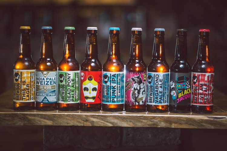
This fairly minimalist design means that branding up a newly crafted beer is a simple task, with no need to commission extravagant artwork and no fear that it won’t be recognised amongst the ranks.
A quality beer deserves a great brand
We know how important branding is, and how hard it can be to turn your values and abstract ideas into an actual brand. Working with DWH will allow you to benefit from years of expertise while still having creative input in the brand you’ve built.
Get in touch with us to find out more about working with us to craft your beer brand—and if we have to taste a few samples to get the feel for your brand, I’m sure we can be persuaded!