With high-end fashion houses opting to rebrand themselves with ‘clean’ and ‘contemporary’ sans serif logos, Claire Baldwin asks whether this modern typeface trend is nearing the end of its shelf life or if this is merely the beginning.
If there’s one thing you’d expect designer brands to be good at, it’s design. So why are so many luxury brands opting for such similar plain text logos?
Over the last decade, many brands have updated their logos and wordmarks to simple, sans-serif fonts.
While this trend has been really picking up speed in digital sectors, the most surprising takers have been luxury fashion houses. The last few of years have seen several designers revealing simplified redesigns of their classic logos.
Is this simply a passing trend or will these logos be on our screens for the next fifty years?
Who has thrown out their serifs?
Yves Saint Laurent
2012 saw French brand Yves Saint Laurent change their name to Saint Laurent Paris. A new logo was clearly required, but the look and feel was very different. The skinny lettering and italic initial capitals were thrown out and a bold, sans-serif font took their place.

Diane Von Furstenberg
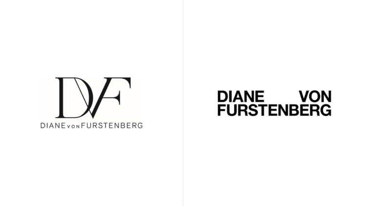
In 2017, Diane Von Furstenberg dropped the serifed “DVF” monogram, which was accompanied by a sans-serif version of the full brand name. The redesigned logo is sans-serif, bold, and in all-caps.

Calvin Klein
Calvin Klein also chose to adopt all-caps in 2017. While their previous logo was already a sans-serif font, the updated version is bolder with thicker lines and all capital letters.

Burberry
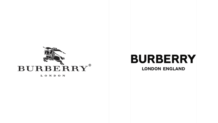
In 2018, Burberry dropped the unique squat, serif font of their brand name, as well as the loopy calligraphy of the words “London, England”. Instead, the’ve opted for … you’ve guessed it! Bold, sans-serif capitals.

Why do companies redesign their logos?
Brand and heritage are key parts of a luxury designer’s appeal, so it seems counterintuitive to reinvent the whole look and feel so drastically. When brands can sell a simple T-shirt for £100 just because it’s got a specific logo on it, changing that logo seems pretty risky.
So why are all these fashion houses doing this?
Current design trends
With so much of the world being online, both in terms of shopping and advertising, many companies are opting for sans-serif fonts for three main reasons:
They display more clearly on a screen
They look cleaner and more ‘modern’, gelling better with current website design trends
They are easier to read, especially for those with dyslexia
These are all factors that can affect the perception of a brand and are important to consider.
Realigning with customers
For brands to succeed, that must build a rapport with their customers. Two of the main ways in which this is done within the fashion industry are by being relatable or being aspirational.
Designer brands often market themselves in one of these two categories, but sometimes there are changes within the customer base that spark an evaluation of brand perception.
Fashion houses may choose to either steer into the change, rebranding to embrace their new clientele, or to reaffirm how they wish to be seen.

Moving the brand forward
There comes a time for any brand when it’s necessary to reevaluate your goals and what you’re looking to achieve. For some of the fashion brands we’ve discussed, this time has come with a change of creative director.
Diane von Furstenberg handed over creative direction of the label to Jonathan Saunders. It’s been theorised that the new logo was intended to make the brand ‘more masculine’ under his direction.
YSL also underwent a logo revamp following the appointment of a new creative director. Hedi Slimane announced the change to Saint Laurent Paris, and the new design was aimed to support the rebrand and usher in a new era for the label.
Keeping up with the Joneses
Peer pressure isn’t just something that kids experience at school; it also thrives in the business world.
Comparing themselves to their contemporaries and competitors helps brands to stay relevant and try things that others aren’t doing, but it also means trying to fit in.
If lots of companies in a particular sector opt for a sleek, modern redesign of their logo, those that don’t follow suit run the risk of being seen as behind the times.
While a big part of branding is differentiating your brand from others to give people a reason to choose it, it’s also important to be seen as a viable or comparable choice. Designing your logo to look consistent with other similar companies aligns your brand with theirs and allows you to feed off their reputation.

Are sans-serif all-caps here to stay?
It’s hard to say for sure. It seems likely that the trend will continue for the time being, as displaying well in digital formats and presenting a modern image are both pretty important for brands right now.
It’s possible that there will be an oversaturation of very similar branding, leading companies to either branch out into something new, or to revert to their ‘vintage’ branding. Both of these options offer great opportunities for marketing campaigns.
For now, I think we’ll be seeing more brands jumping on board before we see logo trends move on to something new. But once a company has broken the seal on updating their brand, it’s often the case that frequent redesigns will follow, and it’s not unheard of for a company to revert to their old branding following backlash from customers.

Claire Baldwin
Claire has over 10 years' copywriting experience across a range of print and digital media, working with a variety of styles, formats and tones of voice. She has written as part of an in-house team client side, as well as at marketing agencies based in the East Midlands. Claire's services include copywriting, copy editing, content creation and proofreading.