Following up on her recent blog about fashion rebrand trends, Claire Baldwin examines the recent rebrand by Zara who, by deciding to buck this trend, have invited a whole new wave of criticism. Was it a step too far, or a genius piece of marketing?
A good logo should capture the essence of your brand and be instantly recognisable. Of course, design trends change and logos can look dated over time.
When rebranding, how important is it to stick to your roots? Should you follow current trends or make a statement with something different?
Unfortunately, there’s no one-size-fits all answer. No matter what you do, you’re bound to be met with a mixture of praise and criticism … as Spanish fashion brand Zara have discovered.
Let’s investigate.

The Case
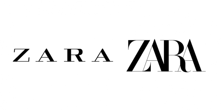
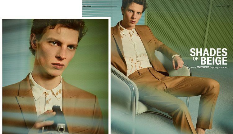
Zara’s new logo was met with criticism following its introduction with the brand’s Spring/Summer 2019 campaign.
The typeface is similar to the one used in the brand’s previous logo. The serifs have been simplified on all letters apart from the Z, where they have been exaggerated, and the R has been given a more organic, curvy shape.
The most obvious change is the kerning, or lack thereof. The four letters overlap across the bottom, although the tops have been given a little breathing room. While designers said the old logo was too spaced out, the new one is being criticised for being too squished up.

Whodunnit?
French design agency Baron & Baron are responsible for the redesign. They’re no stranger to fashion brands, boasting collaborations with Dior, Ralph Lauren, Louis Vuitton, Balenciaga and more.
Baron & Baron’s website refers to Zara’s new look as “an approach that blends elegance with edge” and “an artful new elevation” for the brand.

Prosecution
Critics of the new logo have been pretty vocal with their opinions. Complaints include “overcorrected”, and “claustrophobic” and “barely legible”.
German typographer and designer Erik Spiekermann said that it was “the worst piece of type I’ve seen in years” and wondered whether it was “done by one of those new robots that will replace humans”.
The logo’s individuality and creativity have also been called into question, as it looks similar to Baron & Baron’s own wordmark. It also bears a strong resemblance to the logo used by Harper’s Bazaar in the 1990s, when Fabien Baron was creative director.

Defence
On the plus side, Zara haven’t followed the recent trend of stylish but bland sans-serif wordmarks. This means they will stand out against increasingly similar logos on the high street.
The logo retains visual links to the original font, making it easier to associate with the brand. It feels like Zara has kept its heritage more than many recent redesigns have.
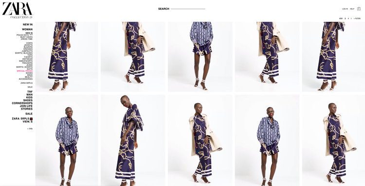
The shapely Z and R letters add character to the logo, whereas the old letters were very uniform. Baron & Baron shared lookbooks where the individual letters are used alone, presenting an interesting new design element.
The logo takes up about half the horizontal space of the old version, making it more versatile for sizing and placement. It nicely fills out the area and is easy to read from a distance.
Verdict
Personally―and I admit that I’m a writer, not a designer―I quite like the new logo. It seemed a little harsh at first, but the more I’ve looked at it (and I looked at it a lot while writing this), the more it’s grown on me.
It’s definitely more interesting than the previous version and feels quite dynamic. With all these boring sans-serif, all-caps logos coming out of the woodwork, I think Zara will do well to have something that divides opinion.

Claire Baldwin
Claire has over 10 years' copywriting experience across a range of print and digital media, working with a variety of styles, formats and tones of voice. She has written as part of an in-house team client side, as well as at marketing agencies based in the East Midlands. Claire's services include copywriting, copy editing, content creation and proofreading.