One of the best things about being a long-standing company is the public’s connection with your brand. Unfortunately, this can throw a spanner in the works when it comes to rebranding. Claire Baldwin looks at BT’s new logo and whether it’s a misstep or a step in the right direction.
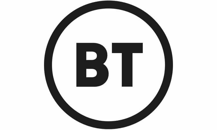
BT filed a trademark application last week for a new logo, which is simply the letters “BT” in a circle.

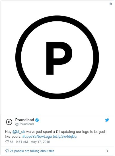
As the redesign has been in the works since 2016, the company has received criticism for the uninspiring result. Graphic designers, members of the public and even other companies have dissed the design, including Poundland’s Twitter jab: “we’ve just spent a £1 updating our logo to be just like yours.”

Haters of the new logo may be pleased to learn that the new branding is apparently still being finalised. However, given how little it has changed since its first appearance in 2016, it looks like BT is pretty set on the simple circle.

BT’s logo history
Since being privatised in 1984, BT have sported a few different logos, reflecting changes in both their company and in contemporary design trends.

Back when they were British Telecom, the original logo was a simple blue T in a circle, designed to resemble a telegraph pole. It was a fairly clean design but didn’t present much in the way of brand identity.
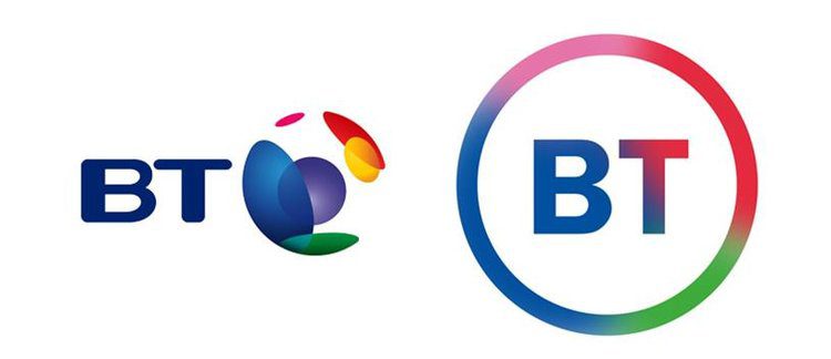
In 1991, the company rebranded as BT and revealed their new logo of “BT” accompanied by the blue-and-red Piper. Apparently intended to represent the empowerment of the consumer, some said it looked like the company was blowing their own trumpet.
The Piper stuck around for a few years until the multicoloured ‘connected world’ globe icon replaced it in 2003. This logo better represented BT’s more modern service, with mobile, internet and TV packages bringing people together. It also fit well with the trend of creating spherical logos in the mid-2000s, championed by the likes of Xbox and Sony Ericsson.
The curse of modern design
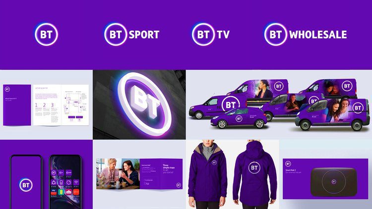
A big issue that brand managers come up against these days is the necessity for logos and designs to work in a vast array of different media. Designing the logo isn’t the end of it; every use of the company branding has to be considered.

While thinking about how branding will look on tangible objects like business cards, storefronts, uniforms and vehicle livery has been standard practice for decades, modern consumers interact with brands in many different ways on a near-constant basis.
How your logo will be viewed on a website, social media stream or banner advert on a mobile device are more modern challenges. These smaller, more fleeting appearances of branding mean that the impact of delicate, detailed designs is lost and, as such, they are falling out of favour.
In the never-ending battle for attention and online real estate, simple logo designs have been taking over, giving consumers more breathing space and a better appreciation of the message behind the branding.
Coming full circle
Usually, when the public bemoans a veteran company’s new logo, it’s because they feel it has strayed from their brand identity or thrown away years of heritage. BT’s critics are no different.
While at first the new BT logo looks like a bit of a cop-out, it actually feels like a combination of the company going back to their roots while embracing modern design trends.
The new design has a crisper, more modern feel, but it’s pretty similar to the capital-T-in-a-blue-circle logo of 1984. What builds on heritage more than returning to your original logo? And at least the new version has both of the company’s initials in it!
The complete removal of any reference to what the company actually does is also testament to BT’s confidence in their brand. After all, there’s no mistaking what company it represents. It might not be a groundbreaking design, but there’s no denying that it gets the job done.

Claire Baldwin
Claire has over 10 years' copywriting experience across a range of print and digital media, working with a variety of styles, formats and tones of voice. She has written as part of an in-house team client side, as well as at marketing agencies based in the East Midlands. Claire's services include copywriting, copy editing, content creation and proofreading.