
The 5 types of Christmas adverts and what makes them successful
It’s almost Christmas and that means the Christmas adverts have been playing on our screens for some time now. If you’re the sort of person who can’t wait to see the latest festive offerings from the high street’s biggest names, you’ll know that there are a few different formulas that they tend to follow. Claire Baldwin takes a look at the different categories of Christmas advert, and what makes them effective.
#1: The Tearjerker
Christmastime can bring about all sorts of strong emotions, and many brands choose to tug at the heartstrings to elicit an emotional reaction. If you’ve never cried at a Christmas advert, you might be made of stronger stuff than me!
While it seems strange to actively try to make your audience cry at your advert, it actually makes us feel good inside, and helps those big corporate brands to feel just a little more human, allowing the public to create a stronger emotional bond.
My pick for this year’s tearjerker is Apple. The three-minute ad starts with two sisters who seem more interested in their iPad than their family this Christmas, despite their obviously grieving grandfather. However, the advert takes a heartwarmingly bittersweet turn when the girls use their beloved iPad to create an emotional family scrapbook featuring their departed grandmother.
Apple gives those tears a helping hand with an almost Pavlovian response created by the music from the opening scenes of the Pixar movie ‘Up!’, which is just about the biggest tearjerker there is. Frankly, that feels a little bit like cheating!
#2: The Character
A cute character is practically a must in a Christmas advert. We bond with them, they make us smile, and our kids want the cuddly toys. Focusing your Christmas campaign around a memorable character is a great way to increase brand engagement, and offers huge possibilities for merchandise, social media, festive events and even apps.
2019 has been all about Aldi’s returning character, Kevin the Carrot. It might seem crazy that an anthropomorphised vegetable has stolen the spotlight, but that’s the power of cuteness. This year, Kevin has been joined by Russell Sprout and his gang of Leafy Blinders, in a nod to the hit TV show ‘Peaky Blinders’.
Furious that the carrots are set to steal the show at the Christmas dinner table, the gang of sprouts tries to teach him a lesson. Fortunately for Kevin, Tiny Tom, the tomato, rescues him, and his family of carrots is able to put on a show-stopping circus performance, accompanied by a Christmas-dinner-themed version of Robbie Williams’ ‘Let Me Entertain You’.
The whole thing is preposterous yet charming, but if the huge demand for Aldi’s cuddly crudités is anything to go by, it’s been a roaring success.
#3: The Comforter
It just wouldn’t be Christmas without that warm and fuzzy feeling. Whatever your personal feelings about the online giant, it’s hard to deny that Amazon’s 2019 Christmas advert is full of joy and warmth.
Accompanied by various homespun renditions of Solomon Burke’s ‘Everybody Needs Somebody to Love’ that bring a smile to your face, the advert focuses on an Amazon delivery driver and the impact their parcels have at this most wonderful time of the year. Amazon’s recognisable smiley arrow logos turn into animated mouths as the parcels sing along with the catchy music, and it’s all smiles all round.
Another reason that this advert is so feelgood is due to the inclusivity of its ‘Love Actually’-style snapshots of family life during the Christmas season. From a female delivery driver and an elderly African-American couple to a racially inclusive school play and a same-sex airport reunion, Amazon has clearly made a conscious effort to bring a little Christmas joy to as many demographics as possible.
#4: The Song
A great song can really make a Christmas advert, and there have been countless examples of this over the years, with John Lewis’ annual quaint covers of well-loved songs.
A musical success story this year has been Walkers’ festive ad, featuring Mariah Carey and her classic Christmas hit ‘All I Want for Christmas is You’. The advert is a pretty standard Walkers concept: the crisps are too good to share. This defiance of the spirit of giving comes even after Mariah has lavished her music video crew with gifts, because Walkers’ festive pigs in blanket flavour is just that irresistible.
The icing on the cake (or the holly on the Christmas pudding?) is that Mariah’s baubly belter has just hit the #1 spot on the US Billboard chart for the first time ever, 25 years after its release. This is testament to the enduring popularity of the track, and cements it as a great choice for a Christmas advert.
#5: The Complete Package
If there’s one company with a highly anticipated Christmas advert release, it’s John Lewis. With a string of wildly popular festive offerings under their belt, the reason that John Lewis’ Christmas adverts are so successful is because they tend to include all the key elements that we’ve looked at above, and this year’s ad is no different.
It focuses on a cute character, Excitable Edgar, a young dragon who is so excited about Christmas that he can’t control his fire. It makes use of another great song, with Bastille’s cover of REO Speedwagon’s classic ‘Can’t Fight This Feeling’ making us feel warm and fuzzy inside.
The advert’s story takes you on an emotional ride, as you feel both sad and sorry for Edgar, then excited and happy for him by the end when his fiery breath is put to good use. Depending on how vulnerable you’re feeling when you watch it, Edgar’s flames may even warm your heart enough to bring a tear to your eye.
Can a new logo salvage your brand?
New branding is often accompanied by a new direction for the company, whether that’s turning over a new leaf or simply adopting a more modern and inclusive approach. With Facebook having just released a new brand amidst ongoing controversy, Claire Baldwin takes a look at how a new logo fits into an attempt to salvage your company reputation.
Sans serif, sans effort
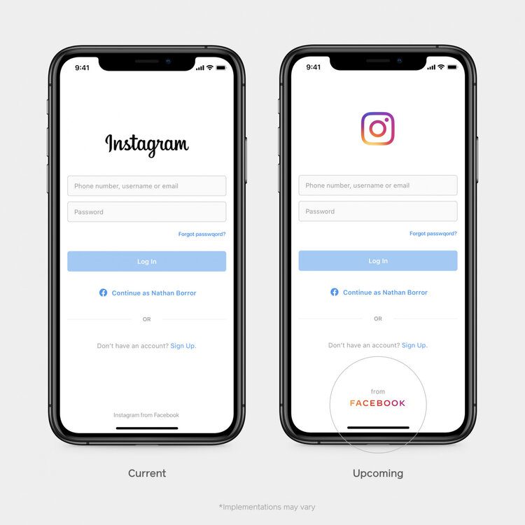
Facebook has just revealed their new generic logo, which has been devised to separate the company from its other properties, including Facebook, WhatsApp and Instagram.
In keeping with recent logo redesign trends, Facebook has opted for a sans-serif all-caps wordmark. It will be displayed in different colours when used in conjunction with the company’s various apps: blue for Facebook, pink for Instagram, and green for WhatsApp.
That’s about as far as the rebrand goes. Facebook claims that the new logo has been “designed for clarity”, which is a little ironic when you consider that the social media platform has been under fire for its failure to tackle the ‘fake news’ epidemic, as well as concerns about the privacy of users’ data. Facebook is currently under investigation by the Federal Trade Commission over its business practices, which isn’t a great look for any company.
The new logo is hardly innovative. It doesn’t say anything new and it doesn’t elicit excitement. There is nothing about the new brand that draws attention away from the whispers about Facebook’s unscrupulous and shady business practices.
The writing on the wall
The real issue with this attempted brand salvage is that it’s pretty superficial. Creating a slightly different logo to differentiate the parent company from the app does nothing to tackle the bigger issues facing the company right now.
Facebook really needs to rebuild users’ confidence in the brand, and new wordmark just isn’t going to change anything. Restructuring the company, changing the business model, creating greater transparency for users, or even rebranding to the point of naming Facebook, Inc. something completely new would all be more effective trust-building tactics.
It’s also hard to have much confidence in Facebook when the multi-billion-dollar company released a mock-up of their new design for Instagram with a stupid and unforgivable typo. The fact that Facebook seems to have done the bare minimum in an attempt to repair the relationship with their customers makes the whole thing feel very low-effort and, to be honest, a little insulting.
Uber
Last year, ride-hail app Uber overhauled both its branding and its practices to rebuild faith in the company due to continued backlash from staff and the public for its unscrupulous business practices.
The issues ranged from sexism and sexual harassment at its corporate headquarters to the unfair pay and poor treatment of drivers, not to mention the uproar that the app caused local taxi firms worldwide. Many people swore off Uber completely and defected to rival company Lyft instead.
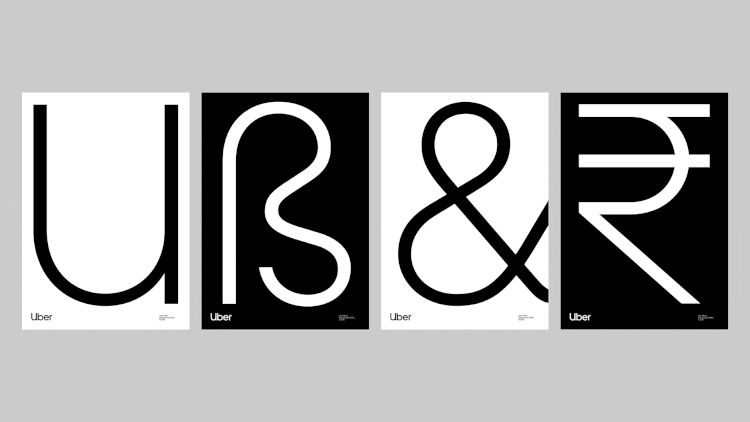
In efforts to move past the various scandals and rebuild a loyal customer base, Uber rebranded, just two years after revealing their latest logo (and they wouldn’t be the first company to try this tactic). They replaced the stark, all-caps wordmark with a sleek, rounded and more friendly-looking version, with much tighter kerning that made the whole thing look more put together. It wasn’t a drastic redesign, but it was a good move for several reasons.
Firstly, the new logo looked less intimidating and more professional, making it look much more appealing. Secondly, the logo is wildly different to that of competitor Lyft, whose bubblegum pink logo looks fun and squishy and silly. This makes Uber stand out as the serious and professional company at first glance, though it may also imply a certain coldness that one might not expect from the Lyft logo.

New logo, new attitude
However, along with the new design, Uber also overhauled the company and its practices.
Travis Kalanick, the company’s founder and CEO, was ousted and replaced by Dara Khosrowshahi, former CEO of Expedia Group.
The company hired former Coca-Cola executive Rebecca Messina as their first ever chief marketing officer in order to get the company’s reputation back on track.
New safety procedures were introduced, including Ride Check, a feature that uses the accelerometer and GPS of the drivers’ phone to detect issues such as crashes or unusually long delays, and safer two-factor authentication for riders’ accounts.
While the new logo hinted towards the company’s new direction, they actually backed up this new image with actions and change for the better. Although things aren’t perfect, Uber have visibly been making the effort to right their wrongs while also moving away from the visual identity of their former selves.
Build a reputation
We talk to our client all the time about brand building. It’s not just a case of “here’s a new logo” and leaving it at that. Building a brand is all about building your company’s reputation and constantly maintaining this. We help our clients do this in a number of ways. Whether that is through social media management, content generation or SEO audits, we make sure your online presence reflects your brand positioning and maintains your brands integrity. This is as important in building trust as conducting a brand refresh, building a new website and producing marketing collateral.
If you’re looking to give your brand a refresh or if you need help to build your business reputation online, get in touch with DWH today.

Creative ways to get work in the creative industry
Job hunting can be difficult at the best of times, and if you’ve got your heart set on working in the creative industry, landing that dream role can seem almost impossible. Claire Baldwin looks at some creative ways to get work in the creative industry and beyond.
When looking for a role in the creative sector, it’s likely that the words “creative” and “creativity” feature fairly prominently on your CV. The difficulty here is actually showing this creativity to make employers desperate to hire you.
Here are some creative ways to express your creativity and land that job in the creative industry (Have I said “creative” enough yet?!).
Fringe benefits
In August, Edinburgh-based graphic designer Laura Whitehouse turned the Fringe Festival’s endless flyering to her advantage by creating her own flyers advertising her services. In her blog post about the project, Laura discussed using the Fringe as an opportunity to find more of the work that she loves: designing posters and flyers for performers.
The flyers were about as matter-of-fact as adverts can get, featuring a handful of her previous design work on one side and a simple, memorable and hilarious message on the other. Instead of tiptoeing around the subject of a business transaction, Laura waded right in: “You need a poster, I need money. Seriously, I’ve been trying to but the same armchair from Ikea for months.”
By swapping flyers with performers, she was able to get her name in front of the very people she was hoping to work with, and adding a clever nod to the Edinburgh Fringe Festival community.
employadam.com
You might not know the name Adam Pacitti, but you might have seen his face on a billboard, especially after it went viral in 2013.
Aged 24 at the time, Adam used his last £500 to pay for a billboard in Shoreditch asking for a job. The billboard directed people to the website employadam.com, where you could (and still can) watch Adam’s video CV detailing the humourous and self-deprecating experience that makes him a perfect candidate for roles in the media industry.
It was a long shot, especially during the recession, but it paid off, as Adam received over 100 job offers and found himself as a viral video producer for award-winning production company KEO. He then used his first wage packet to pay for a second billboard, thanking the Great British public for their help.
The Google Job Experiment
In 2010, Alec Brownstein set up a series of Google Ads so that when top NYC creative directors in advertising Googled themselves, they would see a message from Alec asking them for a job.
In the search results, they would see an advert for alexbrownstein.com that addressed them by name along with the message: “Googling yourself is a lot of fun. Hiring me is fun, too.”
Alec set up adverts for five top creative directors, landed interviews with four of them, and received job offers from two. This creative use of industry-relevant knowledge and experience led to a job at global marketing and communications company Y&R in New York.
In total, The Google Job Experiment cost Alec the princely sum of … $6. Not a bad investment.

How to promote yourself creatively
What these examples show us is that great creative promotion works best if you are able to leverage something key to the industry: Advertising flyer design for performers by handing flyers to performers; creating a viral campaign to get a job creating viral campaigns; or investing in adverts to land a role in advertising.
This allows you to directly acknowledge the skills that make you suitable for a role and demonstrate them through tangible, real-life examples.
If you’re not sure how to promote yourself, get in touch with us and we’ll work on your creative campaign together.

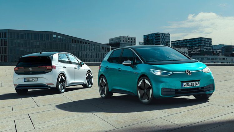
Volkswagen's rebrand: The new VW or just PR?
German car manufacturer Volkswagen has updated their iconic logo as part of the launch of their all-electric cars. Is this a simple rebrand or is it another step on VW’s path to redeeming their somewhat shaky reputation? Claire Baldwin takes a look.
We don’t need to introduce Volkswagen to you. The car manufacturer is a household name that has been around for over 80 years. Their iconic VW logo is almost a cultural icon in its own right, but it’s recently undergone a transformation as part of the company’s launch of their new all-electric cars.
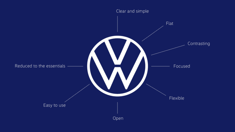
Behind VW’s iconic logo
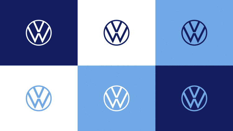
VW’s rebrand is focused on the simplification and modernisation of their iconic logo. This classic symbol has been with the company since its beginnings in 1937, though its first design definitely feels a little swastika-y.
It’s here that we come to the first of VW’s various PR nightmares: its origins as the ‘people’s car’ (which is what ‘Volkswagen’ translates to) under the Nazi regime. While initially created as a positive company promoting, ‘strength through joy’, (Kraft durch Freude) it’s hard to separate the events of the Second World War from the origins of the company.
The initial logo was scrapped before the war due to its resemblance to a pedestal fan, and it was replaced with a simpler version featuring the letters V and W within a cog. Further versions of the logo stayed very loyal to the heart of the design, and it was mostly a simple logo until the addition of chrome and shadows in the late 1990s that started to detract from the pleasing simplicity of the design.

Fuelling the flames
Volkswagen is now one of the world’s most successful car manufacturers, employing almost 200,000 people and producing vehicles for customers in over 150 countries.
However, this successful history hasn’t been devoid of the odd moment of disgrace, most notably the emissions scandal of 2015.
Often referred to as Dieselgate or Emmissionsgate, the scandal broke when VW was found to have been cheating diesel emissions tests for years, making the cars appear to be more environmentally friendly than they were. Consumers and other manufacturers were understandably put out by this, and Volkswagen’s stocks plummeted, with the company losing almost a quarter of its market value practically overnight.
Simplifying a complicated past
VW’s recent rebrand comes as part of the release of their new range of all-electric cars, with the world premiere of the ID.3 at the beginning of September. It’s carbon neutral and, with the basic model costing less than €30,000, it’s a car for the people with the environment at its heart.
Along with their responsible manufacturing and green energy, VW has unveiled a streamlined logo update. According to their press release, it has been reduced to its “essential elements” making it clear and simple, open, and easy to use.
Call us skeptical, but we can’t help but wonder whether there’s a slight ulterior motive here. While moving to greener and more sustainable practices is something to celebrate, it can’t be denied that VW’s reputation in recent years has been anything but “clear” and “open”.
Is the new logo and a move to electric vehicles a sign of VW changing for good, or are they simply trying to distance themselves from a sketchy past? We’ll have to wait and see.

Spot the missing word
How important is a wordmark to a company’s branding? Would you recognise a logo without seeing the name? As companies such as Doritos and Mastercard have chosen to remove the names from their logos, Claire Baldwin looks at what makes brands able to survive on a logo alone.
Another level of brand recognition
Doritos recently launched a new advertising campaign that completely removed their name from their branding. The ‘Another Level’ campaign was targeted at Gen-Z’s desire to reject traditional advertising, in a world where brands are trying to make their marketing less on-the-nose and more integrated with the digital age.
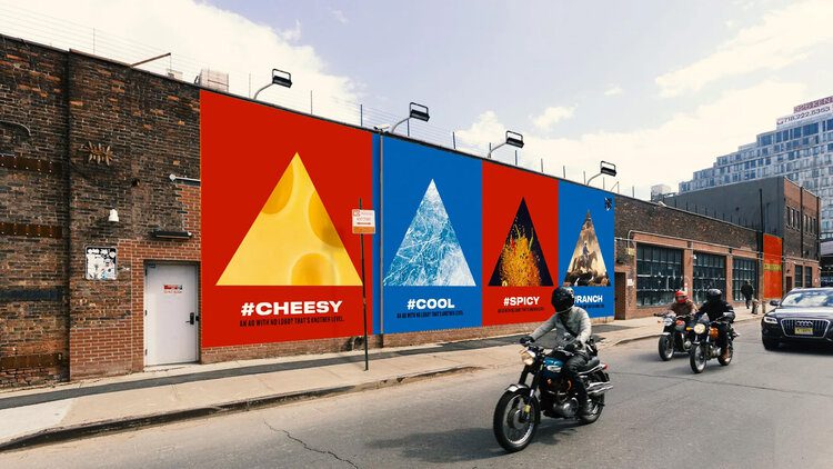
The campaign includes a TV advert that Doritos referred to as an ‘anti-ad’. It opens with a narrator informing viewers: “For a chip so iconic, we don’t need to name it. ‘Cause this is an ad with no logos, no jingles, no gimmicks. Just those red and blue bags with the stuff you love in it.”
Instead of focusing on the brand and what the product is, the advert instead focuses on how consumers interact with the product itself, such as shaking the last few crumbs from the packet, and getting the tangy flavour powder on their fingers. The ad brings the viewer’s existing familiarity with the product to the forefront of the campaign, stimulating memories and a desire to again experience that “sweet, cheesy, salty, spicy, crispy, crunchy, flavour-packed” snack.
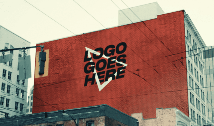
As well as removing their name from their advert, Doritos also removed it from the internet, changing their website and social media handles to “Logo Goes Here”. They shared tweets like “It’s 2019 do people even use names anymore” and “You’ve all been referring to us as “red” and “blue” for forever so might as well make it official”, showing an appreciation of how real people interact with brands.
Logo flexibility for the digital age
While Doritos’ campaign is temporary, several other notable brands have decided to either remove their wordmark completely or focus on using the logo on its own.
Coffee chain Starbucks made its brand design evolution public on a new website, explaining exactly what the vision for the brand is from its use of colour and typography through to tone of voice and photography.
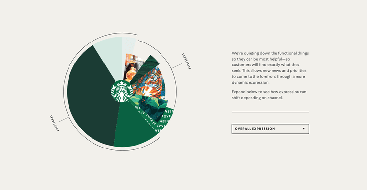
The site explains: “As we evolve to meet beautifully diverse customers all over the world, our brand has evolved too.” This is an interesting and important message for their overall branding, showing that they value inclusivity and growth.
As for the famous Siren logo, the website states: “The preferred approach is to use the Siren logo by itself, unlocked from the wordmark. This allows flexibility to present the Siren with greater prominence while maintaining a considered, open and modern presentation.” This idea of prominence works especially well in the digital age, which often requires logos to be presented on very small screens, which can make wordmarks difficult to read.
Leveraging brand heritage
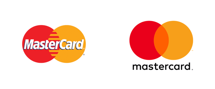
Similarly, Mastercard has chosen to permanently remove the wordmark from their interlinking circle logo for the first time since its inception in 1968.
Raja Rajamannar, chief marketing and communication officer at Mastercard, stated that, according to research, “more than 80% of people” recognize the logo without the brand name and said: “We are proud of our rich brand heritage and are excited to see the iconic circles standing on their own.”
The change is to create the “modern simplicity” that is required for the digital age and, while the logo looks clean and is still recognisable, not all brands could get away with this.
There are many companies that have survived for decades without the use of a wordmark, thanks to their popularity, strong brand presence, and highly recognisable logos. Examples include Apple, Nike, Adidas and McDonald, who have leveraged their ubiquity, brand lifestyles and distinct logos to create brands that are stronger than words.
Create your own strong brand
While most companies won’t have the instantly recognisable logo success of the examples we’ve just looked at, a strong brand and thoughtful logo design are key to your company’s image.
If you’re looking to create a new brand or refresh your existing logo to better represent your company’s values in the digital age, get in touch with DWH today.

Hidden in plain sight
A LOGO IS MORE THAN JUST A VISUAL REPRESENTATION OF A COMPANY. WHEN EXECUTED WELL, IT’S AN IDENTITY IN ITSELF THAT CONSUMERS CAN CONNECT WITH ON A DEEPER LEVEL. CLAIRE BALDWIN LOOKS AT THE EASTER EGGS HIDDEN WITHIN SOME OF THE MOST WELL-KNOWN LOGOS THAT YOU MAY NOT HAVE NOTICED BEFORE.

FEDEX
Probably the most famous example of the hidden image within a logo is the arrow created by the negative space in between the “E” and the “x” in the FedEx logo.
As a distribution company, this subtle portrayal of movement and speed is right on brand. The design is simple enough that doesn’t detract from the logo, and it’s easy to go years without even noticing this hidden arrow.

PUKKA PIES
Heralded as “the nation’s favourite pie”, you probably see the Pukka Pies logo on a daily basis if you live in the UK. But did you know that there’s a pie hidden inside the “A”?
The brand’s previous logo was simple bold, black letters on an orange background, but the newest design is hiding a tasty treat. At the bottom of the letter is a clear silhouette of a pie, complete with domed top and raised pastry crusts.
This means that by simplifying their logo to just the word “Pukka”, they can still incorporate the pie element without needing the extra text.

HERSHEY’S KISSES
If you’re not familiar with Hershey’s Kisses, they’re individually wrapped chocolate drops made by American confectionery brand Hershey’s.
To get an idea of what a Hershey’s Kiss looks like, just take a look at their logo and turn your head to the left. The space in between the “K” and “I” is shaped just like a Kiss! As with the FedEx logo, this hidden extra has been incorporated into the design so cleverly that the letters don’t look unusual at all.

BASKIN ROBBINS
Famous for having 31 flavours, the world’s largest specialty ice cream shop Baskin-Robbins has paid homage to this special number in its logo.
The logo includes the number “31” by using different colours for the lines that make up the initials “BR”. For an added tidbit, the number itself comes from the brand’s belief that “guests should have the opportunity to explore a fun, new ice cream flavor every day of the month.”

TOBLERONE
Next time you pick one up at duty free, take a closer look at the logo on your Toblerone. Specifically, look at the mountain, and keep looking until you notice the hidden bear.
The chocolate was created by Theodore Tobler in 1908 in the Swiss city of Bern, which has featured a bear on its coat of arms since the 13th century. The mountain shape is inspired by the Matterhorn, which is a peak in the Alps close to Bern. Add these two things together, and you get Toblerone’s logo.

VAIO
VAIO is a sub-brand for Sony’s computer products, and its logo is just a simple representation of the four letters “VAIO”, right? Wrong.
While clearly spelling out the brand name, there’s actually more to it than that. It also represents the integration of analog and digital technology. The “VA” portion symbolises an analog wave, while the “IO” portion mimics digital binary code.

LSO
Similarly, the London Symphony Orchestra’s logo just looks like the brand’s initials written in a single-line flourish.
However, if you look a little closer, you can see the outline of a conductor with his baton, keeping the orchestra in time. It’s admittedly a rather simple representation, but once you notice it, it’s certainly there–and it’s kind of cute!

The changing face of fonts
Font and typeface design can be incredibly important when it comes to creating a certain look and feel for your brand. There’s more to it than simply choosing your from a set of pre-existing fonts, and many brands have created their own bespoke font to really cement their image. Let’s look at some of the more interesting and unusual fonts to have come out of brands and designers in recent months.
The world’s comfiest font
Swedish furniture brand IKEA has taken a step away from furniture design and entered into the world of font design by releasing the free font SOFFA Sans.
Inspired by their online design your own sofa planner, each geometric letter is made up of various configurations of their Vallentuna sofa.
IKEA worked with digital agency Proximity London to create SOFFA Sans, which they are calling “the world’s comfiest font”. While not all of the letters make particularly practical sofas, it’s a fun concept that shows how far-reaching font design inspiration can be.

A new dimension for fonts
Berlin-based type foundry Hightype has released a three-dimensional font for use in spatial contexts.
With emerging technologies like VR, AR, 3D-capable web browsers, Hightype identified a need for standardised 3D fonts for use in design. By working with classic font designers, the design lends itself to being used alongside 2D fonts for a consistent visual experience.
The font is designed to be a base for ideas and modifications. It can be imported into 3D design software and game engines, where the letters can be altered and customised to suit a designer’s requirements.
Variable font technology
Designer Elias Hanzer has created a generative type concept, making use of technology that allows the font to be manipulated.
Titled Phase, the project is aimed to establish exactly what is possible from a modular typeface, as well as to explore the idea that “every visual code or style is is built upon a more or less modular system.”
Made available through a microsite, Phase features a new typeface that is able to react so sound or to manual sliders, allowing the characters to be manipulated. The lines will grow thicker or thinner, and the font will morph from the traditional-looking base font to something more decorative but less legible. Once you’ve created your font, you can download it for use, though commercial applications will require purchase.

Contrasting font weights
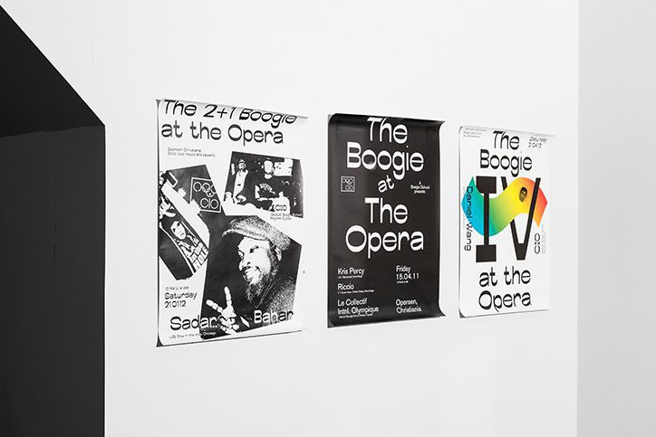
The font Boogie School Sans was released in 2016 by Icelandic and Danish type foundry Or Type. Designed to develop a typeface with a reversed contrast than traditional typefaces, the Boogie School Sans family has since been expanded to include 18 different styles.
These new styles feature varying font weights that offer more contrast in the typeface’s thick and thin lines, creating unusual and interesting characters that still embody the essence of the original font design.
This allows the same letterforms to be used in many different ways, creating contrast and emphasis without changing the actual font.

Fly me to the moon
The world has been celebrating the 50th anniversary of the moon landing with a variety of immersive and interactive events. Claire Baldwin looks at how we’ve been using 2019’s technology to bring this seminal event to a whole new audience.
The Apollo 11 mission to land on the moon was a groundbreaking and era-defining event. Those who witnessed it live will never forget the moment man first walked on the moon. People purchased television sets specifically for the occasion, and friends, family and neighbours gathered in cramped living rooms to watch the event on tiny black-and-white screens.
Now, 50 years on, new projects are allowing new audiences to get a taste of the excitement felt by the world as Apollo 11 was launched, journeyed to the moon, and made its way safely home.
While modern viewers will never be able to fully experience the nervous uncertainty and fear felt as Neil Armstrong, Buzz Aldrin, and Michael Collins headed into the unknown, new immersive technology allows them to learn more about the moon landing and to experience the mission in real time.
Channel 4’s real-time live stream
Channel 4 partnered with digital specialists Little Dot to live stream the moon landing on their YouTube channel. The stream started at 14:31 BST on July 16th, replicating the exact timing of the real event.
Modern audiences were able to watch the launch ‘live’ in real time, allowing them to experience what it was like on the day. Shorter updates from the mission were also streamed over the next few days, giving viewers some insight into what NASA’s team of astronauts were up to at that very moment 50 years earlier.
The full moon landing episodes are available on demand on All 4 for a limited time.
The Smithsonian’s augmented reality app
Polish start-up company Immersion created an augmented reality app for NASA and the Smithsonian Institution, allowing new generations to experience the moon landing in an immersive way.
Using real images, footage and audio provided by NASA, the app allows users to experience space missions, launch rockets, and explore the lunar landscape. Users can receive notifications with hour-by-hour updates on the Apollo 11 mission to the moon, or enjoy AR simulation games that involve navigating through space. You can even take a selfie on the moon to share on social media, which is possibly the most 2019 way to celebrate the moon landing.
Designed to be intuitive and easy to use for all ages, the app complements the Smithsonian Channel’s six-part television series ‘Apollo’s Moon Shot’ and brings NASA’s space missions of the ’60s to a new audience in an exciting and engaging way.

Apollo Lego Reenactment
On a much smaller (and cuter) scale, art and sculpture creator Attoparsec has been celebrating the moon landing through the medium of Lego.
The artist has created Lego scenes and combined them with quotes from NASA’s Apollo 11 transcript, publishing them on Twitter to produce a real-time reenactment of the moon landing.
Twitter is a great platform for this, as posts can be created and scheduled ahead of time, allowing the creator to stick to an accurate timeline with little effort. It also allows followers to check in with the mission as and when they visit the site, giving a feel for how the public may have interacted with the moon landing through social media if it were taking place today.


Is Apple's bubble about to burst?
Tech giant Apple have hit the headlines lately with the launch of their new Mac Pro, which comes with a hefty price tag and some costly extras. Claire Baldwin looks at why Apple can charge a premium price on their products and, with Jony Ive’s imminent departure on the horizon, how long it’s likely to last.
The new Mac Pro has been faced mixed reactions. While the specs are pretty impressive, so is the price tag. Another element that has been heavily criticised is the cost of the display’s stand, which many feel is bordering on—or perhaps fully entering—the absurd.
Apple has a bit of a reputation for charging a premium for products that are portrayed as stylish, prestigious and high-tech, but how true is this image to the reality?
Stylish products
Generally speaking, Apple’s products are thought of as being clean, sleek and uniform. But let’s address the elephant in the room: The Mac Pro looks like a cheese grater.
Ikea was quick to point it out in their tongue-in-cheek advert for a grater “Designed for apples”, and the internet has been awash with the comparison. Is it better or worse than the previous Mac Pro’s comparison to a bin? It’s hard to say.
That said, it’s a very clever design. It’s instantly recognisable, making the device almost a logo in its own right, and it’s actually quite sleek and minimal … once you get past the cheese-grateriness.
You could be tempted to say that Apple should have focus-grouped the design a little more before finalising it but, let’s face it, we’re all talking about it. That’s great exposure.

Prestigious products
Obviously, better things are supposed to cost more. We’ve all heard the old adage “Buy cheap, buy twice.” However, a high cost doesn’t necessarily guarantee a quality product.
There has long been a perception of quality and prestige in Apple products. The sheer number of people who own one is both testament to and an argument against this view.


The Mac Pro is priced at $5,999, with the Pro Display XDR coming in at $4,999. The price of the Pro Display stand is a whopping $1,000. While this puts them out of the price range of many people, it’s worth bearing in mind that the Mac Pro is designed for professional end users with high-end computing needs. The clue is in the name.
While critics may say that Apple should create more lower-end products for the everyday consumer, doing so would decrease the product’s perceived prestige, which may hurt the company’s overall reputation.
High-tech products
The consumers that the Mac Pro is aimed at have the need (and the budget) for its high specs. While the average computer user probably can’t afford a Mac Pro, they also probably don’t need one anyway.
That said, it’s difficult to understand how Apple can justify charging one-sixth of the price of a high-spec computer for a metal stand, albeit one that is touted to have incredible height, tilt and rotation abilities.


Apple have always been at the forefront of tech research and development, and they have become both benchmark and inspiration for other companies. When Apple does something, other companies often follow close behind. Let’s be honest. Most smartphones kind of just look like iPhones at this point.
But don’t forget the iPhone 7’s much-lamented lack of a headphone jack, which essentially offered decreased functionality and an increased obligation to rely on Apple products. Other companies weren’t exactly quick to follow this step, and many used it as a selling point for their own, more adaptable phones.
When will Apple’s bubble burst?
People will always poke holes in new releases from any company, and Apple’s high profile and astonishing user base just makes it more of a target for the haters.
While there seems to be consistent criticism of their new products, Apple brand loyalty is on an upswing, and they claim to have 1.4 billion active users of their devices. It’s possible that these complaints are coming from already biased non-Apple users, or that the younger generations who are so used to smartphones and other high-tech gadgets are taking up Apple products faster than the jaded Apple defectors.
Either way, Apple are a great example of how to successfully create brand loyalty that is almost completely unmatched in any other market.

Apple’s changing design department
However, things could be set to change, as Apple’s chief design officer Jony Ive has announced that he is to leave by the end of 2019 to start independent design company LoveFrom. Ive is credited with rescuing Apple from its decline in the ’90s, and has overseen the design of every product since 1992.
Losing such an influential figure could be a huge blow for Apple, and his role won’t be directly replaced. Instead, existing team members Evans Hankey, Alan Dye and Jeff Williams will manage different design divisions.
Ive has stated that LoveFrom will count Apple as one of its clients, so he’ll likely still have some input, but the dynamic and design process will be very different. While Ive has said that Hankey, Dye and Williams are among his closest collaborators and he has “the utmost confidence” in them, will they be able to continue his legacy? Only time will tell.
One thing is certain: The next few years will be pretty interesting for Apple.
Probably the most honest ad campaign in the world
Continuing our exploration of corporate responsibility in marketing, Claire Baldwin looks at Carlsberg’s new honest stance. With a tone-of-voice overhaul and an updated slogan, can honest marketing increase your brand’s value? Probably.
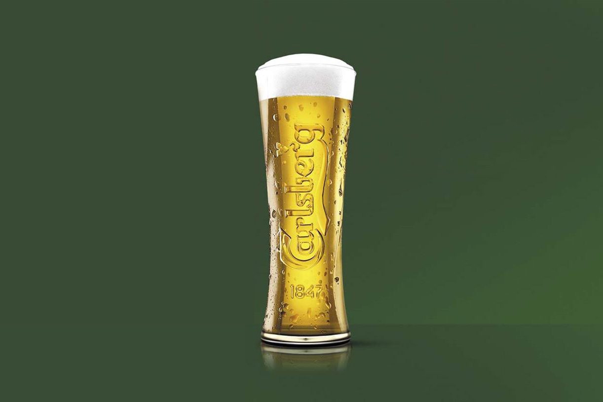
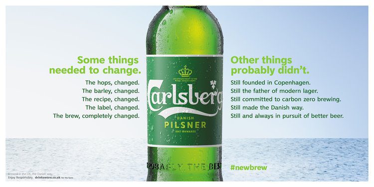
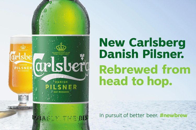
You’re surely familiar with Carlsberg’s slogan “Probably the best beer in the world.” It’s a little arrogant, it’s catchy, and it gives the audience clear expectations of the product.
However, the Danish beer brand has finally admitted that Carslberg is probably not the best beer in the world. In fact, they’ve gone a step further and, in a bold move of turning negatives into selling points, they’ve shared some of their customers’ harsh comments about their product on social media.
These include claims that Carlsberg tastes like “stale breadsticks” or “drinking the bathwater your nan died in”. Catchy, but not particularly enticing.
The new campaign has turned the original, familiar slogan on its head, stating: “Probably not the best beer in the world. So we’ve changed it.”
Let’s take a look at why it’s created such a buzz.
Honesty is always the best policy
According to Carlsberg’s vice president of marketing, Liam Newton:
“At Carlsberg UK, we lost our way. We focused on brewing quantity, not quality; we became one of the cheapest, not the best. In order to live up to our promise of being ‘probably the best beer in the world’, we had to start again. We’ve completely re-brewed Carlsberg from head to hop.”
This brutal honesty in marketing is as refreshing as a cold pint on a hot day.
While a big part of product marketing is trying to portray a desirable product that alludes to a perceived lifestyle, customers ultimately don’t want to be lied to. You can only go so far in your claims before people notice that you’re not living up to your end of the deal.
No matter what industry you’re in, whether you sell products or services, customers have a certain expectation of your brand. That expectation is deeply rooted in the marketing that you put in front of them.
By acknowledging customers’ negative feedback in such a transparent manner, Carlsberg have held up their hands and admitted that what they’re doing isn’t good enough. Honesty and trust go a long way when it comes to customer relations.
The stats are pretty telling
Take a look at these statistics on reputation management, taken from StatusLabs:
78% of consumers trust peer recommendations while only 14% trust advertising
Let’s face it; we all know that advertising exists to make people buy things.
It’s no surprise that consumers trust their peers over a company’s professionally workshopped slogan. If an advert tells you that Carlsberg is probably the best beer in the world, but your mate tells you that it tastes like stale breadsticks, who are you more likely to believe?
More than 80% of reputation damage comes from a mismatch between the buzz and the reality
If you tells consumers that your product is something that it’s not, there’s bound to be backlash.
People are easy to disappoint, and the more you build up someone’s expectations, the more you’re putting your reputation on the line. Don’t make false claims, and don’t make claims that you can’t live up to.
70% of complaining customers will do business with you again if you resolve the complaint in their favour
This is exactly what Carlsberg’s campaign has set out to do.
By addressing their customers’ (scathing) complaints and publically pledging to do something about the problem, Carlsberg has shown their customers that they are listening. It’s likely that many of the beer’s former drinkers will try the new version simply to see whether the brewery has lived up to its word.

We believe in sincere marketing
Here at DWH, we always tell it like it is, and we’d never encourage you to do anything but. We’ll work together to get to know your brand’s strengths and ethos, ensuring that all of your marketing collateral is in alignment.
Get in touch now to discuss your next marketing campaign.