New branding is often accompanied by a new direction for the company, whether that’s turning over a new leaf or simply adopting a more modern and inclusive approach. With Facebook having just released a new brand amidst ongoing controversy, Claire Baldwin takes a look at how a new logo fits into an attempt to salvage your company reputation.
Sans serif, sans effort
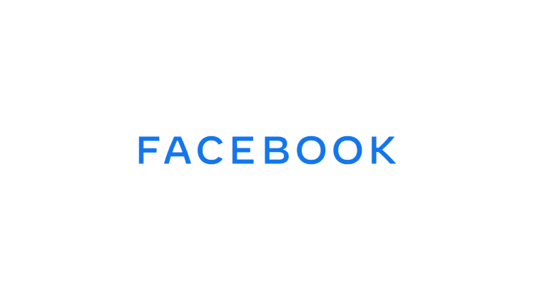
Facebook has just revealed their new generic logo, which has been devised to separate the company from its other properties, including Facebook, WhatsApp and Instagram.
In keeping with recent logo redesign trends, Facebook has opted for a sans-serif all-caps wordmark. It will be displayed in different colours when used in conjunction with the company’s various apps: blue for Facebook, pink for Instagram, and green for WhatsApp.
That’s about as far as the rebrand goes. Facebook claims that the new logo has been “designed for clarity”, which is a little ironic when you consider that the social media platform has been under fire for its failure to tackle the ‘fake news’ epidemic, as well as concerns about the privacy of users’ data. Facebook is currently under investigation by the Federal Trade Commission over its business practices, which isn’t a great look for any company.
The new logo is hardly innovative. It doesn’t say anything new and it doesn’t elicit excitement. There is nothing about the new brand that draws attention away from the whispers about Facebook’s unscrupulous and shady business practices.
The writing on the wall
The real issue with this attempted brand salvage is that it’s pretty superficial. Creating a slightly different logo to differentiate the parent company from the app does nothing to tackle the bigger issues facing the company right now.
Facebook really needs to rebuild users’ confidence in the brand, and new wordmark just isn’t going to change anything. Restructuring the company, changing the business model, creating greater transparency for users, or even rebranding to the point of naming Facebook, Inc. something completely new would all be more effective trust-building tactics.
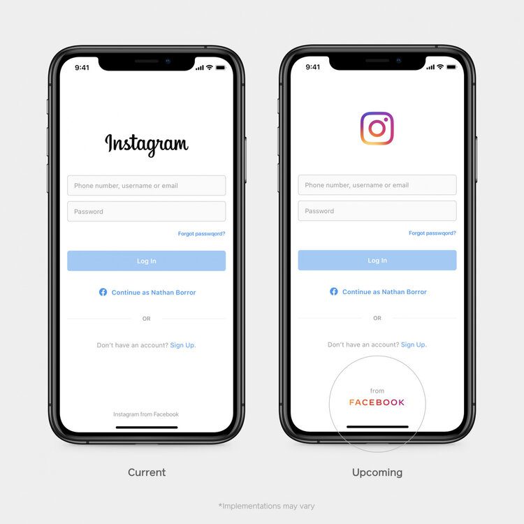
It’s also hard to have much confidence in Facebook when the multi-billion-dollar company released a mock-up of their new design for Instagram with a stupid and unforgivable typo. The fact that Facebook seems to have done the bare minimum in an attempt to repair the relationship with their customers makes the whole thing feel very low-effort and, to be honest, a little insulting.
Uber
Last year, ride-hail app Uber overhauled both its branding and its practices to rebuild faith in the company due to continued backlash from staff and the public for its unscrupulous business practices.
The issues ranged from sexism and sexual harassment at its corporate headquarters to the unfair pay and poor treatment of drivers, not to mention the uproar that the app caused local taxi firms worldwide. Many people swore off Uber completely and defected to rival company Lyft instead.
In efforts to move past the various scandals and rebuild a loyal customer base, Uber rebranded, just two years after revealing their latest logo (and they wouldn’t be the first company to try this tactic). They replaced the stark, all-caps wordmark with a sleek, rounded and more friendly-looking version, with much tighter kerning that made the whole thing look more put together. It wasn’t a drastic redesign, but it was a good move for several reasons.
Firstly, the new logo looked less intimidating and more professional, making it look much more appealing. Secondly, the logo is wildly different to that of competitor Lyft, whose bubblegum pink logo looks fun and squishy and silly. This makes Uber stand out as the serious and professional company at first glance, though it may also imply a certain coldness that one might not expect from the Lyft logo.

New logo, new attitude
However, along with the new design, Uber also overhauled the company and its practices.
Travis Kalanick, the company’s founder and CEO, was ousted and replaced by Dara Khosrowshahi, former CEO of Expedia Group.
The company hired former Coca-Cola executive Rebecca Messina as their first ever chief marketing officer in order to get the company’s reputation back on track.
New safety procedures were introduced, including Ride Check, a feature that uses the accelerometer and GPS of the drivers’ phone to detect issues such as crashes or unusually long delays, and safer two-factor authentication for riders’ accounts.
While the new logo hinted towards the company’s new direction, they actually backed up this new image with actions and change for the better. Although things aren’t perfect, Uber have visibly been making the effort to right their wrongs while also moving away from the visual identity of their former selves.
Build a reputation
We talk to our client all the time about brand building. It’s not just a case of “here’s a new logo” and leaving it at that. Building a brand is all about building your company’s reputation and constantly maintaining this. We help our clients do this in a number of ways. Whether that is through social media management, content generation or SEO audits, we make sure your online presence reflects your brand positioning and maintains your brands integrity. This is as important in building trust as conducting a brand refresh, building a new website and producing marketing collateral.
If you’re looking to give your brand a refresh or if you need help to build your business reputation online, get in touch with DWH today.

Claire Baldwin
Claire has over 10 years' copywriting experience across a range of print and digital media, working with a variety of styles, formats and tones of voice. She has written as part of an in-house team client side, as well as at marketing agencies based in the East Midlands. Claire's services include copywriting, copy editing, content creation and proofreading.