Font and typeface design can be incredibly important when it comes to creating a certain look and feel for your brand. There’s more to it than simply choosing your from a set of pre-existing fonts, and many brands have created their own bespoke font to really cement their image. Let’s look at some of the more interesting and unusual fonts to have come out of brands and designers in recent months.
The world’s comfiest font
Swedish furniture brand IKEA has taken a step away from furniture design and entered into the world of font design by releasing the free font SOFFA Sans.
Inspired by their online design your own sofa planner, each geometric letter is made up of various configurations of their Vallentuna sofa.
IKEA worked with digital agency Proximity London to create SOFFA Sans, which they are calling “the world’s comfiest font”. While not all of the letters make particularly practical sofas, it’s a fun concept that shows how far-reaching font design inspiration can be.

A new dimension for fonts
Berlin-based type foundry Hightype has released a three-dimensional font for use in spatial contexts.
With emerging technologies like VR, AR, 3D-capable web browsers, Hightype identified a need for standardised 3D fonts for use in design. By working with classic font designers, the design lends itself to being used alongside 2D fonts for a consistent visual experience.
The font is designed to be a base for ideas and modifications. It can be imported into 3D design software and game engines, where the letters can be altered and customised to suit a designer’s requirements.
Variable font technology
Designer Elias Hanzer has created a generative type concept, making use of technology that allows the font to be manipulated.
Titled Phase, the project is aimed to establish exactly what is possible from a modular typeface, as well as to explore the idea that “every visual code or style is is built upon a more or less modular system.”
Made available through a microsite, Phase features a new typeface that is able to react so sound or to manual sliders, allowing the characters to be manipulated. The lines will grow thicker or thinner, and the font will morph from the traditional-looking base font to something more decorative but less legible. Once you’ve created your font, you can download it for use, though commercial applications will require purchase.

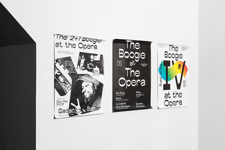
Contrasting font weights
The font Boogie School Sans was released in 2016 by Icelandic and Danish type foundry Or Type. Designed to develop a typeface with a reversed contrast than traditional typefaces, the Boogie School Sans family has since been expanded to include 18 different styles.
These new styles feature varying font weights that offer more contrast in the typeface’s thick and thin lines, creating unusual and interesting characters that still embody the essence of the original font design.
This allows the same letterforms to be used in many different ways, creating contrast and emphasis without changing the actual font.

Claire Baldwin
Claire has over 10 years' copywriting experience across a range of print and digital media, working with a variety of styles, formats and tones of voice. She has written as part of an in-house team client side, as well as at marketing agencies based in the East Midlands. Claire's services include copywriting, copy editing, content creation and proofreading.