
Turning negatives into selling points
Can you really take a negative and turn it into a selling point for your company? Claire Baldwin takes a look at some examples of intelligent and reactive marketing that have done just that.
It’s often said that all publicity is good publicity; even if people are saying bad things, at least they’re actually talking about you.
While this might not be the case in extreme situations, being relevant and in the public eye can give your brand real mileage. It might be preferable to be notorious than forgotten.
The cleverest marketers are able to ride the momentum of negative publicity and turn it into something positive. By reacting quickly to the influx of attention, you’re able to place something worthwhile in the spotlight while the media and public are still paying attention.
Let’s take a look at a couple of examples of creative marketing that turned negatives into positives.
KFC
Over the years, fast food chain KFC has received a lot of criticism over its fries, which many customers feel don’t stand up to the quality of their chicken, or to fries from other fast food chains.
As with most subjects, turning to Twitter yields a variety of negative comments:
“Dear KFC, No one likes your fries. Yours sincerely, The entire world.”
“I’ve got to say, KFC are riding solely on their chicken because Christ, those are crap fries.”
“how can KFC be so good at chicken and so bad at fries?”
Along with creative agency Mother, KFC took this criticism and turned it into teaser posters promoting a new fry recipe. The ads took these direct quotes and even included the authors’ Twitter handles, showing the world that they listen to and value feedback.
By taking a product that was poorly received and improving it, the ‘Ain’t No Small Fry’ campaign aimed to convert their fry-haters into fry-lovers. This approach had the benefit of bringing old customers back through the doors to try the new version, while giving those who still regularly eat at KFC something new and exciting.
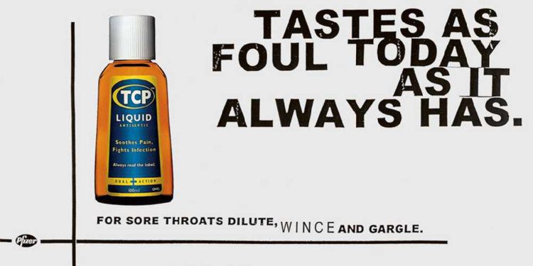
TCP
I might be showing my age a little here, but when I was a child my mother seemed to be constantly dabbing TCP on my various cuts, grazes, spots and sores. I have very vivid memories of this because TCP absolutely stinks. And if you’ve had the misfortune of using it for toothache then you’ll know it tastes disgusting as well.
Of course, I learned that, like broccoli, it tastes bad because it’s good for you. The stuff works. It’s just terribly unpleasant.
Which is why I couldn’t help but smile when I saw this advert for TCP with the strapline “Tastes as foul today as it always has.”
How often have you read reviews online where customers complain that a new formula of something doesn’t work as well as the old one? From lipstick to chocolate, reviews are riddled with ‘improvements’ that have backfired due to a company’s need to cut costs or improve a product’s nutrition.
This ad reassures existing TCP customers that the pungent brown antiseptic is still just as gross as ever, meaning it’s just as effective. It also sparks curiosity in those who aren’t familiar with the product and might wonder why on earth you’d put that on your own advert.
Creative marketing with DWH
It can be difficult to see your own products and services from a new angle, but DWH are here to find the individuality in everything you do. Together, we can embrace all aspects of your business and promote them in the best light.
Contact us today and let us know how we can help.
We are also pleased to announce we have been recognised by DesignRush in their list of Top Branding Agencies in 2019. You can check out the full list here.

Show your true colours
Pantone’s Color Institute has dubbed ‘Living Coral’ the colour we’ll all be using in 2019. With this in mind, Claire Baldwin analyses the importance of colour in the branding process and asks if a brand can really ‘own’ their colour?
Pantone’s Color Institute has dubbed ‘Living Coral’ the colour we’ll all be using in 2019. With this in mind, Claire Baldwin analyses the importance of colour in the branding process and asks if a brand can really ‘own’ their colour?
Pantone’s Color of the Year has set trends in many industries for the last 20 years, contributing to style decisions in everything from fashion to packaging..
Living Coral was chosen in response to our “continually shifting environment” and hints at embracing and regenerating our planet’s natural beauty. It’s been described as an “animating and life-affirming coral hue with a golden undertone that energizes and enlivens”.
Colour in branding
This all sounds very appealing, but be wary of jumping on the Living Coral bandwagon just because it’s the Color of the Year. Embrace it if you want to, but don’t overthrow your existing branding just to be trendy.
Colour is extremely important in branding, and consistent branding is key to creating a sense of trust and familiarity.
How many brands do you associate with the colour of their packaging or logos? Would you still recognise an ad for Coca-Cola if they used Living Coral instead of their signature red shade?
Can brands own a colour?
You might have heard of trademarking a colour, but do brands actually have any legal right to do so?
The answer isn’t completely black and white (forgive the colour pun) but, in short, the answer is yes … sometimes.
For a long time, colour wasn’t seen as being distinctive enough to act as a trademark. This was resolved by the World Trade Organization Agreement on Trade-Related Aspects of Intellectual Property Rights, Article 15(1), which expanded the legal definition of a trademark to include “any sign … capable of distinguishing the goods or services of one undertaking from those of other undertakings”.
What this means is that where the colour (or combination of colours) is distinctive enough to distinguish the product or company from another similar product or company, the colour could be legally trademarked.
Companies may use similar colours without dispute if their products or services are unlikely to be confused. For example, the US department store Target uses a similar red to Coca-Cola, but the companies are different enough to prevent confusion.

Colour wars
Disputes about trademarked colours pop up in the media from time to time, but they aren’t always easily solved. Here are a couple of examples.
Christian Louboutin vs. Yves Saint Laurent
In 2012, Christian Louboutin filed a case against Yves Saint Laurent for producing a red-soled shoe, claiming that the red sole is a trademark of their brand.
The US Federal Court of Appeals ruled that Louboutin’s trademark could only apply where the rest of the shoe was a colour other than red. This meant that YSL’s all-red shoe was not a trademark violation, but Louboutin could protect from future copycats.

Cadbury vs. Nestlé
Cadbury trademarked their distinctive purple back in 1995 but this only covered “chocolate in bar or tablet form.” Cadbury sought to amend this in 2004 to cover products such as cakes and drinking chocolate.
The original phrasing of the trademark application read: “The mark consists of the colour purple (Pantone 2685C) … applied to the whole visible surface, or being the predominant colour applied to the whole visible surface, of the packaging of the goods.”
Nestlé, who also use purple for some of their products, opposed the trademark, stating that Cadbury’s purple shade had no distinctive character and was too broad for a range of products.
The UK Court of Appeal overturned Cadbury’s trademark in 2013. They stated that in the phrasing of the trademark description, “being the predominant colour” was too broad and did not accurately define the mark.

Designing brand excellence
Your branding defines your business. It distills your company ethos, services and values into a cohesive look and feel that tells people who you are and what you’re about.
If you’re looking to make a change to represent a new era, or you need help creating a comprehensive brand from scratch, get in touch with us today.

Do they know it's Christmas?
As UK Christmas TV ad spending is projected to fall by as much as £44m this quarter, Claire Baldwin looks at the latest campaigns to separate the Christmas turkeys from the golden goose.
UK TV ad spending is projected to fall by as much as £44m this Christmas, with companies rerouting that money to more modern methods instead. Facebook, Google and YouTube are set to be the focus this year as retailers try to compete with online competition.
Despite this, we were still treated to the usual weird and wonderful Christmas ads that we all look forward to. Let’s take a look at some of the more noteworthy offerings this year.
John Lewis
Perhaps the most eagerly anticipated Christmas ad in the UK, the department store has taken a different approach this year. Gone are the cute and whimsical characters, with the advert instead revolving around singer Elton John.
We see the singer’s career in reverse, from huge stadium shows to his beginnings as a musician, all the way back to a piano recital at school. The end shows a young Elton John unwrapping a piano on Christmas morning. The line pops up: “Some gifts are more than just a gift.”
Rather than focus on consumerism and excess, the advert hints towards meaningful gestures that change futures and shape lives.
Festive feeling: 2/5
Warm and fuzzy factor: 3/5
Message: 4/5
Iceland
The advert has been banned for being “too political” due to its focus on the environmental impact of palm oil. This is surprising for a supermarket that has never been known to have any kind of political view, but less surprising when you learn that the advert was originally created by Greenpeace.
The animated ad features a girl who has found an orangutan in her room, and is poetically narrated by British actress Emma Thompson. This poem turns from charming storybook to an eye-opening look at deforestation and habitat loss caused by palm oil production.
The advert concludes with Iceland’s promise to remove all palm oil from its own-label products “until all palm oil causes zero rainforest destruction”.
While the message is important, some people felt that hijacking the Christmas advert season to make a political point isn’t particularly festive. It’s definitely grabbed media attention, though.
Festive feeling: 1/5
Warm and fuzzy factor: 1/5
Message: 4/5
Burberry
The luxury fashion brand is known for its decadent adverts packed with famous faces, and this year is no different. 2018’s ad features Kristin Scott Thomas, Matt Smith, M.I.A, Naomi Campbell and her mother, Valerie.
Accompanied by the somewhat haunting ‘Carol of the Bells’, this characteristically beige advert was shot by British artist and photographer Juno Calypso. It is intended to capture “a more realistic British Christmas” taking the viewer through “all the key seasonal rituals, both good and bad.”
It’s a very stylish Christmas advert with a strong focus on the brand’s clothing and accessories, but it doesn’t really bring a sense of holiday joy. If anything, it might leave you dreading that traditional family dinner!
Festive feeling: 2/5
Warm and fuzzy factor: 2/5
Message: 2/5
Sky Cinema
TV giants Sky have put family movie night at the heart of their Christmas ad. With voiceover by Patrick Stewart, the advert opens on a large apartment building with its windows numbered like an advent calendar. We visit the various homes and see a glimpse of their Christmas decorations and festive movie choices.
It ends with the line “Movie magic on demand this Christmas” and promotes a lovely message of spending time with family and loved ones. While it may have been nice for all of the movies to be traditional Christmas movies, Sky obviously needs to advertise the availability of recent blockbusters as well. This does make the concept feel less festive, though.
Festive feeling: 4/5
Warm and fuzzy factor: 3/5
Message: 3/5
What’s your message?
Whether you’re sharing a Christmas message or simply marketing your brand, creative thinking is essential to get you noticed and remembered.
DWH Design can help you to turn your products and services into unique content that converts. To find out more about our copywriting services and content generation, get in touch, and take a look at our case studies to find out what we’re capable of.

When bold copy goes too far
LAST MONTH, WE TOOK A LOOK AT HOW COPY CAN CHANGE THE AD INDUSTRY, FOCUSING ON NIKE’S DREAM CRAZY CAMPAIGN. THIS TIME, CLAIRE BALDWIN LOOKS AT EXAMPLES OF WHEN BOLD COPY MISSED THE MARK AND RESULTED IN MORE OF A NIGHTMARE THAN A DREAM.
Carefully chosen words are the backbone of marketing campaigns. They allow you to get your message across, give your company a voice and explain why customers need you.
Make a statement. Stand up for something. Show the world why your brand is unique.
But… try not to be a jerk about it.
We all like to hear about catastrophic failures, partly because it’s entertaining but it’s also a great way to learn what not to do! Let’s look at some bold ad copy that could have been a little gentler and see what we can learn.
Lesson 1: Don’t insult your customers

Highlighting the problems that your product can fix is a common way to persuade people to try it, but it’s important to use the right tone. Get it wrong, and you end up humiliating or criticising your potential customers.
In 2012, skincare brand Proactiv received backlash for an advert with the text: “Got acne? Just ask your boyfriend what to do. Oh, that’s right, you don’t have a boyfriend.”
While many skincare and cosmetics brands could be said to play on people’s insecurities, this one doesn’t exactly promote a healthy message. It also just comes off as pretty mean!

In 2011, The Economist tried to increase their female readership with an advert that read: “Why should women read The Economist? They shouldn’t. Accomplished, influential people should read us. People like you.”
While you can kind of see what they were going for, there were surely many better ways to make the statement more clearly. Something along the lines of: “Why should women read The Economist? Because it’s for accomplished, influential people.” It’s not perfect, but it does a better job of not doing women down.
Lesson 2: Don’t joke about serious issues


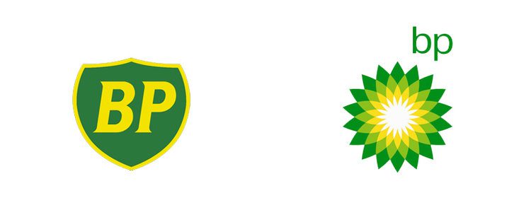
Spirit Airlines got in trouble in 2010 for an advert that seemingly made light of the BP oil spill, with the line “Check Out The Oil On Our Beaches.” Although the airline claimed that the message was misinterpreted, many weren’t convinced.
Spirit had already caused controversy with previous ad campaigns, including one that advertised “Strikingly Low Fares” in reference to their own pilots’ strike.


In 2013, Hyundai launched an advert in the UK that was supposed to celebrate the fact that their sedan doesn’t produce harmful emissions. In a fascinating lapse of judgement, they chose to show this through a man’s failed attempt to take his own life and the slogan: “Our cars are so safe you can’t even commit suicide in them.”
Being bold is one thing but belittling serious issues is just going to anger and alienate customers. Remember that you are selling to real people with real lives, and experiences both good and bad. If there’s any possibility that what you’re planning might cause offence or evoke a traumatic reaction, you should scrap the idea.
Lesson 3: Don’t forget how your words sound to customers
Creating a marketing campaign doesn’t happen overnight and can take months or years. It’s easy to lose sight of how things might look or sound to people that weren’t present in all of your brainstorming sessions.

US department store Bloomingdale’s caused outrage in 2015 with a Christmas catalogue that cheerfully suggested “Spike your best friend’s eggnog when they’re not looking.” Understandably, this was poorly received.
Bloomingdale’s were trying to be fun and lighthearted, adding an attempt at cheeky humour to their catalogue. The result was an advert in poor taste that got them accused of suggesting date rape as a festive activity.

In 2015 Bud Light launched their Up For Whatever campaign. This was accompanied by the tagline: “The perfect beer for removing the word “no” from your vocabulary for the night.” Yikes. I’m sure you can see what’s wrong with that…
The key takeaway
Trying to be fun, quirky and different in your copy is great, but always think through the implications of what you’re saying. Make sure you run the ad copy past as many diverse people as you can to highlight areas of friction that might have been missed.

How brave copywriting can change the ad industry
Off the back of the new Nike campaign featuring Colin Kaepernick launched to celebrate 30 years of ‘Just do it’, Claire Baldwin investigates how creative copywriting in advertising can both inspire a generation and cause major controversy.
Unless you’ve quite literally been living under a rock, you’ll have heard about Nike’s new campaign. Even if you know nothing more than that some people are burning their trainers, you’ll be aware that this campaign has exploded.
The decision to use former NFL player Colin Kaepernick as the main face of the brand’s Dream Crazy campaign has been criticised by some. Kaepernick garnered attention back in 2016 when he knelt during the national anthem in protest of police brutality. Some thought the act was unpatriotic, and Nike’s involvement with Kaepernick has led them to boycott the brand. People have shown themselves cutting the iconic ‘swoosh’ logo off their socks or even burning Nike trainers to show their disapproval.
Although some disagree with Kaepernick’s actions, many stand by him and are inspired by the ‘take a knee’ protest. While the backlash may make it seem like the campaign was a huge misstep, Nike’s stocks actually hit an all-time high just 10 days after launching the campaign, and their online sales shot up by a huge 31%.
Share a message that you can be proud of
Along with the increase in profits, another big win for Nike from this campaign is the message itself. It focuses on pursuing your dreams even if they seem unattainable, and not letting other people’s expectations hold you back. This theme of bravery and self-belief is something that everyone can be inspired by. It works because it’s a message aimed at real, flawed humans and not at ‘the ideal customer’.
The Dream Crazy film features a host of inspirational figures from pro athletes like LeBron James and Serena Williams to emerging talents like 10-year-old wrestler Isaiah Bird, who was born without legs, and Ironman Charlie Jabaley, who reversed the growth of a lifelong brain tumor through diet and exercise.


The range of campaign posters is full of bold, inspirational copy that sparks passion and a desire to be your best self. While they don’t insinuate that buying Nike products will make you the fastest runner in the world, the campaign shows that you can succeed even if the odds are against you. Nike reminds us that the first step to achieving a goal is to “Just Do It”.
Brave copy can make a campaign
A picture may be worth a thousand words, but just a few words could be worth billions of pounds. Distilling your company’s philosophy into a memorable phrase can create an entire culture around your brand and give customers something bigger to support than just a product. What message do you want your customers to take away from your advert? That your product is good, or that your company is influential?
The words you use can be more powerful than what you’re actually selling. While not all companies have the brand recognition to rely on the message alone, every campaign is a chance for you to shout about yourself and to do something different. You don’t have to be cheeky. You don’t have to please everyone. You don’t have to make a political statement. You just have to say something.
Nike’s latest campaign shows that you can reach huge audiences and create a media buzz with brave adverts that take a stand rather than simply explaining the benefits of a product. It’s likely that many more brands will also follow suit and try to replicate this edgy and inspirational campaign, but it will be interesting to see who succeeds in motivating their audience and who ends up provoking them instead.

Can open-source branding really work?
Two years ago, Mozilla opened up their rebrand in collaboration with Johnson-Banks to the creative community as part of their ‘open not closed’ philosophy. As they do the same for their Firefox rebrand this month, Claire Baldwin investigates if there is a model for companies to start ‘open-sourcing’ their branding projects and if there is any scenario in which this could actually work.
You may know Firefox as an internet browser, but did you know that they are also creating a new range of apps and services to reflect modern internet use? This suite of tools will include everything from simple screenshot functionality and file-sharing solutions to voice search and VR browsing possibilities.
In short, Firefox is going to be offering much more than their flame-tailed fox logo can express, so it’s time for a rebrand that truly represents the full Firefox product range.
Mozilla has opened up its design process, asking the creative community for their opinions on the prototypes for their new brand identity. You might remember that they used a similar Open Design process a couple of years ago when working on their logo rebrand.
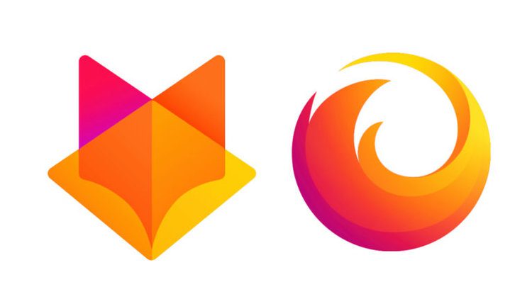
One of the hardest parts of unveiling a new brand or logo is awaiting the barrage of opinions and inevitable backlash from the world. Mozilla aimed to avoid this by being open with its customers, giving them the opportunity to weigh in during the design process and taking these comments on board.
While you’re never going to please everyone, the idea of “crowdsourcing” ideas for your rebrand is an interesting one. But does it actually work?
Let’s take a look at some examples of when companies probably should have asked for a few more opinions before going ahead with a rebrand.
Leeds United
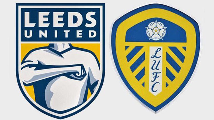
The new design
At the start of the year, Leeds United Football Club unveiled a new crest design to signify a fresh era for the club. It featured clean, modern graphics, replaced the club’s initials with its full name, and depicted the famous “Liverpool salute” that is widely associated with the team.
On the day of its reveal, a fan petition pleading for the logo not to be used gained more than 50,000 signatures by 7pm.
What went wrong?
LUFC had determined that there was significant desire for an updated logo to symbolise a new era for the club, so they were confident that a redesign would be welcomed. Some 10,000 affiliated people were apparently consulted during the six-month design process, but it seems that nobody thought to ask the opinion of the club’s loyal fans.
Clearly the fans had some strong opinions on the update, and the club promised to listen to their views and work with them to create a new brand that they can be proud of.
Tropicana

The new design
Back in 2009, juice brand Tropicana invested $35 million in a modern redesign of their packaging, swapping the classic image of a straw inserted into an orange with a glass of orange juice.
In theory, this better represents the product that customers are actually purchasing, as Tropicana had only previously shown the outside of the fruit and not the flesh or juice.
However, sales dropped 20% following the redesign, resulting in around $30 million of lost revenue. Tropicana reverted to the old packaging in a matter of weeks. Taking into account the the redesign, marketing campaign and lost sales, the whole thing cost them upwards of $50 million.
What went wrong?
A huge part of the issue here is that Tropicana underestimated the emotional bond that its customers had with its original packaging. Too many elements of the packaging were changed at once, making the carton unrecognisable, even to loyal customers.
Many customers also complained that moving away from the image of the orange as a fruit made it feel as though the juice was less natural, despite the carton prominently stating: “100% orange pure & natural”. Images are absorbed much more quickly than text, so it’s important to make sure that they’re telling the same story as the words that they accompany.
So, should companies consult their customers when rebranding?
No matter what you do, you’re going to have critics when you decide to rebrand. If you have the time, resources and budget, you could learn a lot from customer research or focus groups to inform your redesign.
It’s worth bearing in mind, however, that while your customers are the intended target for your rebrand and their opinions are valuable, they are not design experts. You should listen to their opinions and learn what you can, but be wary of ‘creating a camel’ by trying to include everyone’s idea.
Mozilla’s approach to their Open Design process is to welcome comments and criticisms, but not to put the decision to a vote or ask customers to create designs for them. Try to consider your customers as much as possible if you redesign your logo or packaging, but listen to your in-house team or external design agency, too.
Key takeaways
Don’t change too much at once
If customers can’t recognise your new brand, or if they can no longer relate with it, you will lose sales. Even the most loyal customer can be put off if they don’t like your new design or they can’t even locate your product on the shelf.
Don’t change for the sake of change
While many companies strive to achieve a ‘modern’ or ‘updated’ look and feel, it’s important to recognise when a brand has history and heritage, and not to simply throw that away. Make sure that your brand still represents your business or product, but don’t break with tradition just because you feel like it’s time to move on.
Don’t alienate your customers
Learn what your customers like about your brand and what they expect from you. If you’re a corporate finance company, you’re going to surprise people and put them off if you bring out a neon graffiti-style logo. Even if you think a change of tone is beneficial, your customers may not agree.

Why choose DWH for your branding project?
At DWH, we like to take an open approach to branding. We share our ideas with our clients and involve them at every stage of the branding process.
In essence, we make you the central character in the tale of your brand story.
That way, once the project is complete, you have the confidence to take full ownership of the brand. This will enable you to effectively sell your business to your customers and get the best return on investment for your product or service.
It doesn’t stop there. We will give you the tools to make sure you retain brand consistency within your business including a full set of guidelines. We can also support you to effectively market your brand through tools such as social media marketing, website development and content generation.