:) :( :|| :// ;p ... If you're old enough to have owned a phone before the emoji keyboard was invented then you will be familiar with the old 'text emoji' from the Nokia 3210 years. So when did they start creeping into brands? Well, 2017 as it happens! So starts the first bumper brand review of the year. And here's the first one:

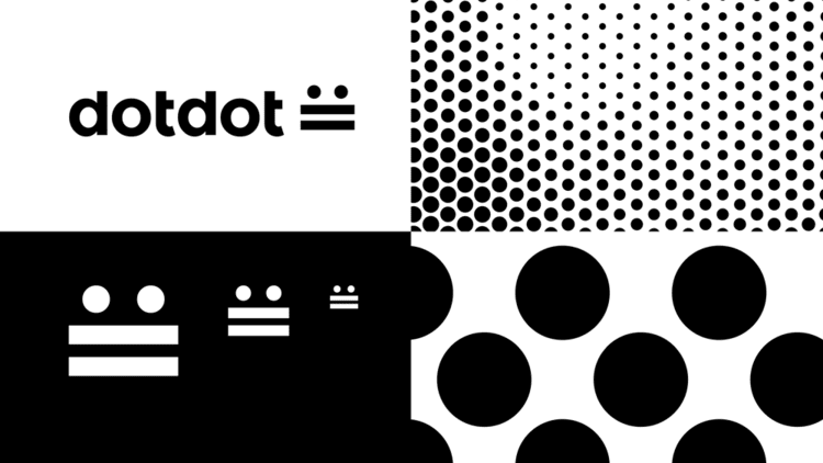
Introducing dotdot, the new protocol for the Internet of Things (IoT) designed by Wolff Olins.
In the age when, according to the brand video, your toaster reeeeally want’s to talk to your espresso machine, dotdot aims to create a programming language that will actually allow this to happen. Why? Well according to the zigbee alliance, a global membership organisation that works to create and develop universal open standards for smart objects, having a universal language will streamline how ‘things’ work together in homes and businesses and make smart objects work smarter.
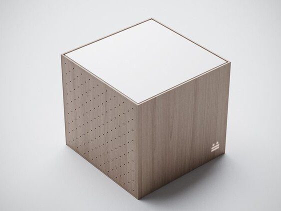
I’m not going to go into the whole “isn’t this the beginning of Skynet” debate. What I do question from this brand is the icon they’ve chosen. Ok I get the ‘dot-dot-dash-dash’ alludes to morse code as a simple way of communicating. I even get that it looks like a text face. But seriously… the angry text face? :||
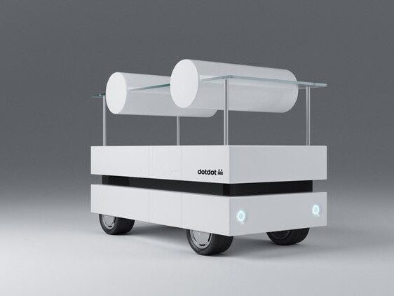
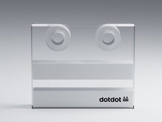
This is where it starts getting a little weird. Ok the work shown previously is fine to introduce a visual language style for corporate rollout such as a website, brochure, etc. But I can’t see at any time or venue where I would want to wear an ‘internet protocol’ icon as a lapel pin. You would have thought that if they were to use the icon the same way they use the universal symbol for ‘USB’ or ‘Wifi’ then they would show examples on say the aforementioned toaster or espresso machine? In fact the Zigbee Alliance showcase a bunch of products they already make here which they could have applied the icon to. So why show a render of a fake ‘shuttle car’. Although I’ve got to admit… that tape dispenser is awesome!
And just in case you were thinking “this looks familiar”, you’re not the only one. I’ll just leave this here…

This might have been a good opportunity to talk about the new Juventus brand but I’m saving that for my next blog. Instead, let’s talk about Mozilla.
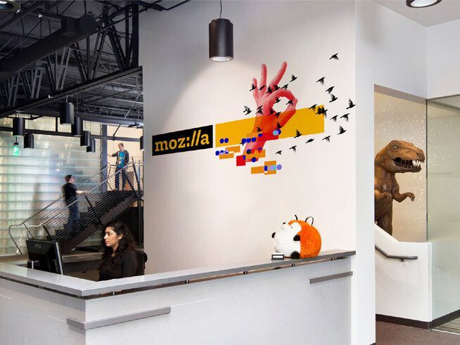
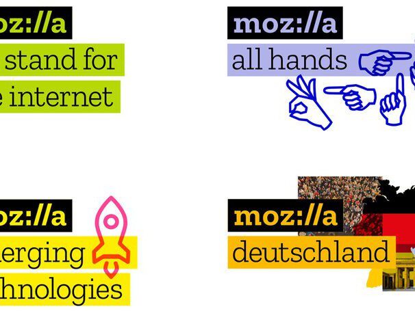
You may remember last year the big who ha in the design community when this branding project was announced by Mozilla and London-based johnson banks when they decided to open critique of each stage of the branding process to EVERYONE! That’s right, to compliment the truly open-source nature of Mozilla, they treated this as an exercise to involve the internet community to help come up with an open-source solution. After a year, here is the result:
In case you missed it here is a snippet of the original concept from rounds one and two:
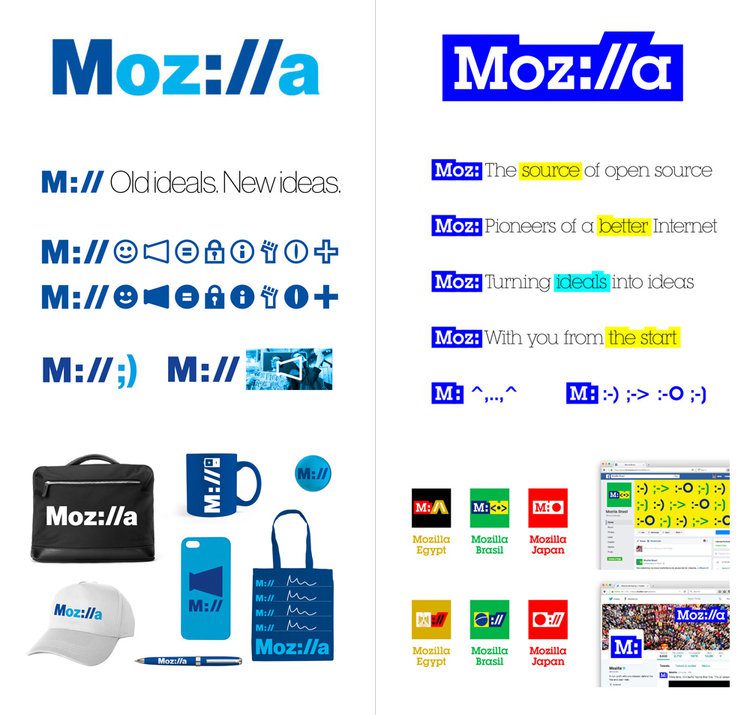
At the time I noted back in September how this was by far the best concept and I’m glad that this was the final choice. It has it’s roots grounded in the original http:// protocol and although it’s had a couple of people slightly :// (that means sceptical) of the clarity of the word ‘mozilla’ I personally had no problem seeing the colon as representing an ‘i’ and the obliques (//) as double-l’s.
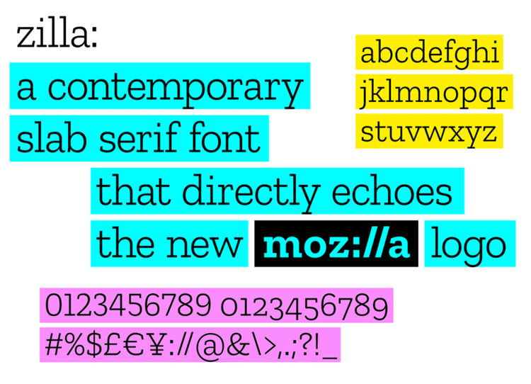
The improvement from the concept to the execution was the lowercasing of the ‘M’ and introducing a custom typeface called ‘Zilla’ by Typotheque. It harks back to the origins of the web using a Courier-style slab serif which is like a cooler version of ITC Lubalin Graph (which I’ve used a couple of times on branding projects to great success). I do get the highlight device and the “wordmark in a box” approach to the logo which alludes to typing in a search box. However, I feel there was an elegance in the original phase two concept where the typeface was framed in a heavy stroke which made it look more unique. The “boxed out” solution does seem to be the obvious solution but in a way it’s lost some of its character as a result.
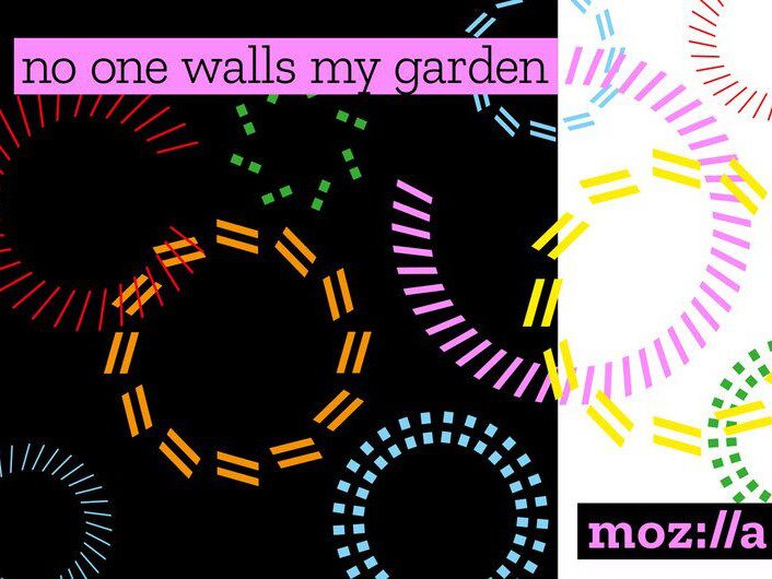
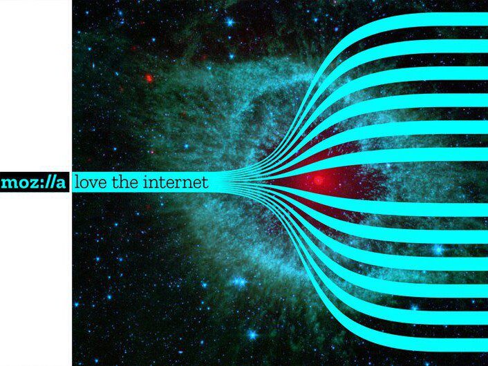
This is where things get a bit weird… but not in a bad way.
The language used in these visuals is used very cleverly (I especially like the use of the gap between the ‘open not closed’ line above) and I find it quite amusing they’ve used popular internet memes such as the ‘fist pumping baby’ and ‘cat’ imagery in their visuals. Again, it harks back to the history of the net, but is it a step too far?
I leave this as an open question which I might come back to over time as we see more roll out. But as we talk about the future of the Internet of Things, AI and the ever evolving web, the visual language seems like it was ripped from old pages of ‘Wired’ magazine from 10 years ago (which again I stress is not necessarily a bad thing). Does it rely too much on celebrating the past rather than looking to the future?

David Huskison
David is the founder of DWH and is involved in all aspects of the design process from the initial creative concept through to final artwork stage. With over 20 years of experience working with agencies across the Midlands, his role is to provide significant creative injection into client projects. By personally delivering creative concepts, he ensures that client briefs are effectively executed and that the final project is delivered within budget.

