I vaguely remember owning a pair of ASICS trainers way back in the late 80s when I was about 10. From what I remember, they were not as cool as the Adidas and Nike trainers that the other kids had and they were quickly discarded. Fast forward to today and things aren't that different. But could that be about to change?
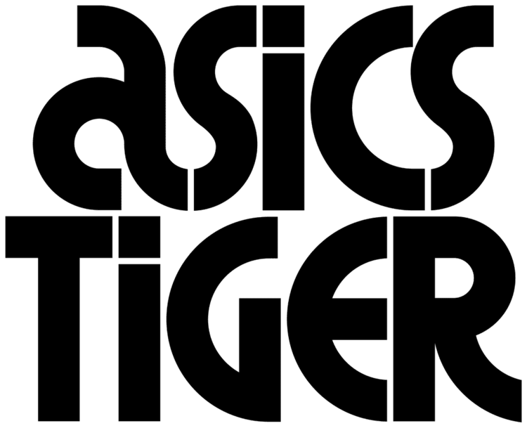
Launched in 2015, ASICS Tiger is a sports and lifestyle shoe and apparel brand from parent company ASICS Corporation, that manages the sister consumer brands of ASICS and Onitsuka Tiger. To coincide with the opening of the first ASICS Tiger store, located in Osaka, Japan, the brand introduced a new logo by New York-based designer Alan Peckolick and Herb Lubalin, who designed the original ASICS logo in 1977. Check it out below:
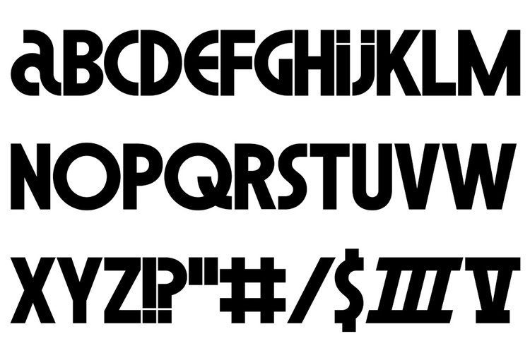
The brand aims to build on the retro aesthetic of the original logo with a new typeface from Copenhagen-based Kontrapunkt reminiscent of the phototypesetting-era of typography from the 70s and 80s. While the roots of this logo are from the late-70s, the new lock up and typeface feel quite modern. This is partly as a result of completely dropping that god-awful swoosh from the main brand. Remember it? You can still see the pattern on the trainers themselves (albeit a lot more subtler) but as part of the new logo it wouldn’t make any sense.
Following the trend of stripping back brands while retaining heritage, this one works well as you will see in application shortly. Although I can’t help but feel on the stacked version is slightly unbalanced as to me there seems to be more emphasis on the ‘TIGER’ element (probably because of that dominating ‘R’ at the end).
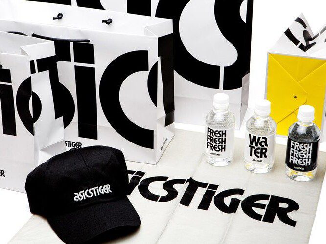
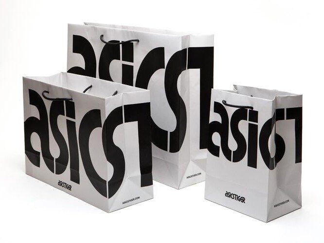
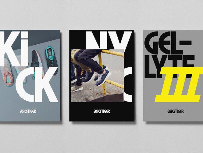
The rolled out identity was designed by Canada-based Bruce Mau Design which includes bags, water bottles, caps and posters. I love the stripped back minimalistic approach on the bags with the brand wrapping around.
But the water bottles is where the inconsistency lies. Remember I was saying about the ‘R’ on the brand? Well you’ll notice it’s changed on the word ‘WATER’ opting for a straight kick rather than the curved one from the logo. At first, I didn’t notice this in the typeface but when it’s paired with the logo it sticks out (or maybe that’s just me being picky!)
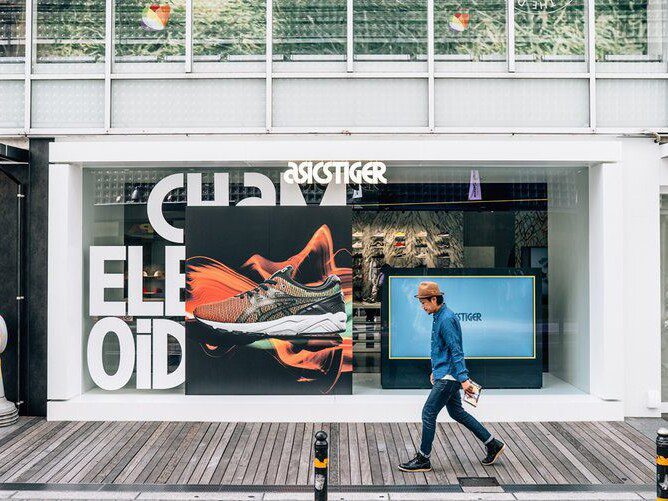
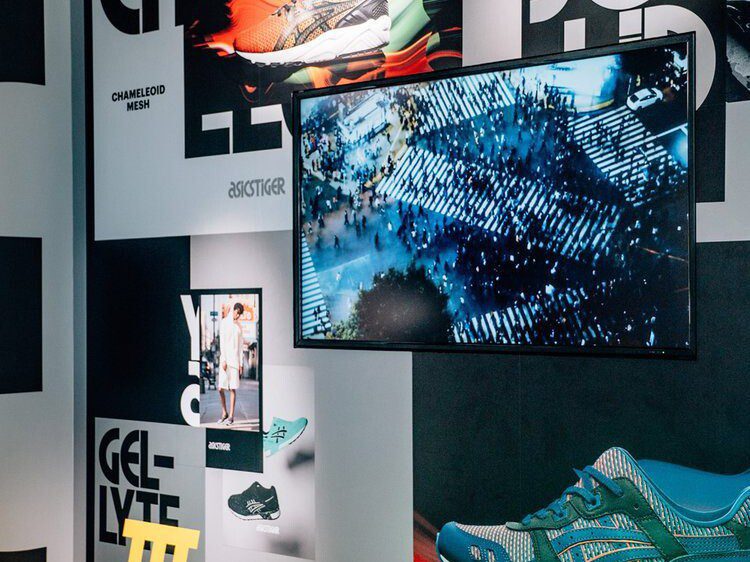
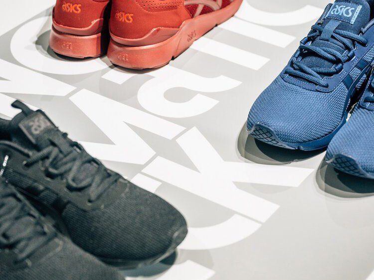
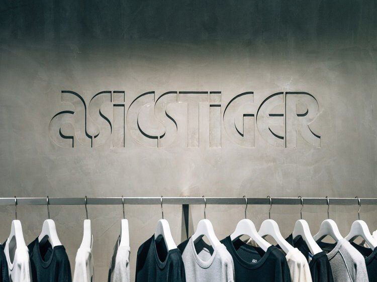
The store exterior and interiors are where it identity really comes to life. The simple black and white type really helps the bold colourful products to stand out. And the raised logo on the concrete wall literally gives it depth and looks awesome!
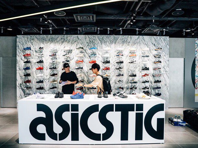
Pity about the counter. I get what they were trying to do with wrapping the logo around in continuity of the bag. Thing is it worked on the bag as you could clearly see ‘ASICS’ one side and ‘TIGER’ the other side. But front on reading the brand as ‘ASICSTIG’… ‘ER’. Again, I may be being picky, but as the new store is the first opportunity to expose your new brand I think it may have been a step too far.
That being said, the overall identity having a retro feel is by no means a bad thing. The new look ASICSTIGER is contemporary and dare I say it… cool.

David Huskison
David is the founder of DWH and is involved in all aspects of the design process from the initial creative concept through to final artwork stage. With over 20 years of experience working with agencies across the Midlands, his role is to provide significant creative injection into client projects. By personally delivering creative concepts, he ensures that client briefs are effectively executed and that the final project is delivered within budget.
