In todays world of digital cameras and smartphones, it seems alien to think that, not long ago, you took a picture on a clunky camera. You then had to take your 35mm film to a photo shop and wait a few days for the film to be developed before being handed an envelope of your memories on photo paper... that's right... paper!
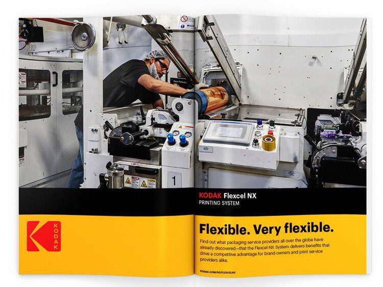
Arguably, one of the most iconic brands of this era was Kodak. I say was… Kodak are still around! Nowadays though, they are known for targeting the professional and business level with print systems and other enterprise solutions. But now, they’re getting back into the consumer market!
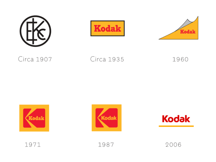
Kodak recently released the Ektra, a photography-first smartphone, and at CES this year announced the return of the Super 8 camera and film. To coincide with this return as a more general consumer brand, Kodak has reinstated its iconic logo with an identity update by New York based Work-Order. Check out the evolution below:
Although this is more of a revival than a rebrand, its not to say that the logomark that preceded it was wrong. In fact it was one of the first brands to introduce the modern geometric sans which is a prevalent trend in branding nowadays.
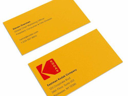
What this brand aims to achieve is a renewed sense of consumer confidence in a brand that is rich in historical equity. In terms of the mark, there is little difference between this and the original 1971 logo. If there was one criticism of the previous logo it was the awkward way that capital K sat so close to the point in the centre of the icon. By introducing Commercial Type’s Graphik as the main typeface, this allows the wordmark to be used vertically instead, which is a great way to modernise the logo and make it feel fresher. “But what happens when used at smaller sizes?” I hear you cry. The beauty of reverting to a brand that has so much equity is you could choose to lose the wordmark altogether and it would still be instantly recognise it as Kodak.
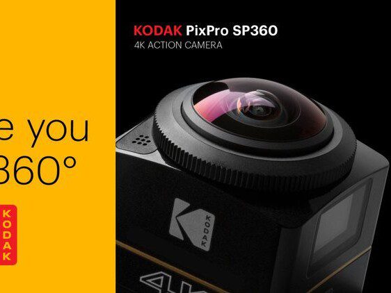
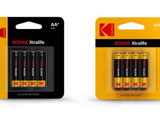
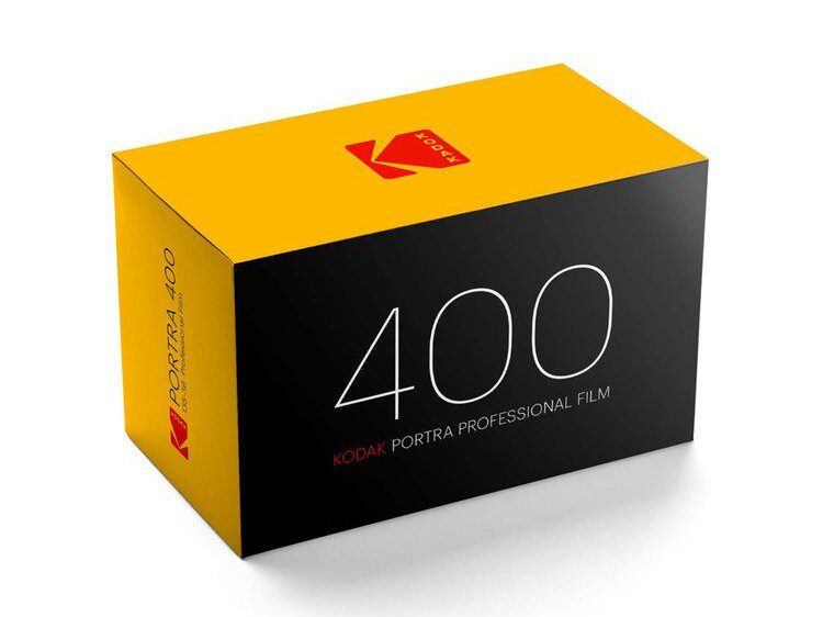
Work-Order explains the new design aims to bring a more unified look back to the brand – the K will appear as a manufacturer’s stamp on everything from batteries to camera boxes:
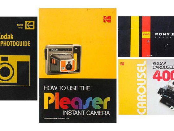
“Since the early 20th Century, Kodak’s packaging and marketing materials have been blanketed in a warm yellow with red and black features. Our aim was to re-establish this strength and to never abandon the use of yellow on anything.”
The prototype packaging looks awesome! Clean, minimalistic and elegant on a par with Apple’s packaging. Let’s hope the cleanliness is retained when it eventually makes it to the shop floor.

When summarising the rebrand, Kodak’s VP of global brand and creative Dany Atkins claims:
“We have gone back to what we do best, we make products that enable creativity and we are celebrating our heritage whilst looking very much forward to the future.”
For me, it’s a definite return to form for a brand that at one point was on the brink of becoming obsolete. Here’s hoping they can continue to innovate for another 128 years!

David Huskison
David is the founder of DWH and is involved in all aspects of the design process from the initial creative concept through to final artwork stage. With over 20 years of experience working with agencies across the Midlands, his role is to provide significant creative injection into client projects. By personally delivering creative concepts, he ensures that client briefs are effectively executed and that the final project is delivered within budget.
