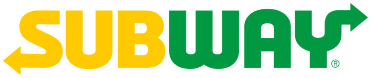
Today saw the launch of the rebrand for Subway. One word to describe this... urgh! What little personality the old logo had has disappeared with the italicised font. With the geometric wordmark, the arrows, which have been a core part of the brand since its launch in 1965, now seem bolted on to the new logo. When the wordmark was italicised the arrows looked a lot more organic with the curve feeling part of the wordmark. The sharp right-angle on that 'y' is way too forced and the way it breaks out of its visual area imbalances the whole wordmark.
The new icon for social media channels for me works a lot better with it’s clever use of the two arrows forming the ‘S’ in the negative space.

The new logo is featured in a series of new adverts for the ‘Appetite for Better’ campaign. The ads are uplifting and the logo kind of works off that sunset background (apart from that awful ‘y’). We’ll have to wait and see how the brand gets applied when its fully launched in 2017 but right now, I’m not sold on it!

David Huskison
David is the founder of DWH and is involved in all aspects of the design process from the initial creative concept through to final artwork stage. With over 20 years of experience working with agencies across the Midlands, his role is to provide significant creative injection into client projects. By personally delivering creative concepts, he ensures that client briefs are effectively executed and that the final project is delivered within budget.