YOYO Display is a design-led company producing creative, high-quality and cost-effective solutions for display and exhibition requirements. Combining their in-house facilities together with its network of trusted suppliers, YOYO will design, project manage and install exhibition stands that create truly amazing results.
We have worked for YOYO in one form or another for over a decade, working on everything from exhibition graphics through to reception graphics and showroom exteriors. We have forged a close working relationship with the Managing Director, Pete Hyde, so when the time came to create a new website, DWH was his first port of call.
The Logo
As part of the work, we offered to give the brand a refresh. The previous logo was quite quirky in the way it was stacked and used at an angle. It had been used as a repetitive pattern across all of their brand materials, but after 10 years it was looking a bit tired. The new brand needed a fresh tone of voice that spoke to a B2B audience.
Over the last few years, YOYO had attempted to evolve its brand, initially rebranding as Yoyo Exhibitions Solutions (y:es) and in its current form as Yoyo Display Limited (ydl). Despite this, clients still refer to the company as YOYO. This is as a result of building long-standing relationships with their clients. With 25 years of experience, YOYO has built a reputation for quality, reliability and trust. It is this trust that the new brand needed to build on. With this in mind, we proposed restoring the name ‘YOYO’ in the brand and using this as the driving force for the overall look and feel.
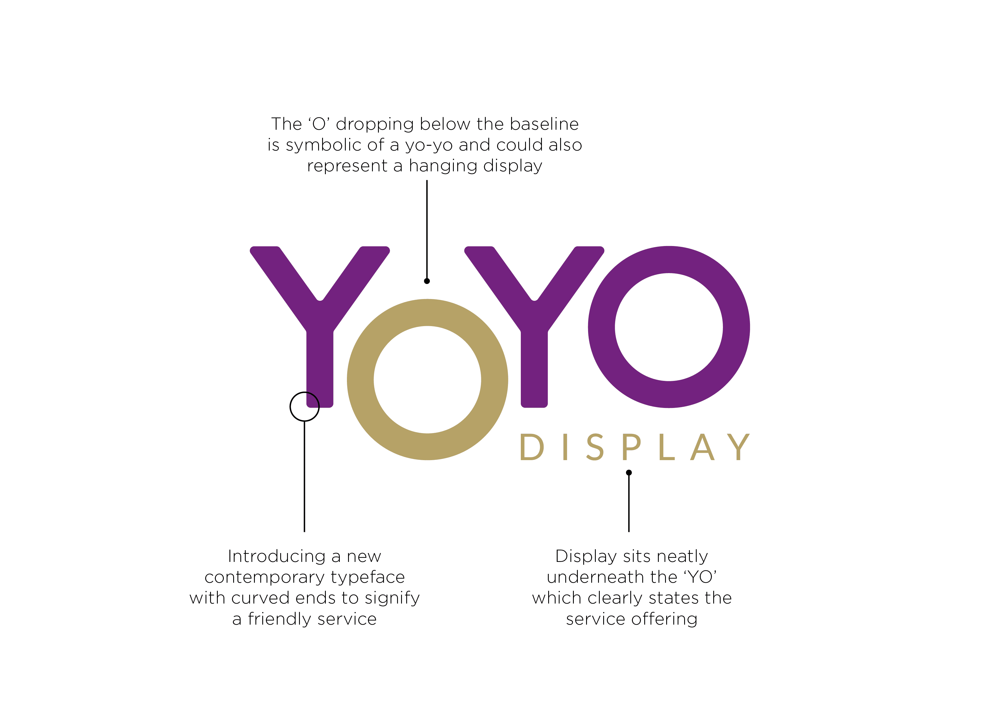
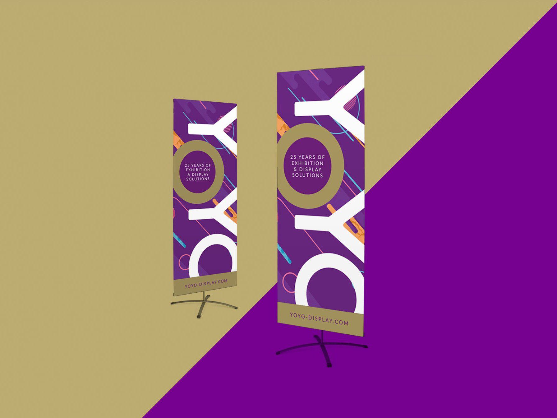
The new logo uses a crisp wordmark that feels more contemporary but doesn’t lose its uniqueness. It still retains a bit of playfulness with an ‘O’ that drops below the rest of the mark like a yo-yo. This lines up nicely with the ‘Display’ which is now included to clearly state the primary service that YOYO provides. We also introduced a new visual language which can be used across all print and digital media. The tone of voice can be dialled up and down depending on the audience. On materials such as PowerPoint templates and bid documents where the information is quite heavy and needs to be quite straightforward, a simple plain purple background is used. The loud, colourful background is used on display materials that simply carry the logo and the proposition statement. The cyan and magenta colours form the basis of a secondary colour palette, which can be used sparingly alongside the primary purple and gold.
We introduced a new proposition statement of “25 years of Exhibition & Display Solutions” which, as well as reinforcing the years of experience, reaffirms the element of trust that YOYO has with their clients.
The Website
With the brand in place, we then turned our attention to a new website. The previous site was primarily a showcase piece for YOYO’s exhibition and display stand portfolio. However, at no point were there any specifications or pricing for their banner stands, which is one of their highest selling products.
The new site rectifies this by introducing a dedicated section for travel banners, targeted specifically at clients who require lightweight display solutions for exhibiting worldwide. The structure of the site is built with SEO in mind. We created new content for the exhibition and display sections, while still retaining the portfolio pieces in dedicated gallery pages.
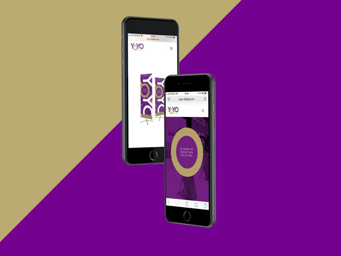
This results in a vibrant, responsive website that demonstrates the flexibility of the new identity while showcasing the products and services that YOYO offers in a clear and distinctive way.
The Roll Out
As part of the website work, we created a range of artwork to showcase the different size ranges of the travel banners. The client was so impressed with the results that they decided to roll these out on the production line. They are currently using these as tools to demonstrate how lightweight and portable the stands are to their clients.
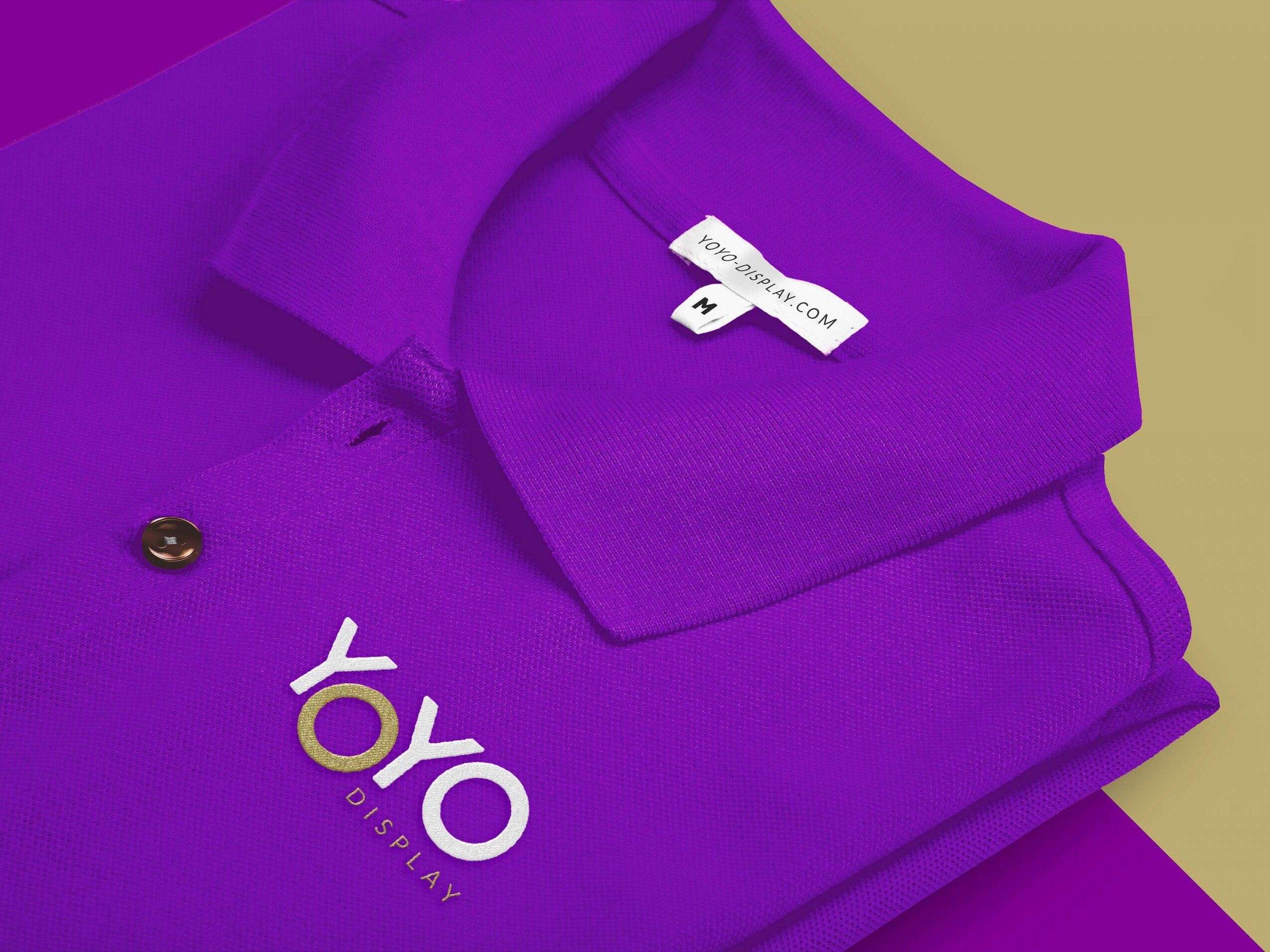
We were also asked to produce some branded clothing for the workforce. This included formal shirts that can be worn to meetings, coats and Hi Vis vests for installing outdoor displays, and polo shirts to be worn while fitting exhibition stands on-site. Finally, we rolled out the brand on a wide range of collateral including business cards, PowerPoint templates, email footers and signage.
"David and his team always produce innovative concepts and solutions that are not only visually stunning, but also practical. We have used DWH on many projects in the past. Their passion for creative design combined with their knowledge of current communication trends always ensure a successful outcome."
Peter Hyde, Managing Director, YOYO Display
