M&H Plastering is a local plastering company that came to us in need of a brand, website and business cards on a relatively tight budget. The brief and the confines of the budget meant that the work had to be very direct and concise.
The Logo
First of all, we had to come up with a strong visual identity, beginning with the logo. We provided a few options before they were narrowed down to the final choice, varying from serif monograms to more illustrative stamp-like options. The client settled on a 3D cube-like option, with the letters M and H built into the foundation. This logo made use of 3D space and also comprised shades of white, which we felt was reflective of the plastering industry. We therefore felt that it fit the brief of being simple and straight to the point but with an extra visual element to add some depth.
With the logo signed off, we were able to make some progress on the roll-out, beginning with business cards. Again, we decided to go as straightforward as possible with the cards, using a bold logo in stark contrast to the dark background, making it immediately impactful and identifiable without being overly complicated.
With the logo signed off, we were able to make some progress on the roll-out, beginning with business cards. Again, we decided to go as straightforward as possible with the cards, using a bold logo in stark contrast to the dark background, making it immediately impactful and identifiable without being overly complicated.
The Website
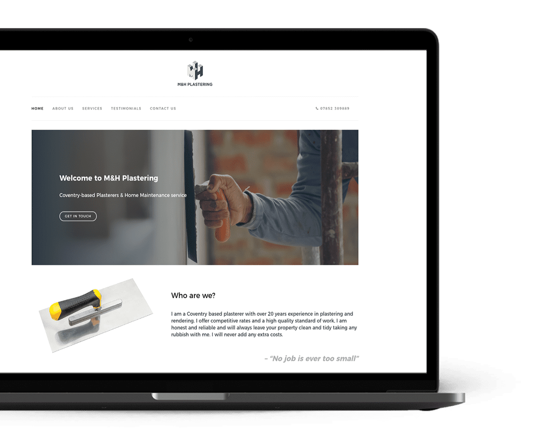
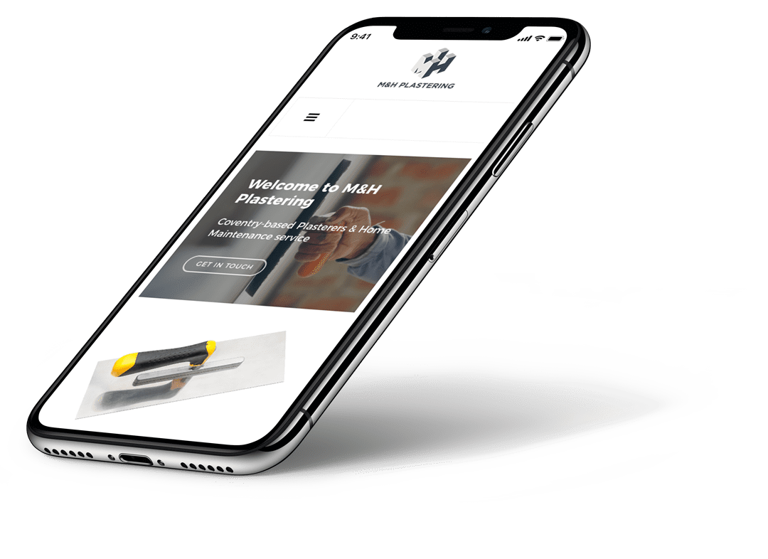
We decided early on that the website would be best suited as a single page that clearly displayed all of the information about M&H Plastering and the services that they offer. We executed this to the client’s satisfaction, getting the final design signed off and built in a very short space of time.


