Each year, the colour gurus Pantone select their Color of the Year, sending marketing teams, interior designers, fashion bloggers and artists into a frenzy of following the trend. Of course, 2023 is no exception. If you like, you can watch the 30-minute announcement video on Pantone’s website. Or if you don’t fancy that, I’ll be quoting various sentiments about this year’s choice in the article below. So, without further ado, welcome to the Magentaverse.
Each year, the colour gurus Pantone select their Color of the Year, sending marketing teams, interior designers, fashion bloggers and artists into a frenzy of following the trend. Of course, 2023 is no exception. If you like, you can watch the 30-minute announcement video on Pantone’s website. Or if you don’t fancy that, I’ll be quoting various sentiments about this year’s choice in the article below. So, without further ado, welcome to the Magentaverse.
Viva Magenta
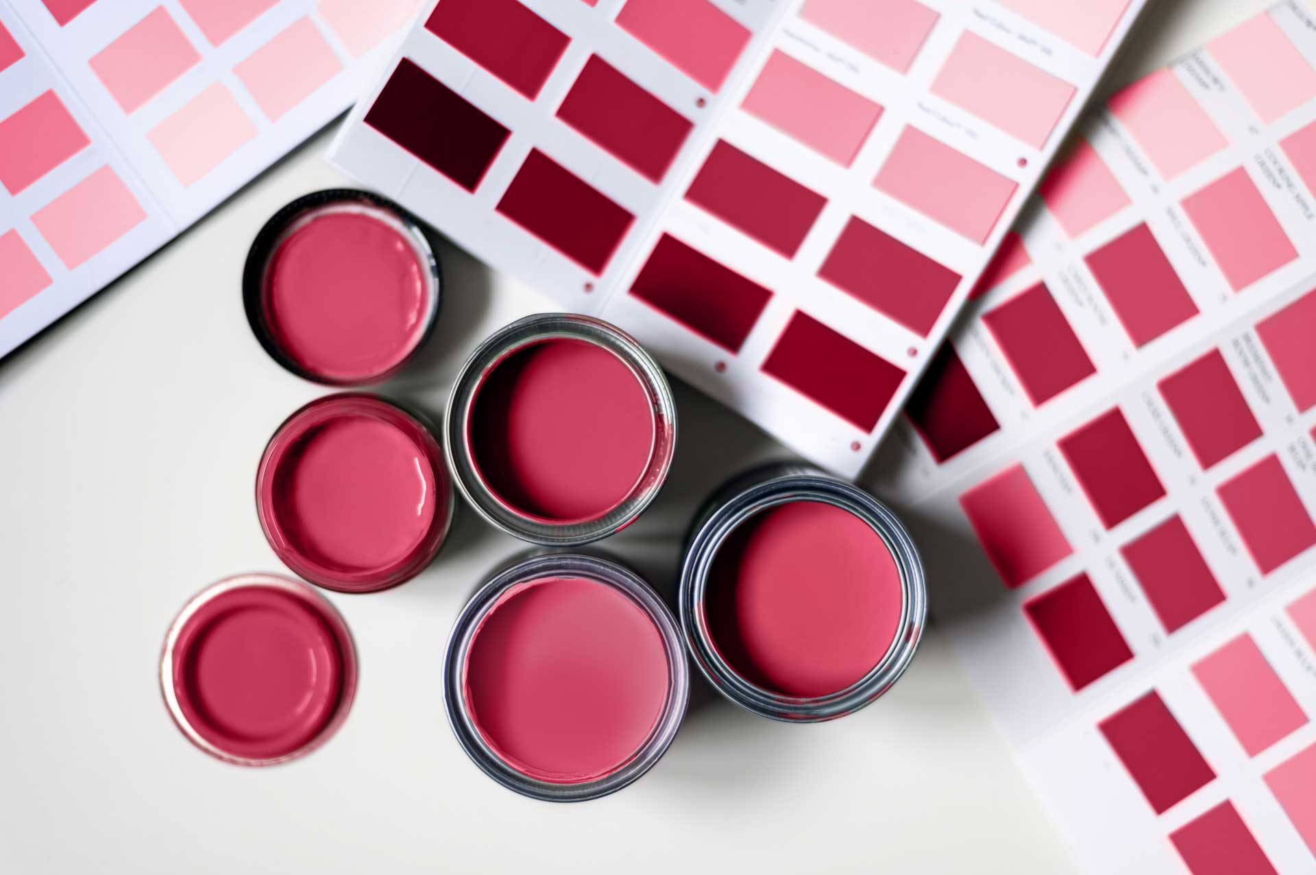
Pantone chose Viva Magenta 18-1750 as the 2023 Color of the Year, noting that it is “a shade rooted in nature” that is “inspired by the red of cochineal”.
In case you didn’t know, this is an insect that is known for its bright red colour. This is where the pigment carmine comes from. It’s been used for thousands of years as a dye and is still used for fabrics and cosmetics today, as well food colouring. So those tasty red sweets you’ve been enjoying and your favourite red lipstick… you might want to check the label for crushed up bugs.
While Pantone is drawing upon natural and historical connections to their latest Color of the Year, it does feel like a slightly odd choice in 2023, where sustainability, plant-based products and environmentally friendly ethics are stronger than ever. Admittedly, it’s not as tone deaf as 2019’s Living Coral, which prompted Australian design studio Jack and Huei to suggest Bleached Coral as the 2020 Color of the Year.
You might be thinking that it’s not really their place to deliver commentary on the human impact on our environment and it’s unfair to expect that of them, but the way that Pantone talks about colour shows that we connect with colour on a deeper level than simply liking or disliking the shade, and this makes it a strong vessel for messaging.

Colour as action
One thing that I find particularly fascinating about Pantone’s descriptions of Viva Magenta is their use of verbs, creating a sense of motion that is inherent to the colour. They describe Viva Magenta as “a pulsating color” that “vibrates with vim and vigor” and is “a new animated red”.
It’s interesting to consider the perceived motion of certain colours and how this can be used to strengthen brand messaging. As well as static applications such a logo design, these concepts could be incorporated into branded animations for even more engaging storytelling.

Colour as personality
Viva Magenta is described by Pantone as being “full of wit” and having a “verve for life” and “rebellious spirit”. I’m not sure how a colour can be witty, but the more I thought about it, the more there seems to be a certain amount of sense to the claim.
Colour theory has long been an integral part of creating a brand, and it’s true that we ascribe certain traits to different colours. Green is fresh, blue is cool, red is exciting… But these don’t necessarily translate to distinct personalities. What Pantone has done is taken the traditional expectations of colour theory and supercharged them, magnifying simple concepts like “exciting” into having a “rebellious spirit”, which is easier for people to connect with on a personal level.

Colour as promise
Leatrice Eiseman, Executive Director of Pantone Color Institute tells us that Viva Magenta “galvanizes our spirit” and helps us to “build our inner strength”. These are bold claims to attach to something as intangible as colour, but there’s something reassuring about hearing them that makes us want to believe, and we may even end up manifesting these qualities simply because we have faith in the promise.
Much like the extension of colour theory into human-like traits above, this type of description helps us to build a personal connection with the colour itself, almost entering into a partnership with it. In order for Viva Magenta to build your inner strength, you have to be open and receptive to the concept, in much the same way as an audience interacts with a brand’s product claims.

Colour as brand
The way that Pantone talks about colour creates a unique mythology that essentially translates to an entire brand identity for a single specific shade. In doing so, Pantone has created an identity that is exciting, has fascinating roots in human history and has the entire creative sector talking about it… even though it’s just a pretty shade of pinkish red.
We can all take lessons from how Pantone treats its colours; these are the qualities we should be attributing to our own brands. Everything your brand puts out should be another chapter in its mythology, demonstrating the unique actions, personality and promises that consumers can expect. If Pantone can create an entire character for a single colour, there are almost endless possibilities for even the tiniest of brands to engage with an audience on a deeper level.

Looking to add a little colour to your brand?
If your brand identity needs something new and exciting for 2023, the experts at DWH are on hand to offer strategic insights to help you achieve your goals. We’ll work hard create a unique personality that entices your audience – and that doesn’t mean just swapping out your hero colour for Viva Magenta. To speak to us about your brand, get in touch online or give us a call on 024 7518 5490.

Claire Baldwin
Claire has over 10 years' copywriting experience across a range of print and digital media, working with a variety of styles, formats and tones of voice. She has written as part of an in-house team client side, as well as at marketing agencies based in the East Midlands. Claire's services include copywriting, copy editing, content creation and proofreading.