Graphic design exists to serve its audience, and they can be a demanding lot. Trends rise and fall at a dizzying pace and it’s up to us to pre-empt the mood of the people. 2021 was yet another chaotic year, leaving for many of us a gaping hole where the fun once was. One of the many trying to step up and fill that void are the graphic designers, who are looking to inject a little more joy with a definitive shift towards quirky, bright and bold. So, let’s look at the graphic design trends we can expect in 2022.
Graphic design exists to serve its audience, and they can be a demanding lot. Trends rise and fall at a dizzying pace and it’s up to us to pre-empt the mood of the people. 2021 was yet another chaotic year, leaving for many of us a gaping hole where the fun once was. One of the many trying to step up and fill that void are the graphic designers, who are looking to inject a little more joy with a definitive shift towards quirky, bright and bold. So, let’s look at the graphic design trends we can expect in 2022.
The ’90s nostalgia revolution
Tried and tested concepts from a few decades earlier can be a great way to create audience engagement.
This is nothing new, but in 2022 we’re finally saying goodbye to the wave of ’80s nostalgia and welcoming in the ’90s, with its outrageous colours and more than a hint of grunge. From fashion to entertainment, we’re set to be bombarded with an eclectic mix of resurrected franchises, loud colour choices, quirky characters and chunky typography.
It’s fair to say that our lives have been “flipped-turned upside down” over the last couple of years. Reminiscing about less apocalyptic times is a surefire way of invoking happy memories, and is a brilliant way of creating an instant connection between your brand and your customers.

Muted colour combinations
Of course, bold, bright and obnoxious won’t do for every design. Many designers are opting for a much more restrained palette of muted colours. This allows them to create striking pieces that draw the eye while retaining a sense of elegance and grace, which might be the exact opposite of a brazen ’90s-inspired palette.
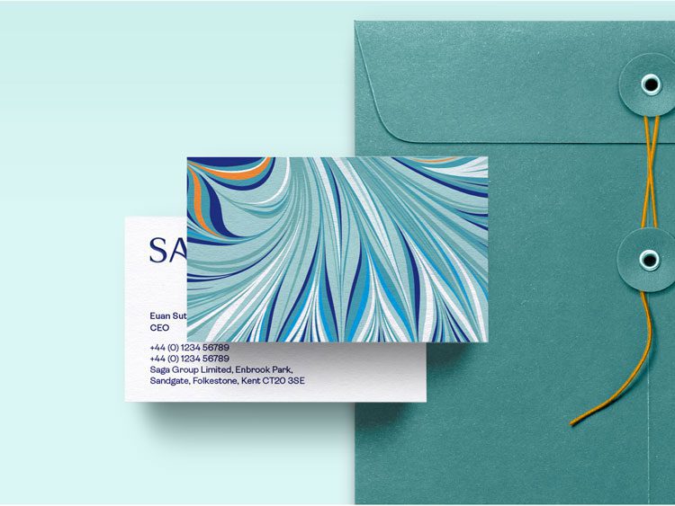
Designers are utilising these muted themes in a multitude of different ways, from combining them with simple geometric shapes to creating delicately intricate layered designs. Saga, provider of financial services for the over 50s, portrays this perfectly in their 2022 rebrand. They’ve opted for calming blue and turquoise hues, but have layered simple shapes to create beautifully stylish patterns.
Alternatively, muted colours can be incredibly powerful when utilised in the form of minimalism. We’ve moved beyond the effectiveness of the black-and-white designs that define the minimalist trend, with artists looking for new ways to keep their canvas clean but engaging. Muted colours seem to be the answer. Support provider Zendesk perfectly demonstrates the effectiveness of this simple approach, as seen on their current homepage banner.

An evolution in eco graphic design
It’s taken a long time for the world to take real notice of environmental issues. However, 2021 saw such a rush of it that there’s a risk of consumer fatigue with the same old ideas being used to push eco-focused agendas.
The subtle greens and browns, along with the overuse of tranquil landscape imagery and the hands-holding-the-planet cliché have been done to death. As such, they’re quickly losing their impact. This year, designers are going to have to come up with far more creative ways to promote environmentally friendly values.
One answer could be putting your money where your mouth is. There’s an increased focus on the materials and methods used for your graphics, rather than just the graphics themselves. Sustainable materials, planet-friendly inks and recyclable packaging will be key. This will undoubtedly detract from the pristine aesthetics we’re accustomed to, but if done correctly it can instantly show the positive environmental intentions of a brand.
Lose the sheen, keep ’em keen in 2022.

How will your graphic design reinvigorate your audience?
2022 is set to be a bit of a confusing year for the graphic design industry. On the one hand, ’90s nostalgia demands bold, quirky choices, while the muted colour trend calls for elegance and restraint. And how do you flaunt your eco-friendliness while evoking a decade known for tonnes of plastic and waste?
It all comes down to finding the right balance for your brand, and not just following trends because they’re trendy. Need a little help figuring out the right path to take? Talk to DWH.

Claire Baldwin
Claire has over 10 years' copywriting experience across a range of print and digital media, working with a variety of styles, formats and tones of voice. She has written as part of an in-house team client side, as well as at marketing agencies based in the East Midlands. Claire's services include copywriting, copy editing, content creation and proofreading.